
Do more with less UI.
BlogBlogBlogBlog2021-06-09
Introducing Pinegrow Web Editor 6
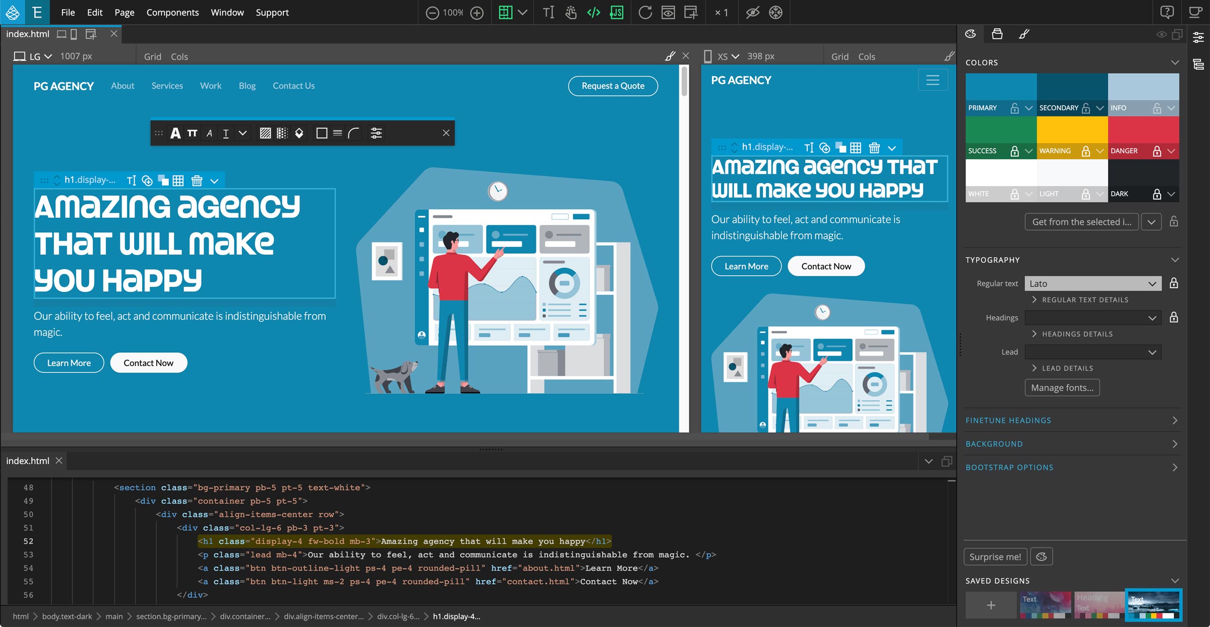
Pinegrow Web Editor 6 is out with some amazing improvements!
The already powerful desktop website editor that lets you build web projects with visual tools and code using CSS/SASS styling, CSS Grid, plain HTML, Bootstrap, Tailwind CSS, Foundation or WordPress has a range of powerful new features.
The focus of Pinegrow 6 is making Pinegrow more accessible and easier to use while keeping all its power at your disposal.
Download
Want to quickly take Pinegrow for a spin? Here are the download links. Go through the rest of this post while Pinegrow is downloading.
Trial version is included.
- Mac - Anti-virus checked - SHA1 688b1cb2ed6fbf29f21d2972dd30c9877290974e
- Windows 64bits - Anti-virus checked - SHA1 e6a47f4e2d1cdac8619db6ead6d198934848a92e
- Windows 32bits - Anti-virus checked - SHA1 ac3d6cf1ef3ffb04fb13a47cdebdb41edab69759
- Linux - Anti-virus checked - SHA1 33f6488c720bf88a348e62d7260d280764313b37
Video tour of the top new features
Want a quick overview? Watch the video and then continue reading for more details:
Meet the new Design Panel!
Design panel lets you visually create custom themes for Bootstrap and Tailwind CSS: set colors, fonts, background and control many framework options.
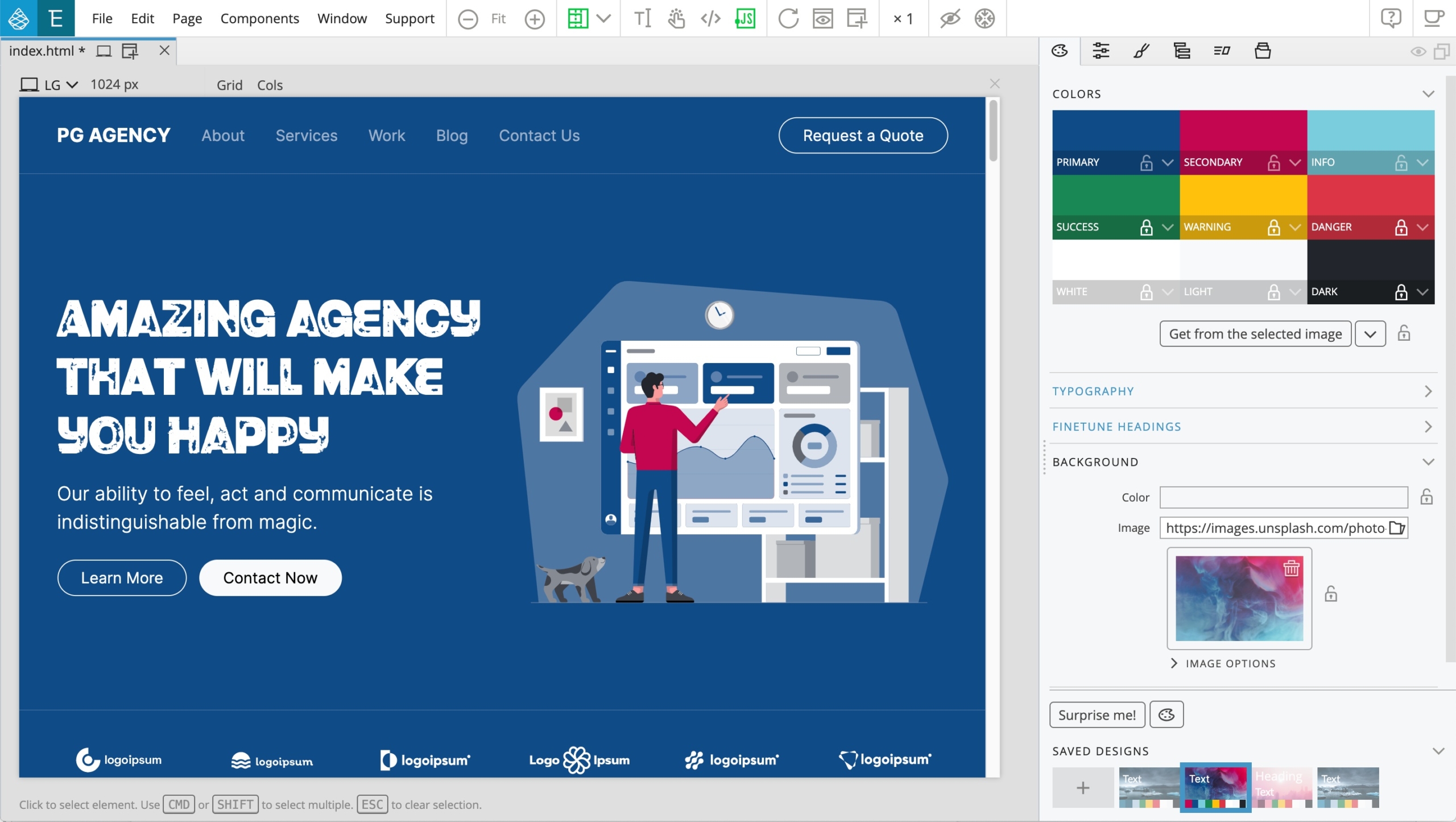
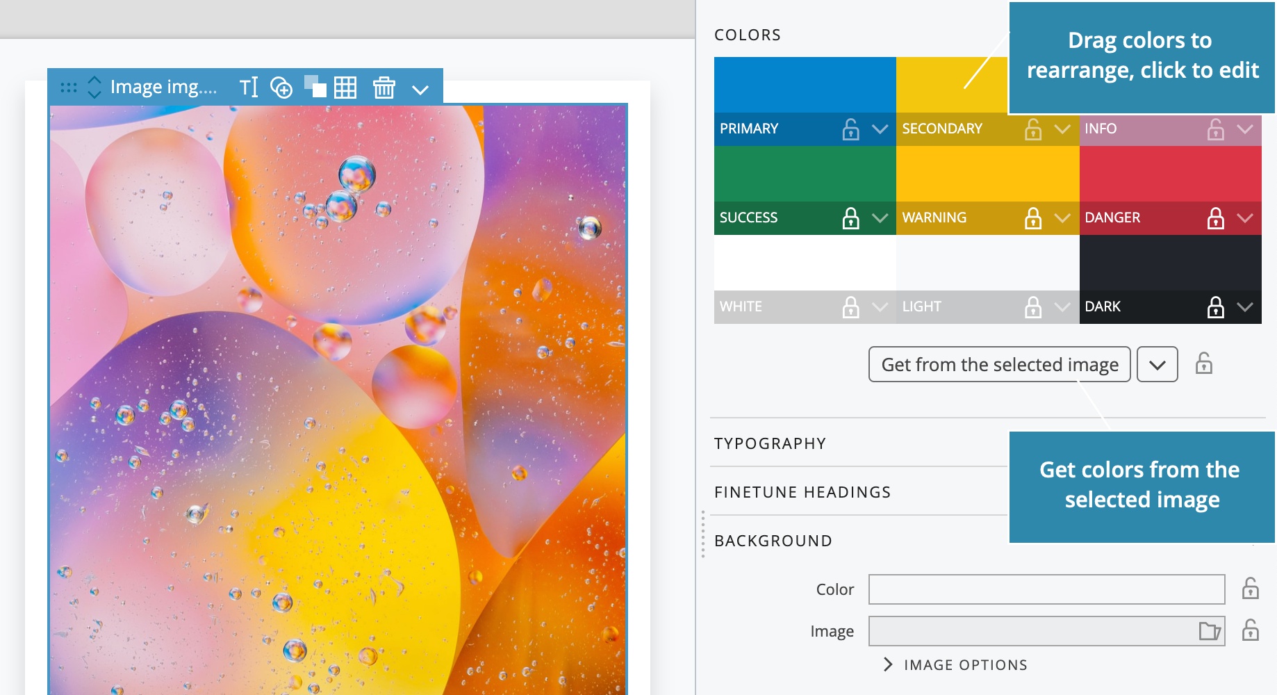
Quickly generate a color palette from any image on the page and fine-tune it:
Set the typography for regular text and different heading levels:
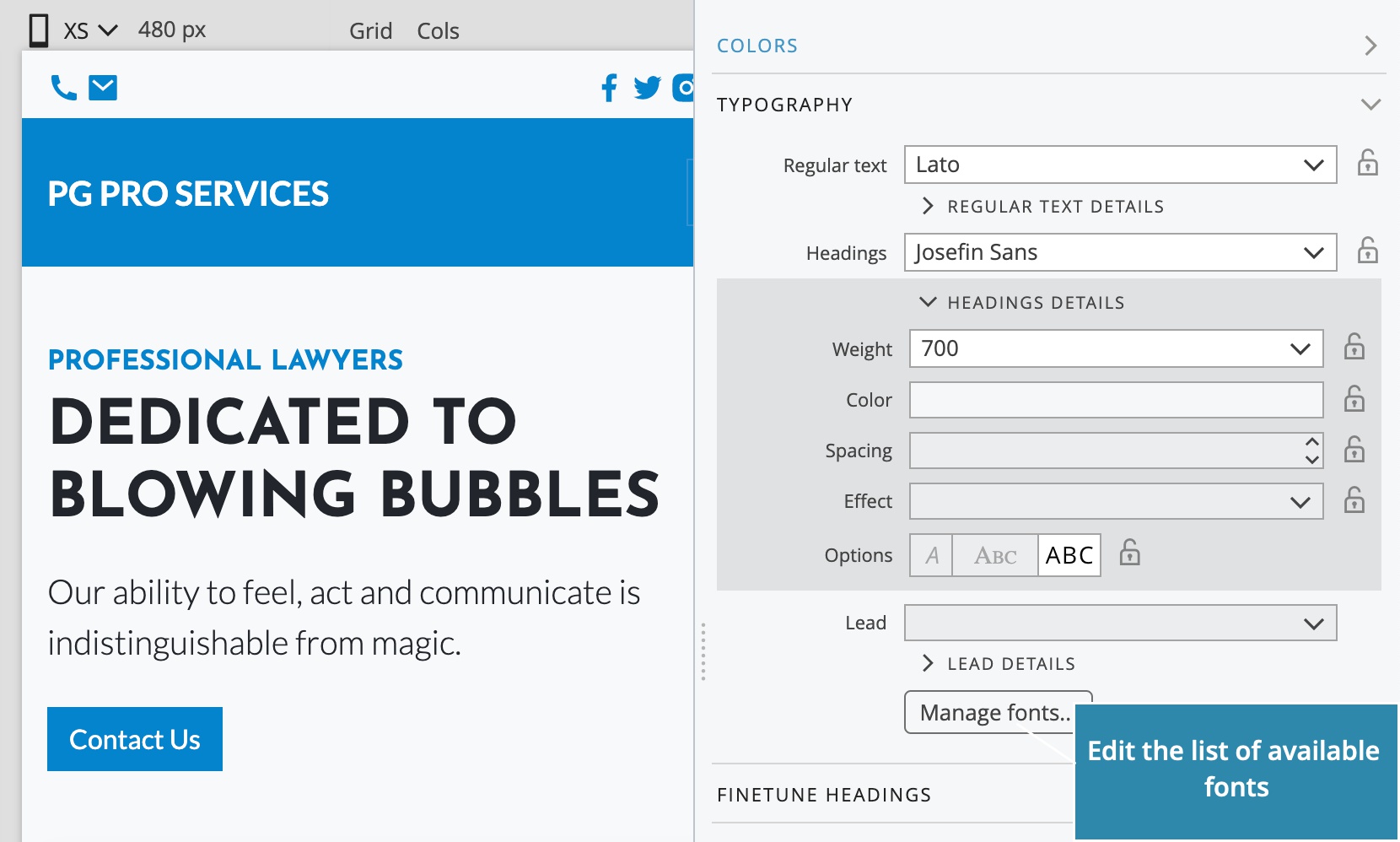
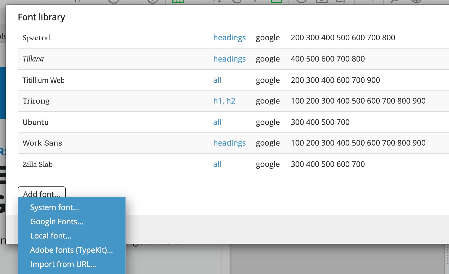
The new Fonts manager lets you add fonts from a variety of sources, including Google Fonts, Adobe Fonts (TypeKit), import from URL and local web fonts:
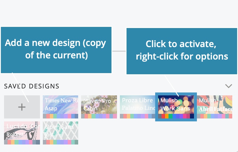
Save different variants of your design and easily switch between them to preview your styling on open documents:
But the best feature is the Surprise Me button.
Press Surprise Me and Pinegrow will come up with a unique design based on a randomly selected image.
Choose the appropriate image search query - or select a local folder with images - and lock those design parameters you wish to keep.
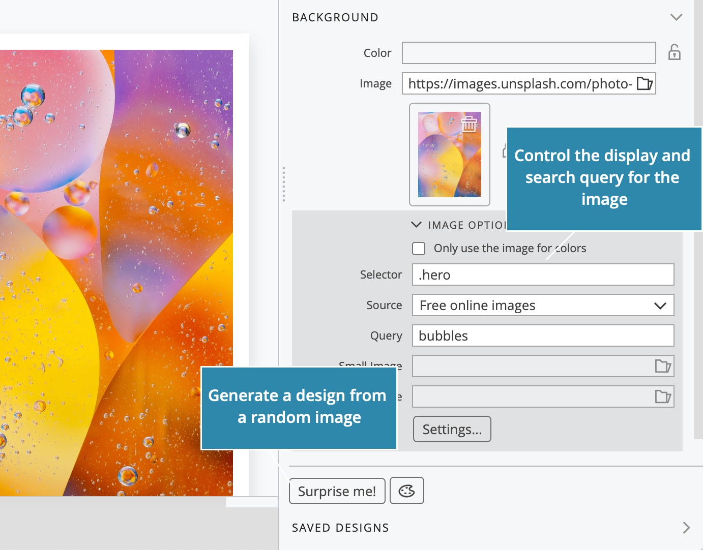
See the Surprise Me! in action:
Coming up with surprising designs is easy and lots of fun!
“Wanna watch Netflix?”
“No… Let’s keep clicking on the Surprise Me button!”
Design Panel works for Bootstrap 4, 5 and Tailwind CSS projects.
The Tailwind CSS version uses the Just-in-time compiler to quickly generate the stylesheet with just those CSS rules that are used in the project.
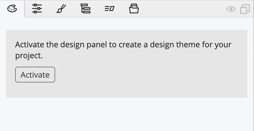
To get started with the Design panel, open or create a Bootstrap or Tailwind CSS project (create a new page, save it and open the folder as a project), and then click on Activate in the Design panel.
For more information take a look at the guides:
Floating tools
While playing with the Design panel you’ll probably want to make quick changes on the page, for example change the color, set the font family, paint the background…
Wouldn’t it be nice to be able to do that without having to switch to the Properties panel where those controls are located?
You can now!
Just press SHIFT SHIFT (2 x SHIFT key) and the new Floating tools palette will fly directly to the mouse cursor.
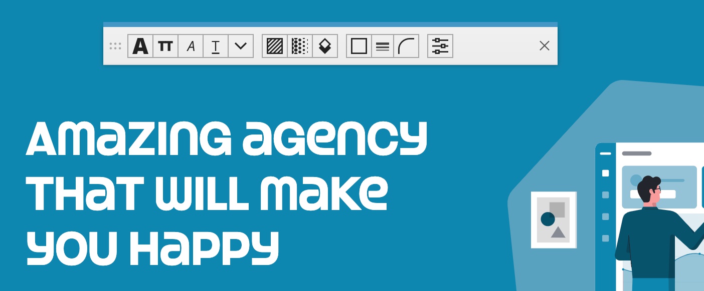
Floating tools contain the most common and useful visual controls. The range is framework specific and at the moment both Bootstrap and Tailwind CSS are supported.
Floating tools can work in two modes: paint mode and set mode:
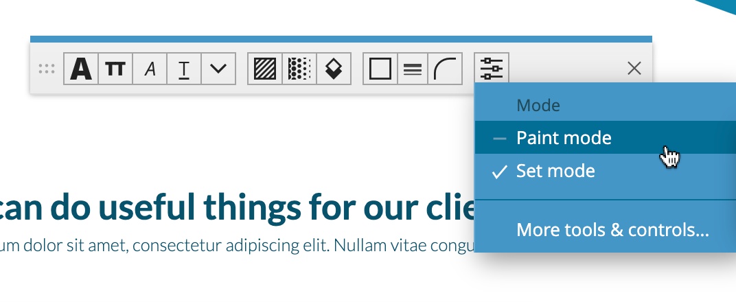
Set mode (default) applies the selected value to one or more selected elements.
Paint mode, on the other hand, lets you pick up a value and apply it to elements by “painting” on them in the page view. For example, pick up a text color and then click on elements to color them. This also works for inline SVG images:

Once you’re done with painting, press ESC or dump the tool in the bin.
Let us know if you like the Floating tools and we’ll expand the palette with even more controls.
To learn more take a look at:
Replacing colors
Staying on the topic of easily making edits directly on the page views, you can now quickly swap Bootstrap and Tailwind CSS colors directly from the selected element menu:
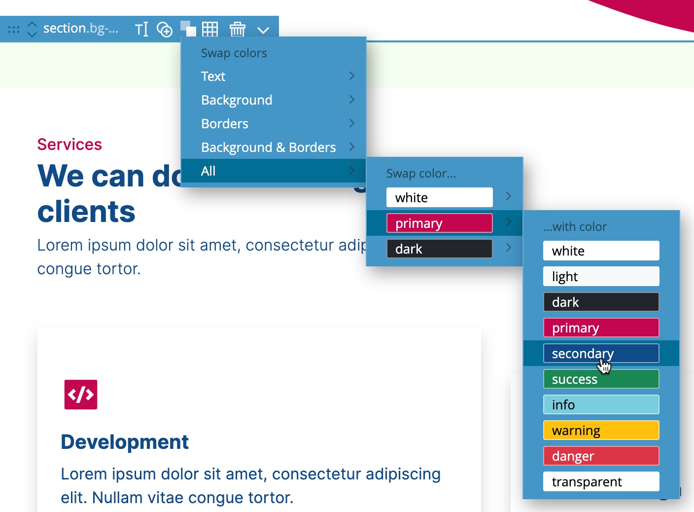
The change affects the selected element and all its content. If you want to change the colors on the whole page, select the Body and replace colors there.
Moving elements up & down
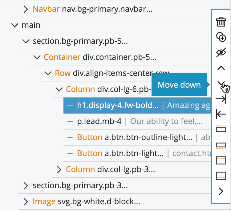
Another addition to the selected element menu are up and down buttons that let you move the element up (insert it before the previous element) and down (move the element after the next element):
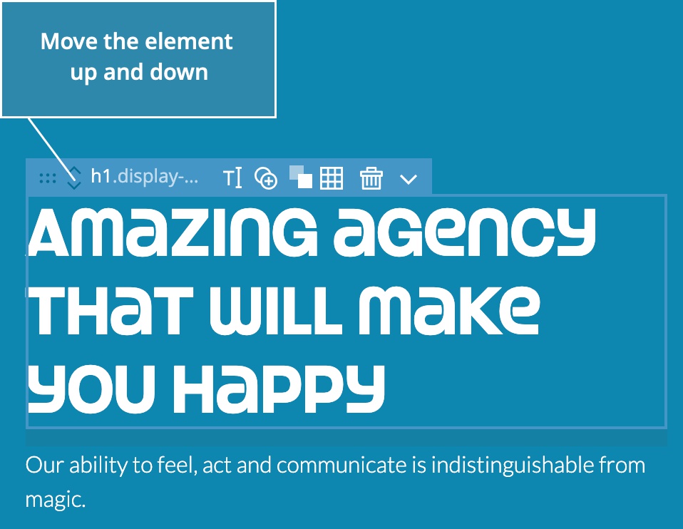
The same buttons are available in the Tree panel as well:
Auto-collapsing Tree structure
While we are in the Tree panel, you can now automatically collapse all tree branches below a certain level while keeping the branch with the selected element expanded:
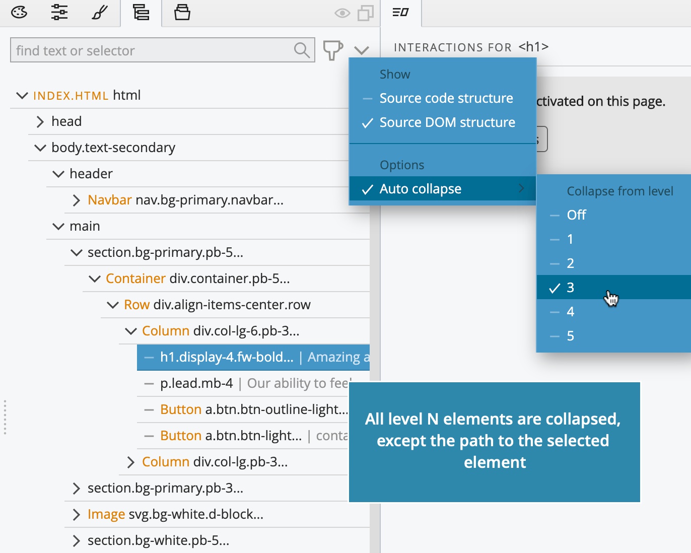
Use the Tree options menu to choose the level. The Source / DOM structure toggle has been moved there as well.
Too much good stuff? Don’t stop reading yet, we saved a major improvement for the end of this post.
Easily create and remove links
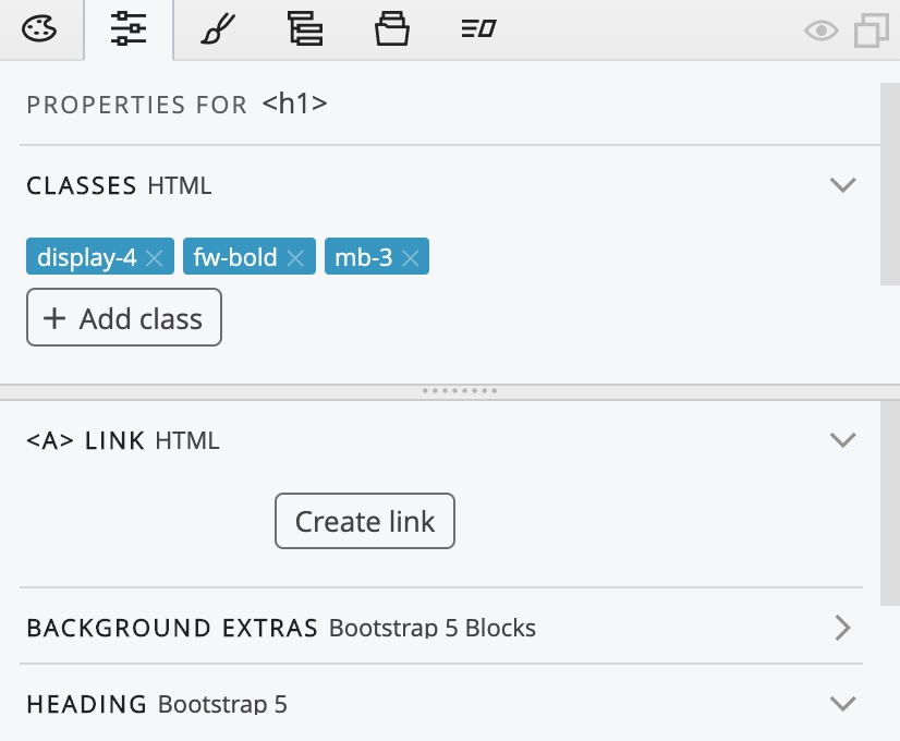
The Properties panel has a new Link section with the “Create link” button that wraps the selected element with an <a> anchor element. The Link section makes it easy to edit an existing link, even when the selected element itself is not an <a> anchor element, but one of its parents is.
Smarter CSS Fields
Moving over to the Style panel, all fields in the Visual CSS editor got a handy helper menu, from which you can convert units, toggle !important and use CSS variables:
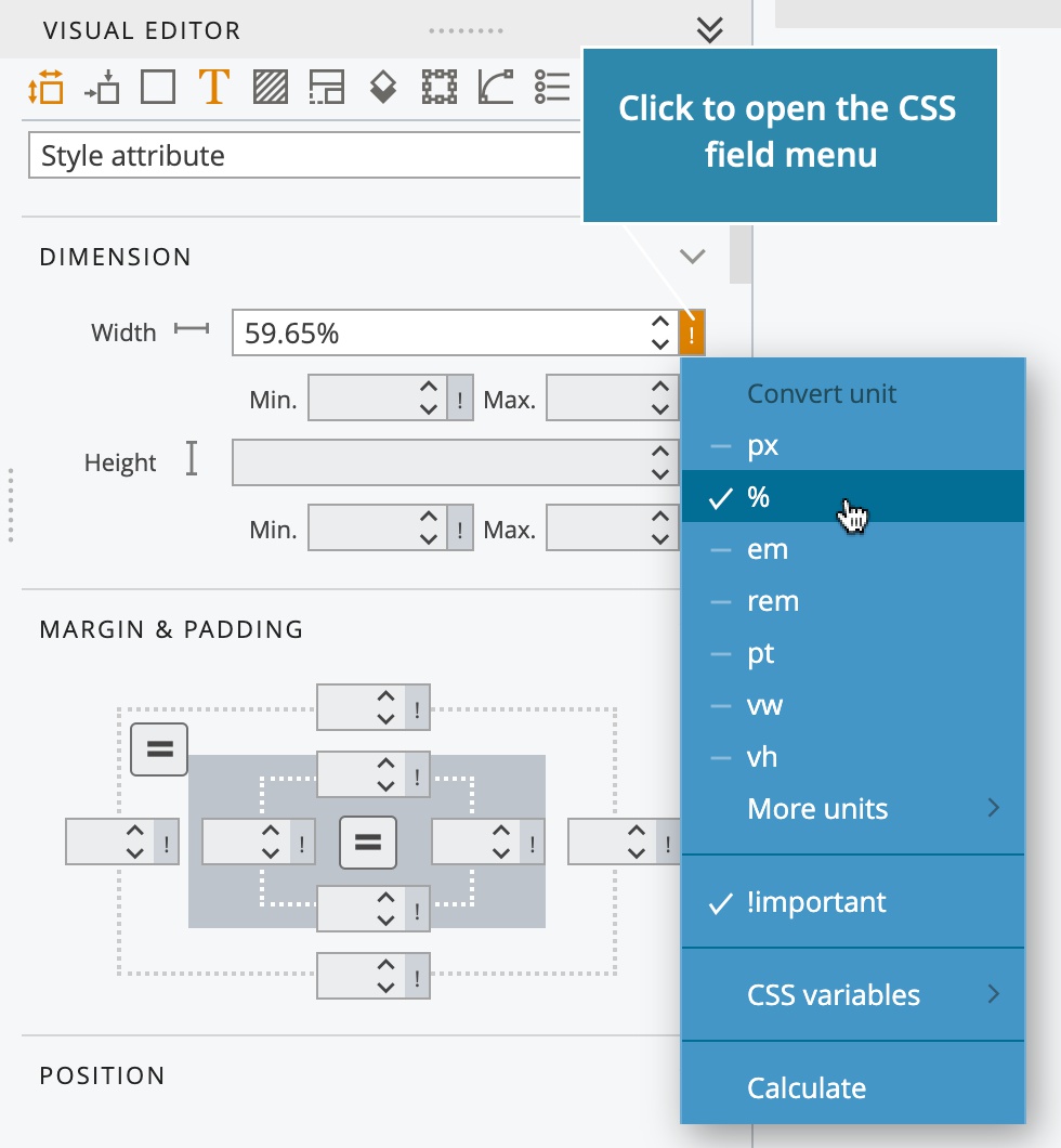
It is no longer needed to enter the px unit after the value; px is used as default.
Customize the workspace with the new Window menu
All features that have to do with customizing the workspace have been moved into the new Window menu.
There you can also show and hide individual panels and tools. Pinegrow has a lot of features. Hiding unnecessary panels lets you create perfect workspace layouts with only those panels that you need for the task.
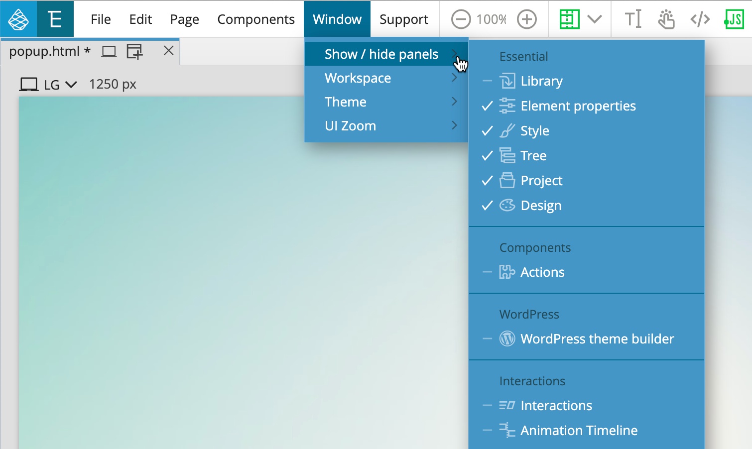
You can save as many layouts as you need, and easily switch between them with the Window menu.
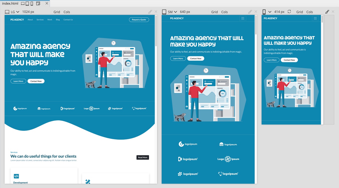
Remembering open page views
Pinegrow lets you open multiple views of the same document and edit them side by side. The open page views are now remembered and restored for each individual document.
Closing the current document got a new hotkey combo - CMD+SHIFT+W on Mac, or CTRL+SHIFT+W on others.
Expanded use of named animations in Pinegrow Interactions
You can now use any named animation that is defined on the page, as the animation in Interactions action. That means you can easily re-use animations in multiple places and chain animations together.
Animation property Interactions › Play animation will first look for the named animation on the target element, and if not found, will use a global animation with that name.
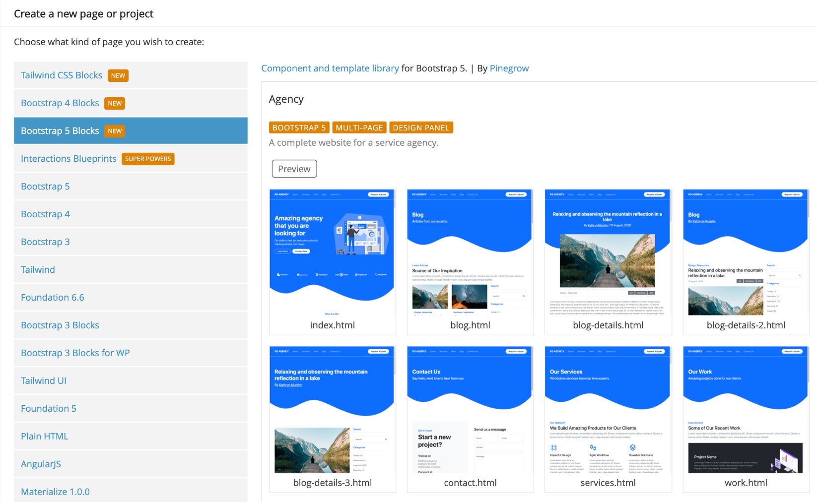
Bootstrap 5 with Blocks library
With so many improvements we almost forgot to mention that Bootstrap 5 is now fully supported in Pinegrow, alongside Bootstrap 4, 3 and other frameworks.
Bootstrap 5 Blocks and templates are available in the Pinegrow Library.
We are almost done here and will let you go and get your hands on the new Pinegrow goodies. We have just one more point to cover.
Monaco is the new code editor in Pinegrow
Monaco is the same editor that powers Visual Studio Code. It is very fast, even with large files. Get the best of VS Code in Pinegrow and reduce running multiple applications for your web development.
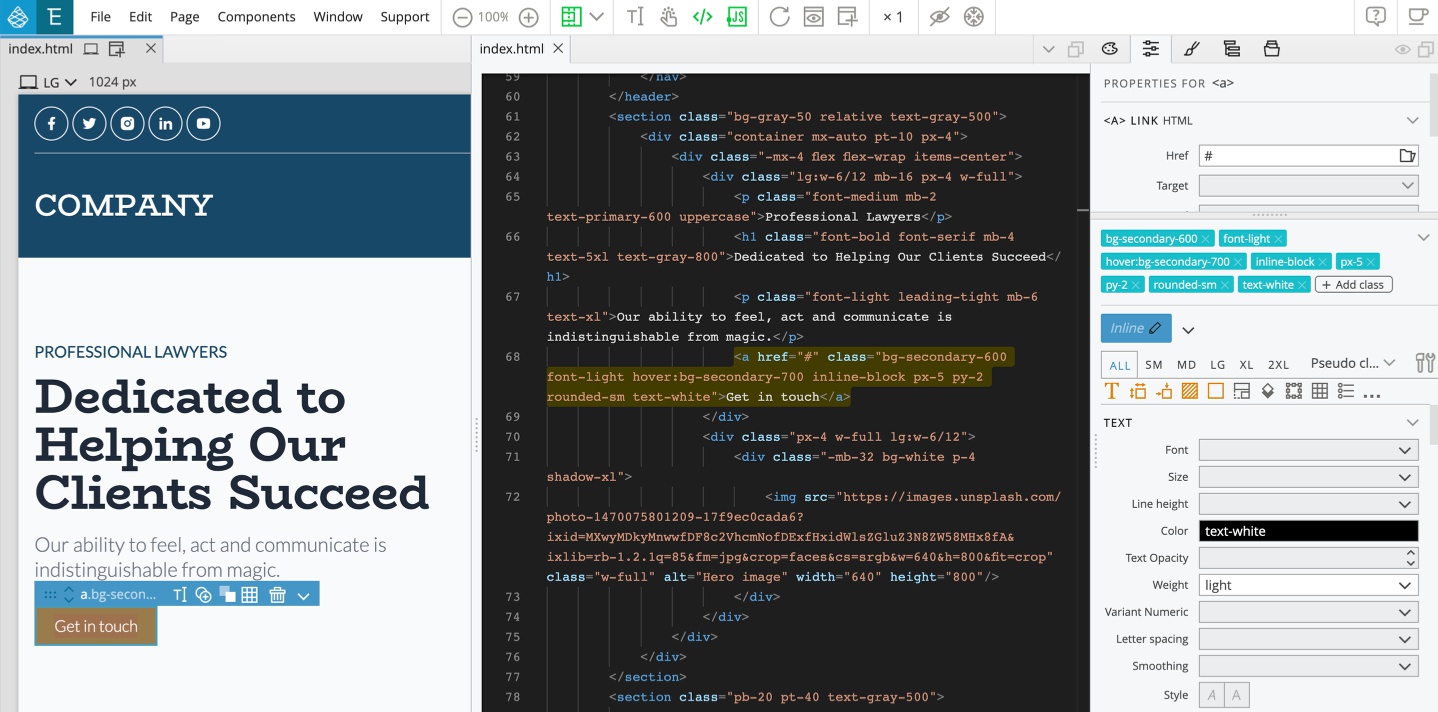
Benefits of Monaco
Better performance, especially when working with large files.
Easier search & replace (press CMD/CTRL + F in the editor):
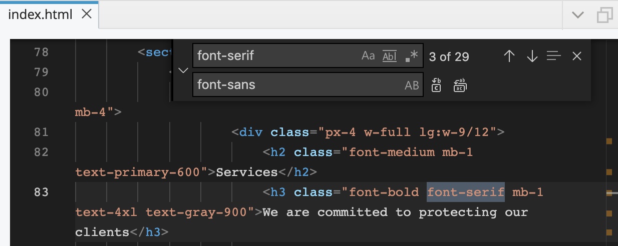
And more:
- Better and faster code completion
- Better code validation
- Extended language support
- Perfect Emmet support out of the box (needs to be enabled in Settings)
- Support for font ligatures
- Great code navigation
Note, the complete code completion for Bootstrap and Tailwind CSS classes is not yet available.
The switch from CodeMirror to Monaco lays the foundation for more future improvements of the internal code editor.
Added Windows 64bit install package
On Windows, Pinegrow Web Editor is now available for both 32bit and 64bit systems. Both installs are provided in the download section.
Download
Pinegrow 6 is available for download now. Pinegrow 6 is a free upgrade if your one-time-payment license is valid for updates or if your subscription plan is active.
Trial version is included.
- Mac - Anti-virus checked - SHA1 688b1cb2ed6fbf29f21d2972dd30c9877290974e
- Windows 64bits - Anti-virus checked - SHA1 e6a47f4e2d1cdac8619db6ead6d198934848a92e
- Windows 32bits - Anti-virus checked - SHA1 ac3d6cf1ef3ffb04fb13a47cdebdb41edab69759
- Linux - Anti-virus checked - SHA1 33f6488c720bf88a348e62d7260d280764313b37
Free trial is included. If your Pinegrow trial has expired, you will get a fresh trial period.
Enjoy Pinegrow and all the surprises it brings!