
Activate the Design panel to compile your Tailwind CSS project into one stylesheet, tailwind_theme/tailwind.css, with Pinegrow’s built-in Tailwind CSS 4 compiler. Set colors, fonts and backgrounds, save design variations, and add your own @theme configuration.
DocsTailwind CSSDocsTailwind CSS2026-10-24
Design panel and the built-in compiler
The Design panel turns a Tailwind CSS project into a compiled site. When you activate it, Pinegrow's built-in Tailwind CSS compiler writes one stylesheet, tailwind_theme/tailwind.css, with only the CSS rules your project uses, links it on your pages and removes the Tailwind CDN script. The published site then loads no Tailwind script from a CDN and needs no build tool.
The same panel sets the colors, fonts and background of the whole project, keeps several design variations side by side, and holds your own Tailwind CSS configuration.
This page describes Tailwind CSS 4 projects. For Tailwind CSS 3, see Working with Tailwind CSS 3. The Design panel and the built-in compiler work the same in Pinegrow Desktop and Pinegrow Online. Only the external build process is Desktop only, see Use an external Tailwind CSS build.
Activate the Design panel
The Design panel works with projects. If you started from a new page, save it and open its folder as a project first.
- Open the project and a page that uses Tailwind CSS.
- Open the Design panel.
- Click Activate.
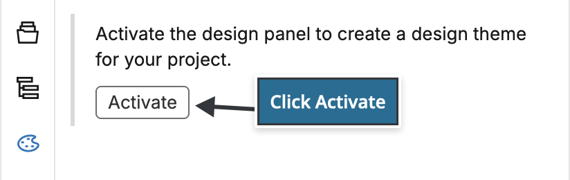
If you create a new project in Pinegrow Desktop with Create project and Activate the Design panel checked in the new page dialog, Pinegrow activates the Design panel for you.
What activation changes
- Pinegrow creates the stylesheet
tailwind_theme/tailwind.cssin the project. - It links that stylesheet on every open page and on other pages when you open them. An existing link to a stylesheet named
tailwind.cssortailwind.min.cssis replaced. - It removes the Tailwind CDN scripts,
https://unpkg.com/@tailwindcss/browser@4andhttps://cdn.tailwindcss.com, from those pages. - It chooses the compiler from the page: Built-in JIT compiler (4.2.2) for a Tailwind CSS 4 page, Built-in JIT compiler (3.4.3) for a page that loads the Tailwind CSS 3 CDN script. You can change it later in the Tailwind CSS Options.
Save your pages to keep these changes. From now on, the Tailwind visual controls and the Class Tree read your colors, fonts and configuration from the built-in compiler, so there is nothing to set up for them.
If the project contains a tailwind.config.js file, Pinegrow first asks whether you want to keep compiling the stylesheet outside Pinegrow. Choose Use the built-in compiler, or Use the external compiler and follow Use an external Tailwind CSS build.
Which classes are compiled
Pinegrow keeps a list of the classes used in the project's HTML pages and scripts and compiles exactly those. The list grows as you edit. It doesn't shrink when you stop using a class. To rebuild it from the files, use Refresh used classes in the Tailwind CSS menu (the Project settings menu, or the Settings & Tools icon in the Visual controls panel on Desktop).
The Design panel
After activation the panel shows the sections Colors, Fonts, Background and Tailwind CSS options, the Saved designs list and the Surprise me! button.
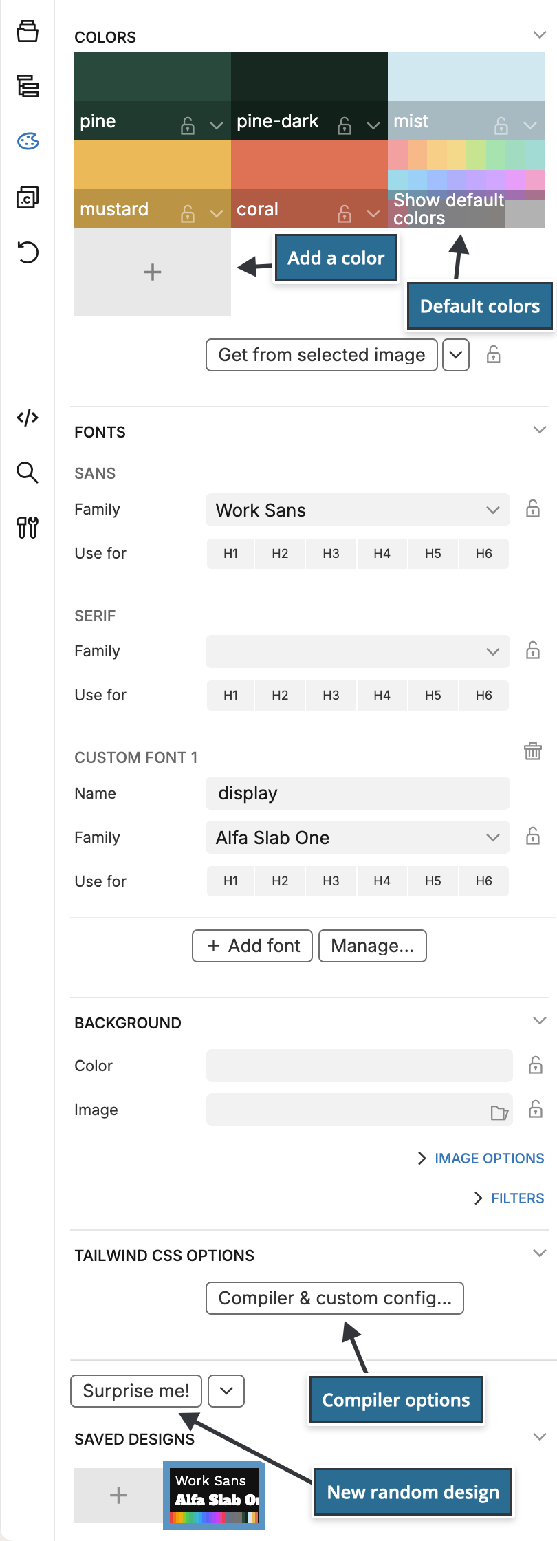
Every change recompiles the stylesheet and updates the page view. Design changes are recorded in the undo history, so Undo and Redo step through them.
Colors
Default Tailwind colors
The 22 default Tailwind color palettes (red, orange, amber and so on to stone), each with the shades 50 to 950, are part of every design. They are hidden and locked so that red stays red. Click Show default colors to see them, or turn Show default colors on and off in the colors menu (the arrow button next to Get from selected image).
Add a color
Click the + swatch to open Add a new color:
- Color name: letters, numbers and
_. The name becomes part of the class names, for exampleprimarygivesbg-primary-500andtext-primary-700. - Color value: the base color.
- Shades: the shade names, separated with commas. The default list is
50, 100, 200, 300, 400, 500, 600, 700, 800, 900, 950. Pinegrow calculates a color for each shade from the base color. Leave the field empty for a color without shades.
Prefer names that describe the role of a color, such as primary, secondary or accent. You can then change the color without making class names like bg-blue-500 misleading.
Change, rename and delete colors
- Click a swatch to pick a new color. Pinegrow recalculates its shades.
- Right-click a swatch for Edit shades…, Rename color… and Delete color. In Edit shades… you can change the base color and list the shades one per line, either as
500 = #3b82f6to set a shade or as500to let Pinegrow calculate it. - Drag a swatch onto another to swap the two colors. Hold Option (Mac) or Alt (Windows, Linux) while dragging to copy a color, and Shift to change the order.
Renaming or deleting a color changes the stylesheet, not your pages. Classes that use the old name, such as bg-brand-500, stop working until you change them on the pages.
Get colors from an image
Select an image, or an element with a background image, on the page and click Get from selected image. Pinegrow takes the colors from the image and assigns them to the unlocked colors. The lock icon on a swatch protects that color.
The colors menu sets how the colors are picked: Get all colors from the image, or two colors from the image plus one complementary, two split, two triad or two similar colors. Restore default colors resets the default Tailwind palettes.
Fonts
The Fonts section sets the font family of the font-sans and font-serif classes. Choose a family from the list for each.
- Click H1 to H6 under a family to use it for those headings without adding classes to them.
- Click Add font to add another family with its own name, for example
displayfor afont-displayclass. It appears in the font controls of the Visual controls panel. - Click Manage…, or choose Manage fonts… at the end of the family list, to open the Font library.
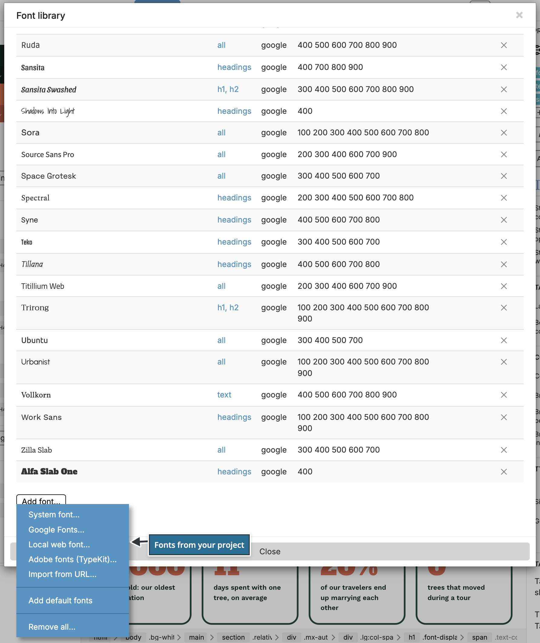
In the Font library, Add font… adds fonts to the lists:
- System font…: a font stack the visitor's device already has, for example
"Times New Roman", Times, serif. - Google Fonts…: fonts from Google Fonts.
- Local web font… (Desktop) or Self-hosted web font… (Online): a font whose files are in your project. On Desktop, select the CSS file of a web font bundle that contains the
@font-facerules. A service such as Font Squirrel's Webfont Generator makes such a bundle from font files. Pinegrow copies a bundle that is outside the project into the project'sfontsfolder. - Adobe fonts (TypeKit)… and Import from URL…: fonts from a stylesheet on another server.
- Add default fonts puts back the fonts that come with Pinegrow.
Only the fonts used in the active design are added to the stylesheet.
Fonts on a site without external requests
Google Fonts, Adobe fonts and fonts imported from a URL stay on their servers. The compiled stylesheet imports them from there, for example from fonts.googleapis.com, so visitors' browsers request them from Google or Adobe. For a site that loads nothing from other servers, use Local web font… or Self-hosted web font… with font files in the project, or a System font….
Background
The Background section sets the page background for the whole project:
- Color: one of your design colors, applied to
body. - Image: an image from the project or from the online photo library. By default Only use the image for colors is checked, so the image only provides colors. Uncheck it to show the image as the background of the Selector, which is
bodyby default. A selector that starts withimg, for exampleimg.poster, sets thesrcof that image instead. - Small Image and Large Image: other images for small and large screens. Settings… sets their media queries, by default up to 767px wide for the small image and from 1440px wide, or from 992px wide on high-resolution screens, for the large one.
- Support fixed bck. on mobile & filters places the image in a pseudo-element, so a fixed background works in mobile Safari and the Filters (blur, brightness, contrast and others) can be used.
An image picked from the online photo library is loaded from that service. For a site without external requests, pick images from the project.
Surprise me and saved designs
Surprise me! creates a new design: a random photo for the background colors, new colors for every unlocked color and new font families for unlocked fonts. Lock what you want to keep and click again.
All default Tailwind colors are locked. If the design has no other colors, Pinegrow offers to add primary, secondary, color3 and color4 for Surprise me to change. Use these color names in your classes, so a new design changes the page.
Source and Query in the Background image options set where the random photos come from: Free online images with an optional search word (default wallpaper), or a Folder on your computer (Desktop).
Right-click Surprise me! for Animate transitions and Autoplay, which creates a new design every 5 to 60 seconds until you stop it.
The Saved designs list keeps design variations, for example to show a client several options. Click + to add the current design, click a design to activate it, and right-click it to Duplicate or Delete it. Only the active design is compiled into the stylesheet.
The arrow button next to Surprise me! opens Floating Tools and Deactivate the Design panel…, which deletes all designs and reloads the project. The compiled tailwind_theme/tailwind.css stays in the project. Deactivating can't be undone.
Tailwind CSS Options
Click Compiler & custom config… in the Tailwind CSS options section to open the Tailwind CSS Options dialog. The settings apply to all designs of the project.
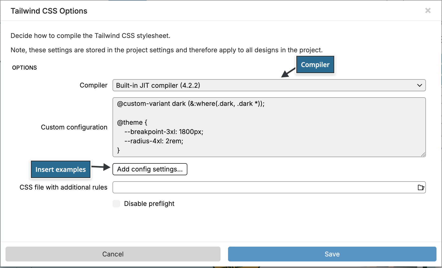
Compiler
- Built-in JIT compiler (4.2.2): Tailwind CSS 4, the default.
- Built-in JIT compiler (3.4.3): Tailwind CSS 3, for projects that still use it.
- Built-in JIT compiler (2.2.6) and Built-in non-JIT compiler (2.2.6): Tailwind CSS 2, for old projects. The non-JIT compiler writes the complete Tailwind stylesheet and makes it very large.
- External build process (Desktop): compile the stylesheet with your own Tailwind CSS build. See Use an external Tailwind CSS build.
The compiler decides which Tailwind CSS version the visual controls use.
Custom configuration
For Tailwind CSS 4, the custom configuration is CSS in Tailwind's own format: theme variables in an @theme block, and other Tailwind CSS rules such as @custom-variant or @utility before or after it. Pinegrow adds it to the stylesheet source together with your design.
@custom-variant dark (&:where(.dark, .dark *));

@theme {
    --breakpoint-3xl: 1800px;
    --radius-4xl: 2rem;
}
This example adds the 3xl: breakpoint and the rounded-4xl class, and makes the dark: variant apply inside an element with the dark class instead of following the visitor's system setting.
Add config settings… inserts examples you can edit. Its Define menu has Dark mode, and its Extend menu adds screen sizes, border radius, font size and spacing variables. If the configuration is not valid, the dialog says This is not a valid Tailwind CSS 4 config and doesn't save it.
Colors and fonts are easier to manage in the Colors and Fonts sections, which write the same kind of variables.
CSS file with additional rules
Select a CSS file in the project with your own rules, for example component classes with @apply or @layer rules. Pinegrow adds its content to the stylesheet source and compiles again when you edit the file in Pinegrow. Don't link this file on your pages: its rules end up in tailwind_theme/tailwind.css.
The built-in compiler can't follow @import of other local CSS files. Put the rules in this file instead. @import url(...) of a stylesheet on another server is kept as it is.
Disable preflight
Check Disable preflight to leave out Tailwind's preflight, the rules that reset the browser's default styles. Use it when Tailwind is added to an existing site whose styles rely on the browser defaults.
Plugins
The built-in compiler includes the official typography plugin (the prose classes) and forms plugin. It can't load other Tailwind CSS plugins. For other plugins, use the external build process.
When compiling fails
If the configuration or the additional rules contain an error, Pinegrow shows Tailwind CSS error with Tailwind's message and the code it tried to compile. Fix the configuration or the CSS file, and the stylesheet is compiled again.