With your Vue app, you think of components and its state.
DocsVue DesignerDocsVue Designer2023-09-06
App Tree and State panel
Vue Designer is built on top of Pinegrow Web Editor and shares a similar set of features (panels & visual helpers) and workflow when working on your Vue components.
The App Tree and the State Panel are the two key features that are unique to Vue Designer.
To follow along with this guide, clone the sample apps from the start-screen by clicking on the “New Project” button. If you are new to Vue Desginer, follow the Quick Start guide, which provides step-by-step instructions on cloning an existing starter template (or) sample app.
Sample App used in this guide - Happy Paws with Nuxt and Tailwind CSS.
You can watch and follow this live demo, or scroll down past the video for step-by-step instructions.
Open App Tree
Once the startup page is open, click on the root node of the component currently loaded in the Page Tree.
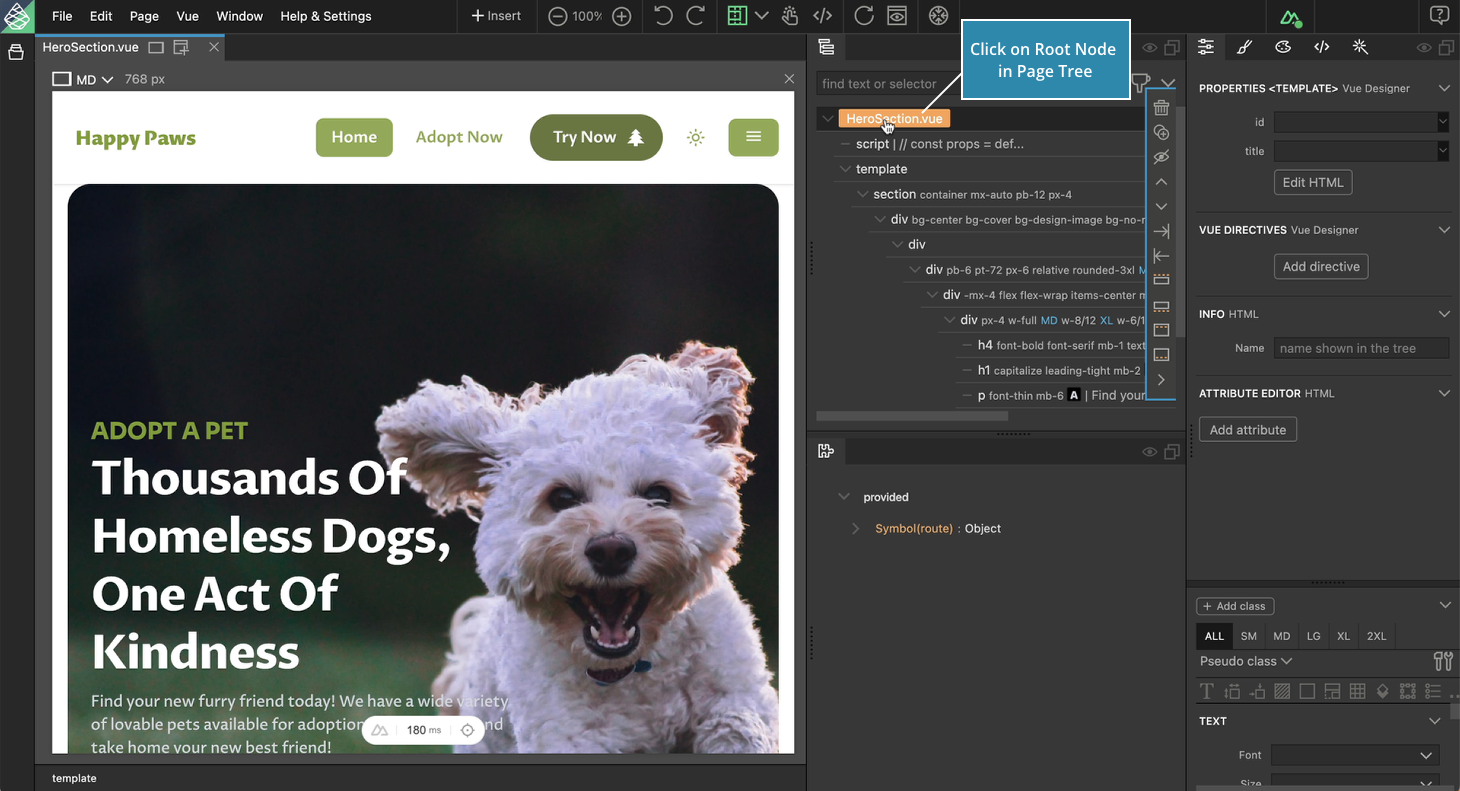
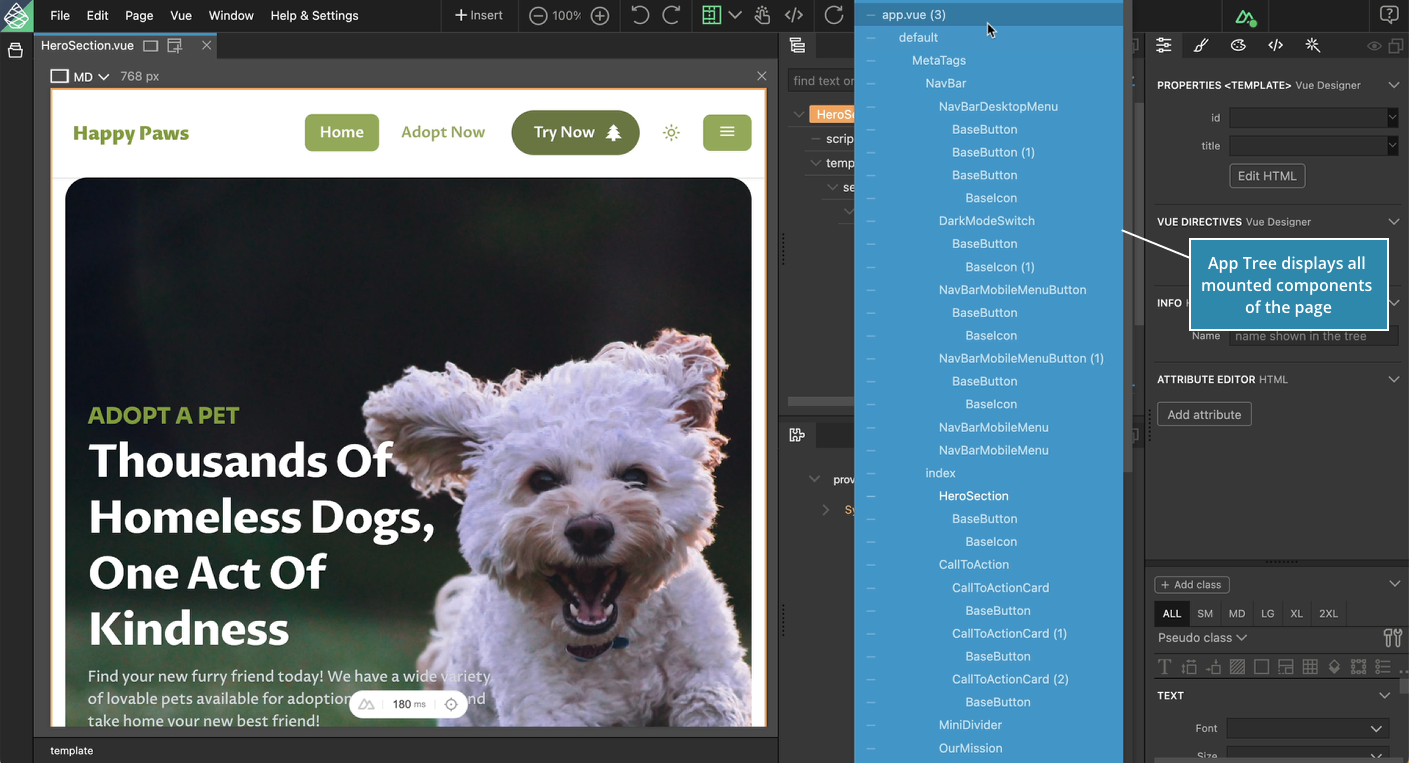
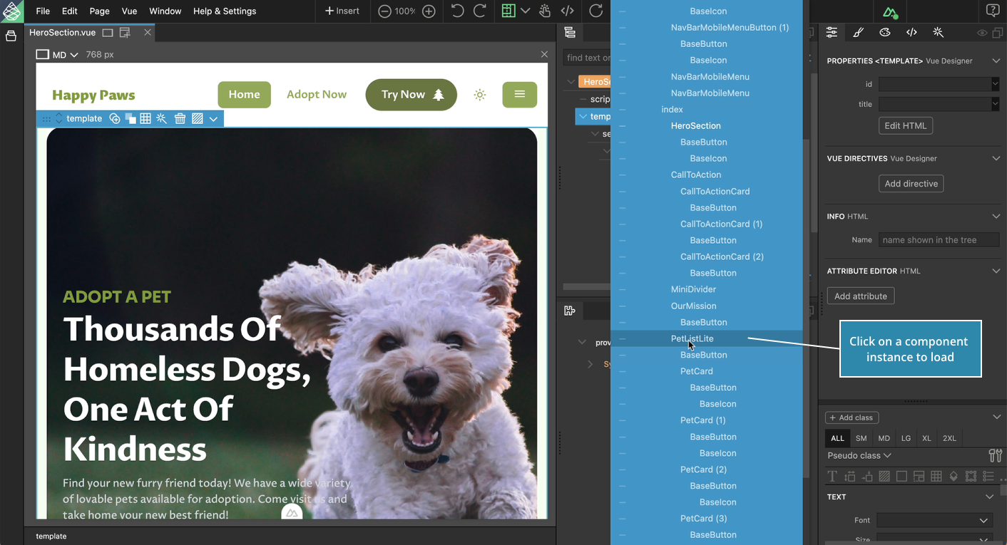
This opens the App Tree that displays all the mounted components of the current page.
Hover on App Tree
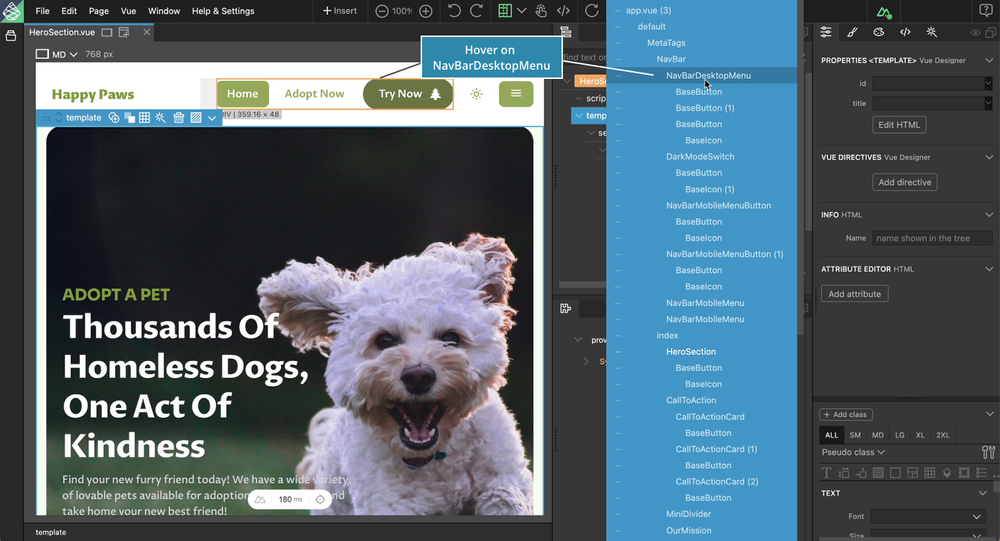
Hovering on the component instances in the App Tree highlights the corresponding components in the live page view.
You might have to scroll down the page view to see components lower on the page when hovering over them in the App Tree.
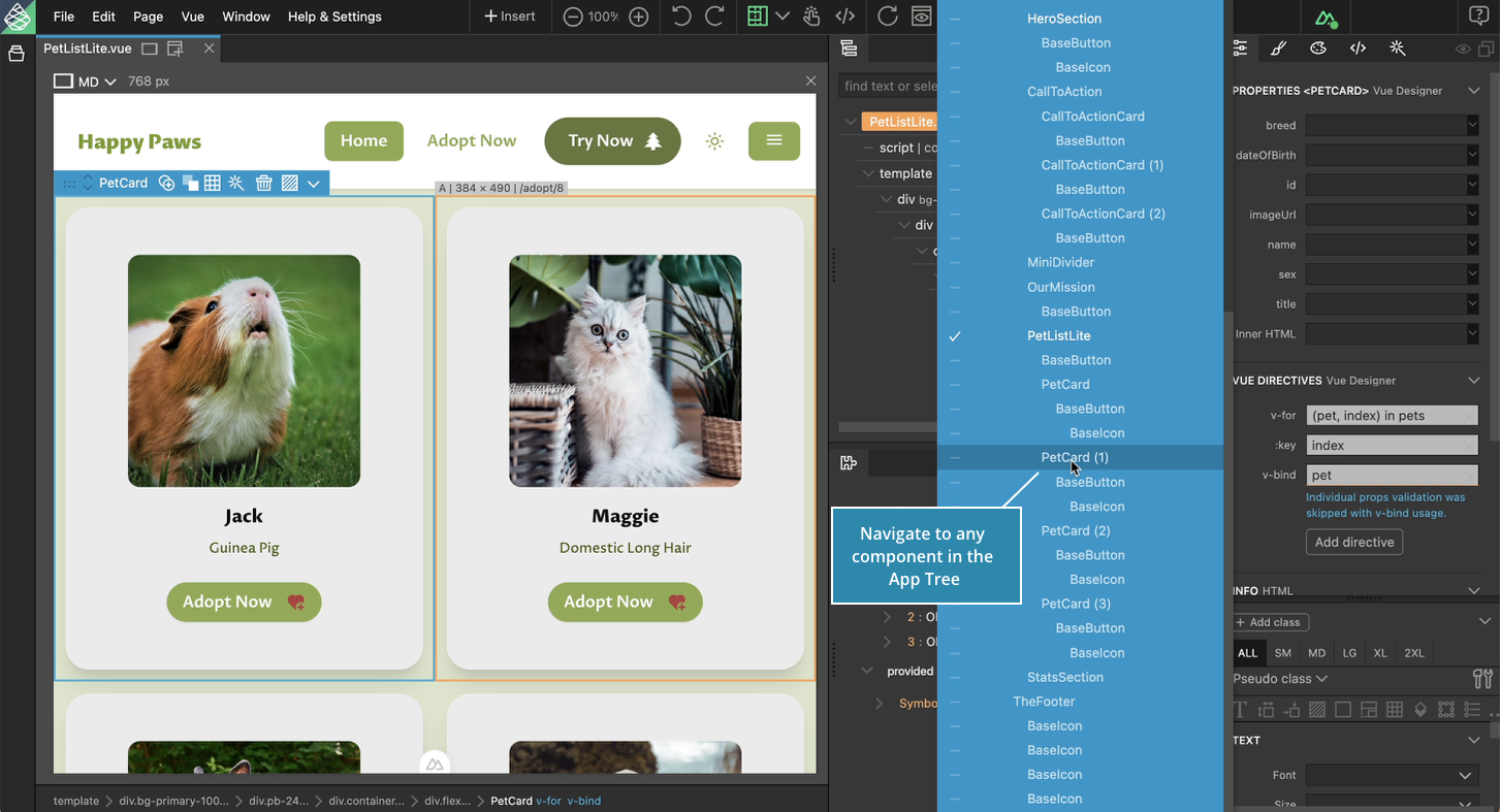
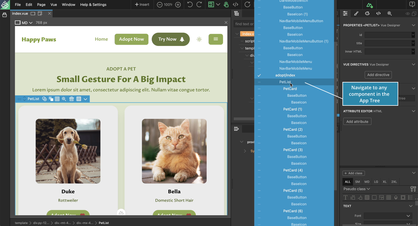
Navigate to any component
Click on any component instance in the App Tree to load the same in the Page Tree. Once the component is loaded in the Page Tree, you can design the loaded component visually using the various visual helpers.
State of the Component
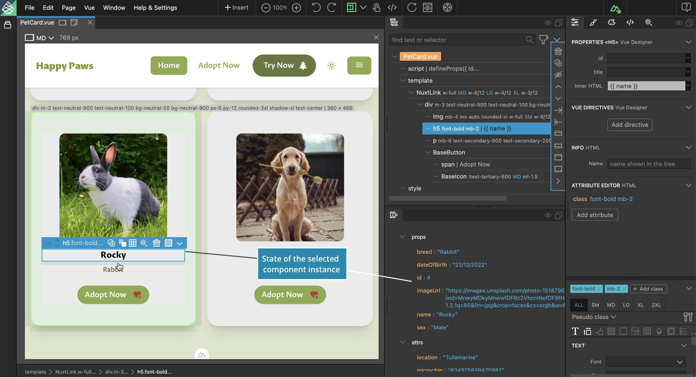
The State Panel displays the state of the currently loaded component. The displayed state includes both the key and the live data it holds, and covers various types of state variables such as:
- Props
- Normal and reactive variables (ref, reactive, computed, etc)
- Provided state (via plugins, for eg, route object)
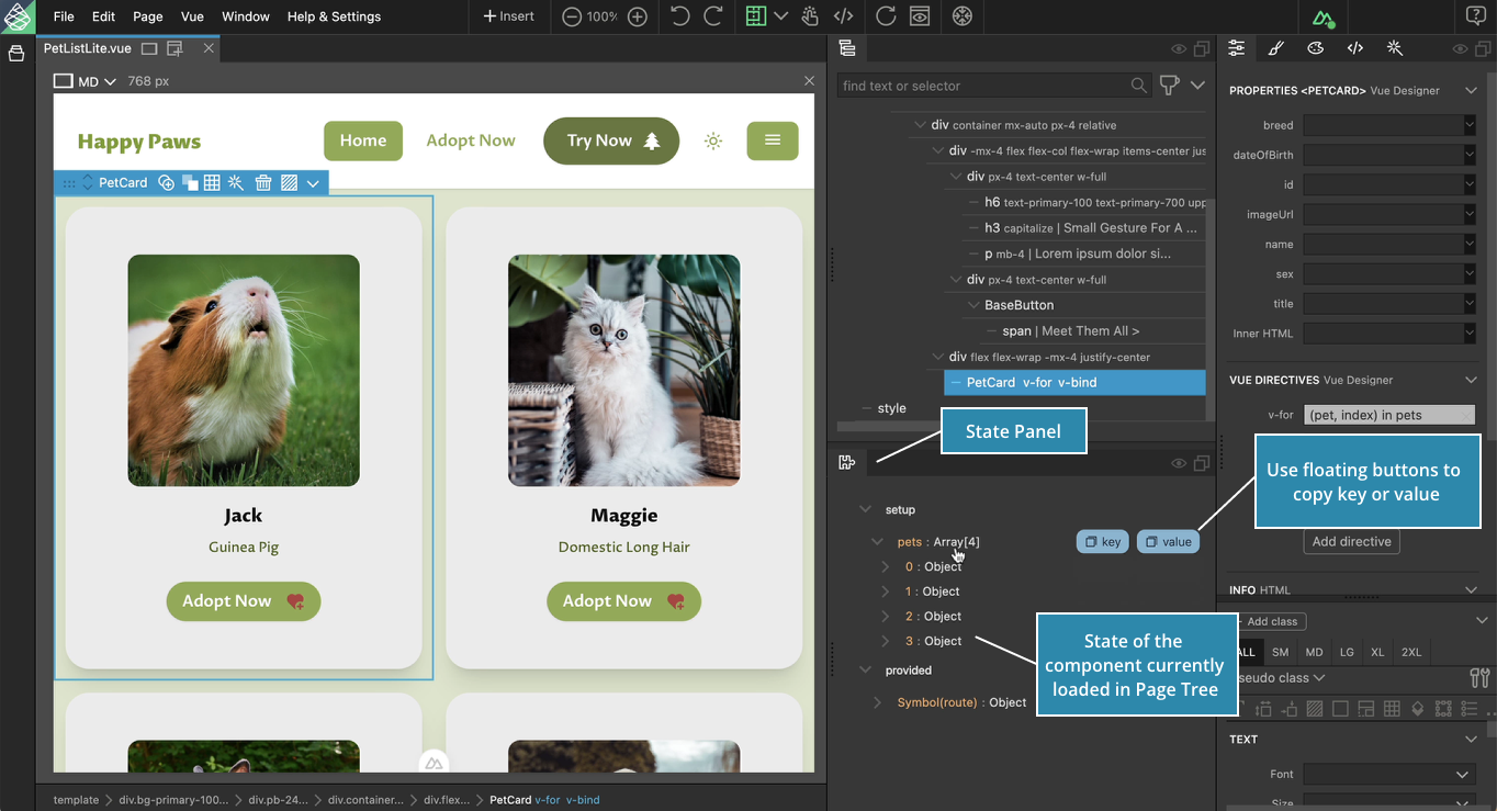
- Use the floating buttons when hovering over the state to copy it’s key or value when required.
- Click on the collapsible groups to view the data within data-types such as arrays and objects.
The State Panel is highly inspired by Vue Devtools, Nuxt Devtools and Vite Devtools projects.
The State Panel dynamically displays the state of the currently loaded component. Feel free to navigate to any component in the App Tree.
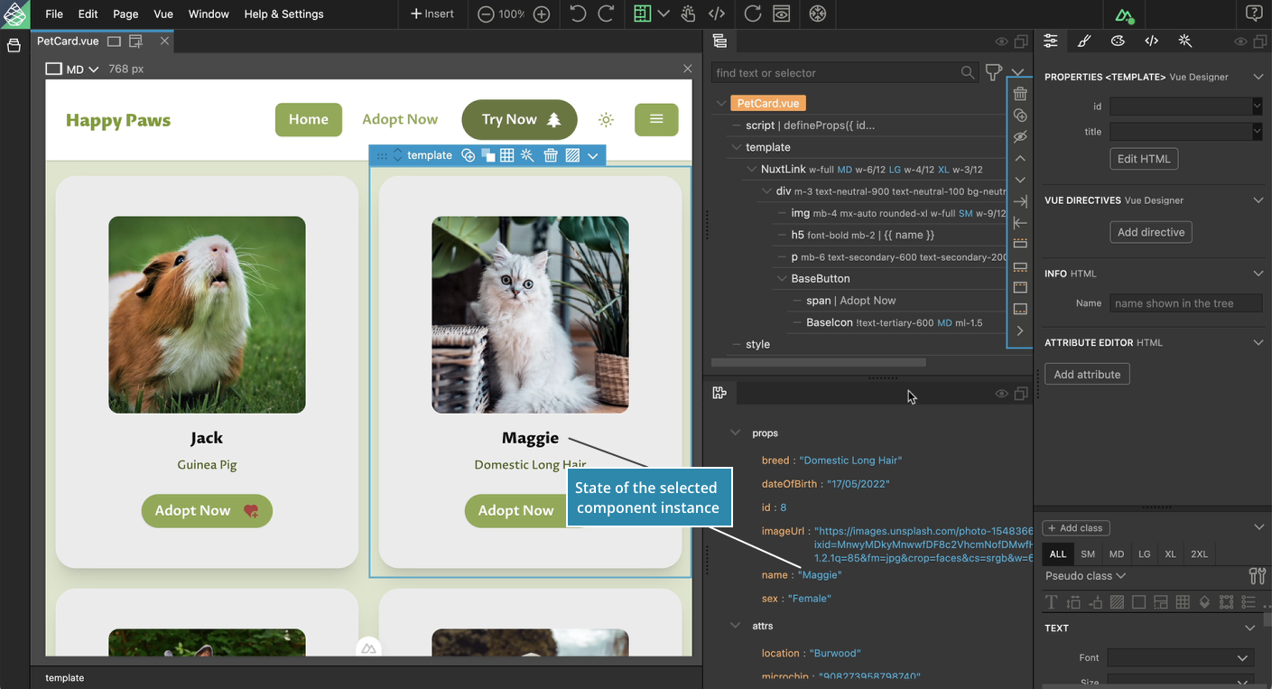
The State Panel displays the specific state of the selected component instance (with a key) of the component currently loaded in the Page Tree.
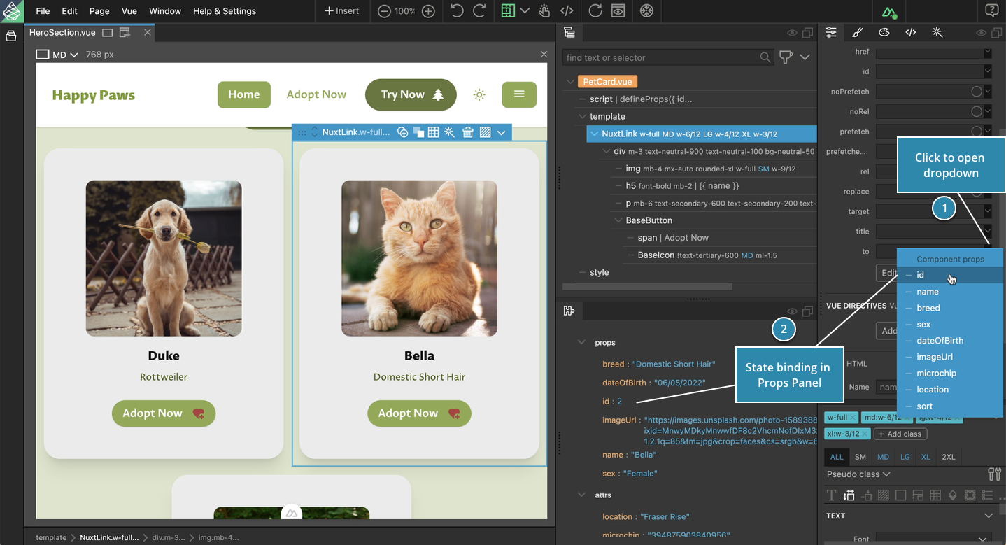
Easy State Binding in Props Panel
Click on the dropdown next to props of a child component to pass the state via props.
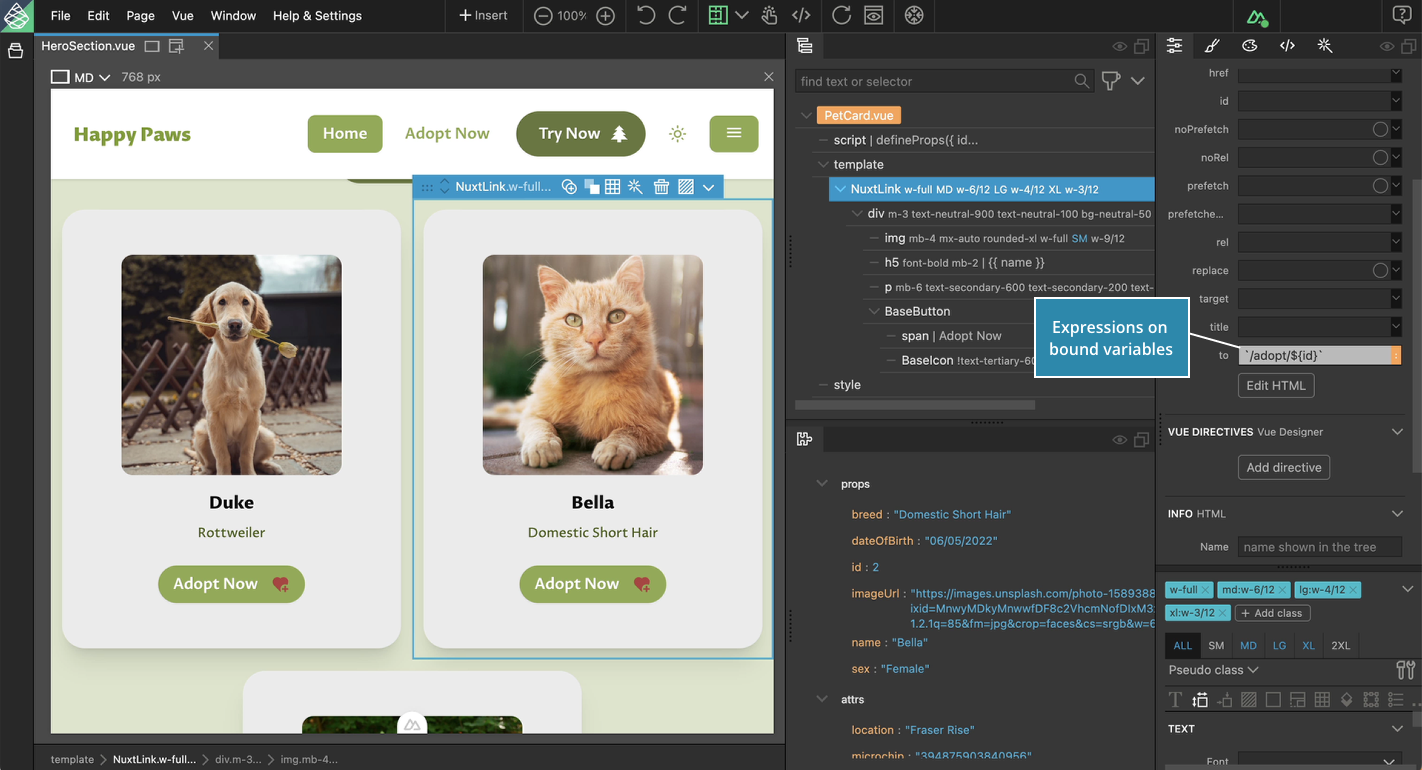
Expressions can be easily applied to the bound state variables.
Navigate Across Pages/Routes
Make sure to enable click-mode for the current page view, by clicking on the button in the top toolbar.
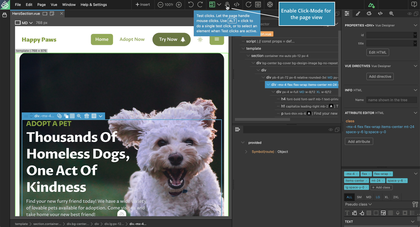
Navigate to another route in your app by interacting with your app’s navigation.
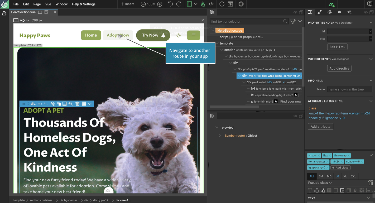
Navigate using the App Tree
As the App Tree is dynamic in nature and displays the mounted components of the current page/route, navigate to any component in the new route.
State Binding with v-for directive
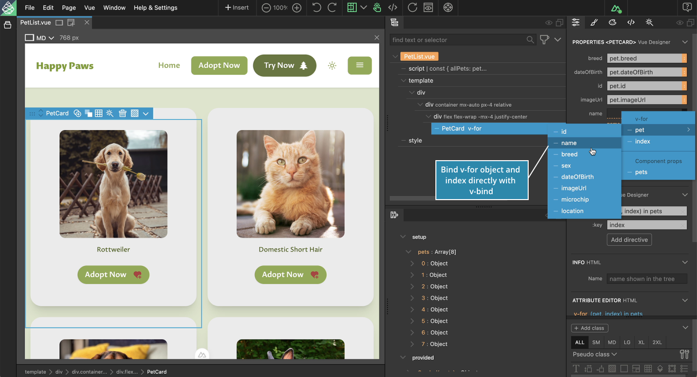
When looping through an array of data, the v-for object and index can be directly bound with v-bind when the child component has the same prop interface.
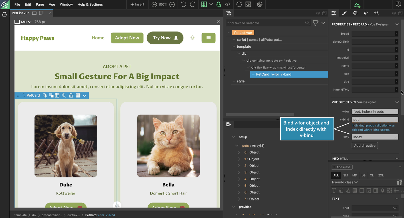
Easily bind v-for object and index properties individually to child component props.