
Open ready-made Tailwind CSS component libraries, such as Tailwind Blocks and Flowbite, from the + Insert button and drag their components onto your page. Add your own pages and projects as libraries too.
DocsTailwind CSSDocsTailwind CSS2026-10-24
Component libraries
Tailwind CSS has no ready-made components. That's by design: Tailwind helps you style your own designs instead of giving every site the same buttons and cards. When you want components to start from, or examples to learn from, Pinegrow opens component libraries in the Insert element window, and you drag their components onto your page.
This page describes Tailwind CSS 4 projects. The same libraries are available in Tailwind CSS 3 projects. Pinegrow Desktop and Pinegrow Online have the same libraries, except where noted below.
Open a library
- Open a Tailwind CSS page and click + Insert in the toolbar, or press the + key. The Insert element window opens below the button, with the List and Images tabs and a tab for each library that is already open, such as Blocks.
- Click the + icon at the right end of the window's tab bar. The menu lists the libraries for the page, grouped by the library plugin that provides them.
- Choose a library. It opens in its own tab.
Click the pin icon to keep the window open while you work. The same library tabs are also available in the Library panel, if you prefer a docked panel.
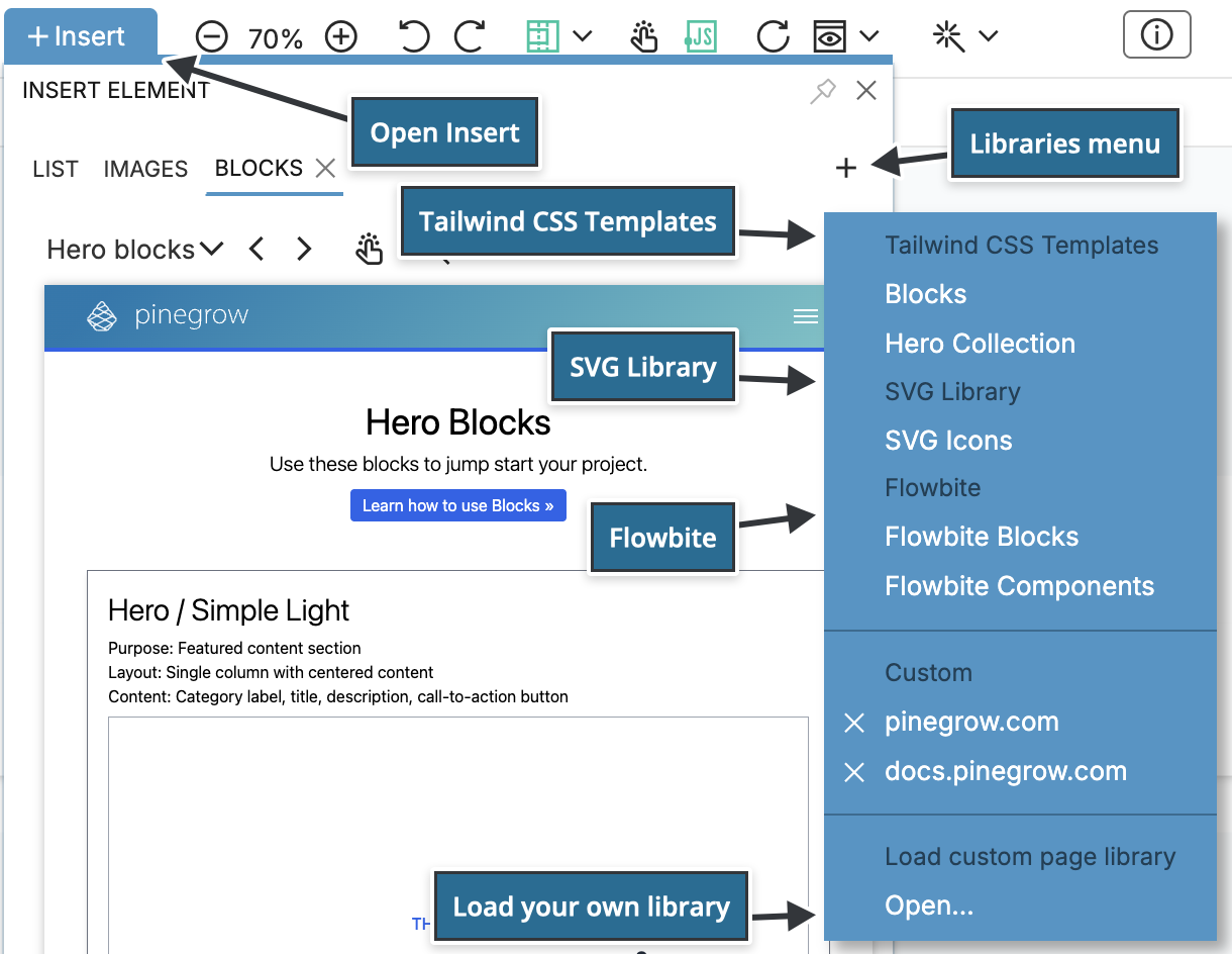
Some libraries open their tab automatically, for example Blocks. Close a tab with its ×, and open it again from the + menu.
Libraries for Tailwind CSS
- Tailwind CSS Templates › Blocks: Pinegrow's Tailwind Blocks, hundreds of sections such as headers, hero sections, pricing tables and footers.
- Tailwind CSS Templates › Hero Collection: a collection of hero sections.
- Flowbite › Flowbite Blocks: page sections from flowbite.com/blocks. Pinegrow Desktop only. To use the Pro blocks, buy a license from Flowbite and log in on the Flowbite page in the library tab.
- SVG Library › SVG Icons: SVG icons, including Bootstrap Icons and Remix Icons. This library is available on all pages, not only Tailwind CSS pages.
Tailwind Blocks activate automatically on every Tailwind CSS page. Flowbite activates automatically on pages that link a Tailwind CSS stylesheet, such as the tailwind_theme/tailwind.css stylesheet of the built-in compiler. If Flowbite is missing from the menu, activate Flowbite in the Libraries & Plugins Manager (the Project settings icon › Libraries & plugins…).
If you use Tailwind UI, see TailwindUI.
Add components to the page
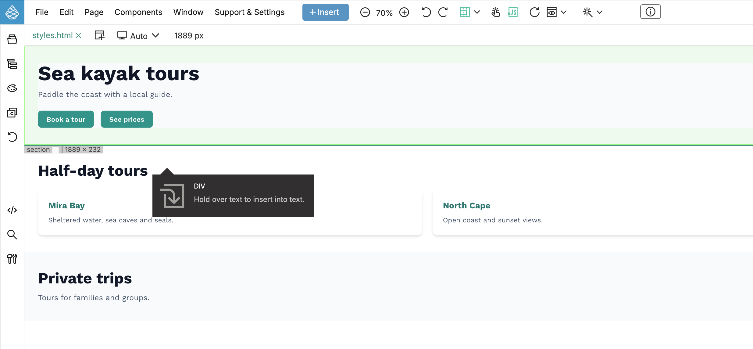
Drag a component from the library tab onto the page or into the Tree panel. The Insert element window steps aside while you drag, and a green line with the element's name and size shows where the component will go. Then edit it like any other element.
With an element selected, point to a component and choose Actions › Replace to replace the selected element with the component, or Replace (keep attributes) to keep the old element's attributes.
Code written for Tailwind CSS 3
Many Tailwind CSS libraries, including Tailwind Blocks, were written for Tailwind CSS 3 or earlier. When you insert such components into a Tailwind CSS 4 page, Pinegrow converts the older classes to Tailwind CSS 4 and shows Tailwind 3 code was converted to Tailwind 4. This is controlled by Auto convert inserted code in Project settings › Tailwind CSS › Convert Tailwind 3 to 4…, which is on by default. See Upgrade a project from Tailwind CSS 3 to 4.
Flowbite Blocks and the primary color
Flowbite Blocks use a color named primary. If the Design panel is active and has no primary color, Pinegrow offers to add it when you insert a block.
Add your own libraries
Any page can be a component library: a page from your project, a page from another project, or a web page with components. In Pinegrow Desktop, click + Insert, click the + icon at the right end of the tab bar and choose Open… under Load custom page library. In Add a new page library, enter the URL or choose a local file, give the library a name, and click Add.
Your libraries are listed under Custom in the + menu. Click the × next to one to remove it from the list.
See Page libraries for all options.