
Style the selected element with Tailwind CSS visual controls. Edit its class list, choose the screen size and variant you are editing, find controls by section, and use the Tailwind 4 controls for opacity, container queries, inset shadows and 3D transforms.
DocsTailwind CSSDocsTailwind CSS2026-10-24
Visual controls
Visual controls set Tailwind CSS classes on the selected element. Choose a value for text size, padding, colour or any other property, and Pinegrow adds the matching class or replaces the old value. The controls work for every screen size and variant, so you can style hover states, dark mode and container queries in the same way.
This page describes the controls for Tailwind CSS 4. With Tailwind CSS 3 some controls differ; see Working with Tailwind CSS 3. The visual controls are the same in Pinegrow Desktop and Pinegrow Online.
Where the controls are
Where the controls appear depends on the UI mode, which you choose in Window › UI Mode:
- In Smart mode, the Tailwind controls have their own Visual controls panel.
- In Flexible mode, they are part of the Element properties panel, below the element's attributes.
When you open a Tailwind page with Window › Show / hide panels › Auto toggle panels turned on, Pinegrow shows the panels for Tailwind editing and hides the CSS Style panel. In Smart mode these are the Visual controls, Class inspector and Style manager panels.
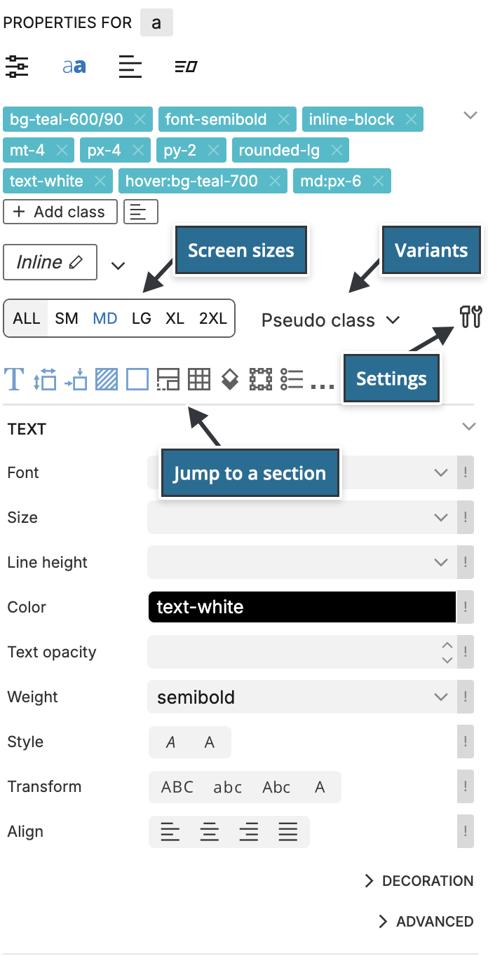
At the top of the panel you find, in this order:
- the class list of the selected element,
- the device size tabs, the Pseudo class selector and the settings icon,
- a row of section icons.
The controls are grouped in sections below.
Class list
The class list shows all classes of the selected element. Tailwind classes are teal; other classes are blue.
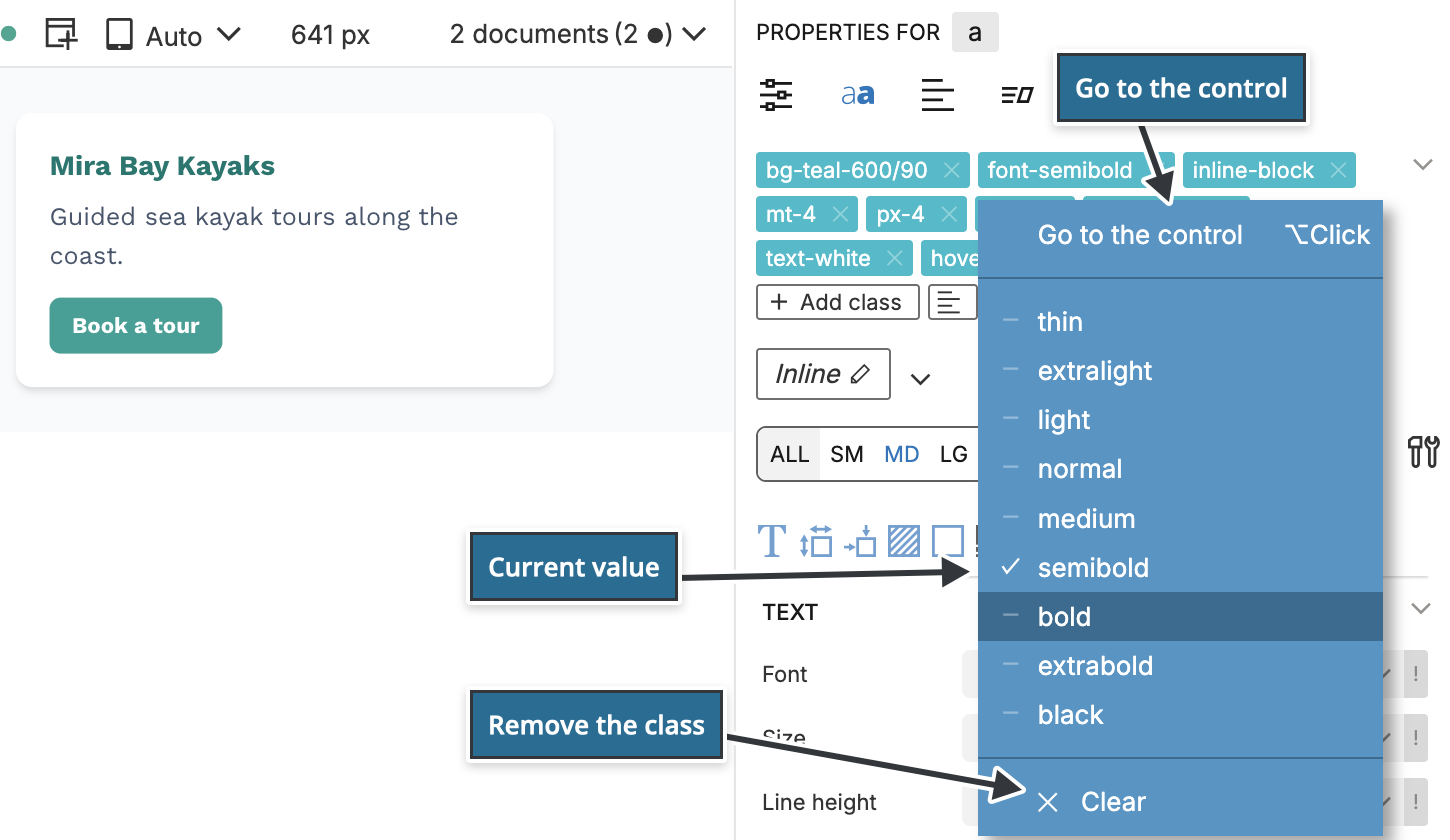
- Click a Tailwind class to see the other values of the same property. Point at a value to preview it on the page and click to set it. Clear removes the class, and Go to the control scrolls to its visual control. Colour classes open a colour picker instead.
- Hold Alt and click a class to go straight to its visual control. Pinegrow also switches to the screen size and variant of that class, so for
md:hover:bg-teal-700it selects MD and hover. - Click × on a class to remove it.
- Right-click a class for more options: Toggle, Remove, Create CSS rule…, Explore CSS rules…, and the Tailwind actions Move to state, Duplicate to state, Move to parent, Swap colors, Copy classes and Create a new style.
- Click Add class to add any class, including classes that are not part of Tailwind CSS.
- Click the tree icon next to Add class to show the classes in the Class Tree inspector. Alt-click it to open the Class Tree in a floating window.
Screen sizes
The device size tabs choose the screen size you are editing. By default they are ALL, SM, MD, LG, XL and 2XL. If the project's theme defines other breakpoints, the tabs follow the theme. Point at a tab to see the width it starts at, for example 640px and up.
Tailwind CSS is mobile-first. Values set on ALL apply at every width. Values set on MD apply from the medium breakpoint up and override the ALL value there. When you select a tab, the controls add classes with that prefix, such as md:px-6.
A control shows a value that the element inherits from a smaller size, labelled with the size it comes from. This tells you which values already affect the current size, so you can override them.
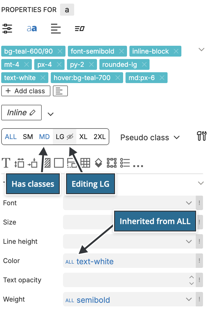
Tabs for sizes that have classes on the selected element are highlighted, so you can see at a glance where the element changes.
Keep the page view and the size in sync
Click the settings icon at the end of the row and turn on Sync with page view. The page view then resizes when you select a tab, and selecting a page view size selects its tab. This also switches between multiple page views of the same page, if you show the page at several sizes.
Without sync, you can still right-click a tab to resize the page view once. If the selected tab shows a hide icon, that size is not visible in the active page view.
The settings menu also has the Editing mode choice between Visual controls and Class tree. In Flexible mode, Class tree replaces the controls with the Class Tree inspector; in Smart mode it opens the Class inspector panel. Open popup class tree (shortcut S) opens the Class Tree in a floating window. In Pinegrow Desktop the menu also lists the Tailwind CSS settings.
Variants
The Pseudo class selector chooses the variant you are editing, for example hover, focus or dark. While a variant is selected, the controls add classes with that variant, such as hover:bg-teal-700, and show only the values set for it. Combined with a size tab, you edit classes such as md:hover:bg-teal-700.
Click the selector to open the list of variants:
- None returns to the base classes.
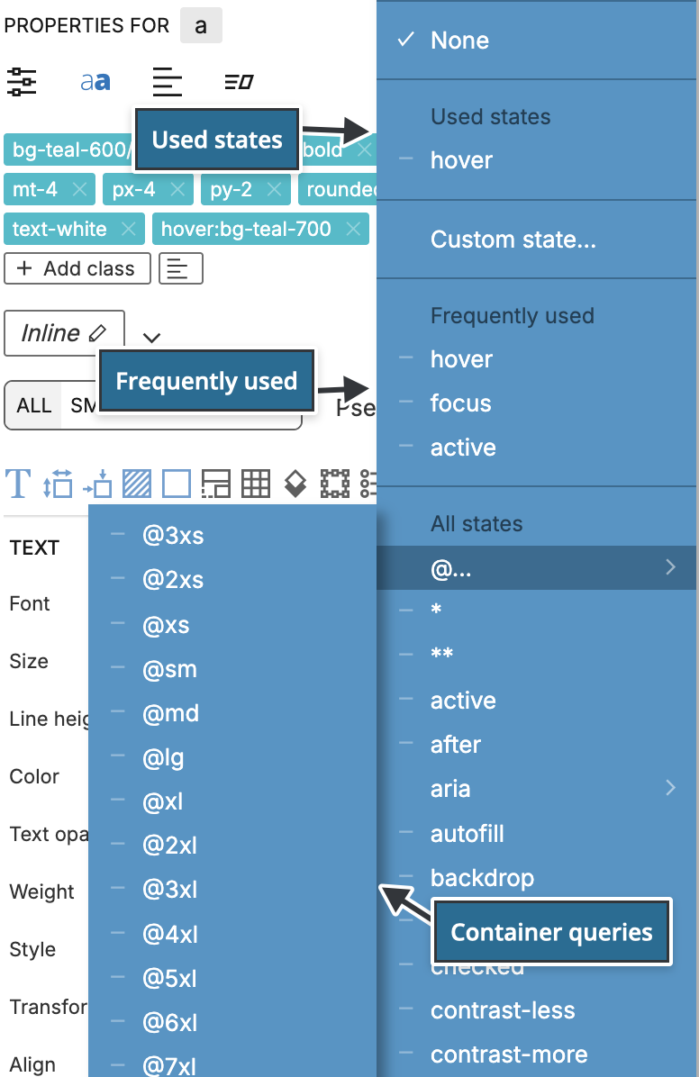
- Used states lists the variants the element already uses.
- Frequently used lists
hover,focusandactive. - All states lists every variant Tailwind CSS 4 offers, including
dark,motion-safe,print,rtland pseudo-elements such asbeforeandplaceholder. Container query variants (@sm,@lg,@max-mdand others) are grouped under @… and ARIA variants under aria. Variants such asgroup-[variant]andpeer-[variant]open a submenu of states to combine with. - Custom state… targets sub-elements by a selector, for example every
pinside the element, or takes a complete custom variant in brackets. - Edit… lets you type the variant as text.
You can also start typing to search the list. For variants that need a value, such as data-[...], nth-[...] or supports-[...], Pinegrow asks for the value when you select them.
For hover, focus, active and visited, the page view shows the element in that state while it is selected.
To return to the base classes, click × next to the variant name in the selector, or right-click the selector.
Container queries
To size an element by its container instead of the browser window:
- Select the parent element and check @container in the Display section.
- Select the child element and choose a container variant such as @md under @… in the Pseudo class selector.
- Set the values that should apply when the container is at least that wide.
Sections
The controls are grouped in sections: Text, Margin & Padding, Dimension, Display, Position, Background, Border, Flex container, Flex child, Grid, Shadow, Ring & Blend, Filter, Backdrop Filter, Transform, Transition, List, Interactivity, Accessibility, SVG, Table, Columns and Typography (prose).
Use the row of section icons to jump to a section. An icon is highlighted when its section has values set on the element. The last icon opens a menu with the less common sections: Interactivity, Accessibility, SVG, Table, Filters, Backdrop Filter, Columns and Typography (prose).
Less common controls inside a section are grouped in collapsible sub-sections, such as Decoration and Advanced in Text, Gradient in Background, Divider in Border and Ring in Shadow, Ring & Blend. Click a sub-section title to open it.
The Tailwind CSS options section at the end shows which Tailwind CSS version the controls are using for the page.
Tailwind CSS 4 controls
These controls appear only when the page uses Tailwind CSS 4:
- @container in Display, which replaces the Tailwind 3 Container option.
- Opacity controls for decoration, gradient From, Via and To, shadow, inset shadow, inset ring, accent, caret, outline, fill and stroke colours. Text, placeholder, background, border and divider have opacity controls in both versions; with Tailwind 4 they write the colour and opacity notation described below.
- Inset shadow and Inset ring width, with their colour and opacity controls, in Shadow, Ring & Blend.
- Transform, Translate, Translate Z, Scale Z, Rotate X, Rotate Y, Rotate Z, Skew, Perspective, Perspective origin and Backface in Transform. Tailwind 4 has no Enable transforms option, because transforms no longer need the
transformclass. - Behavior in Transition and Scroll behavior in Interactivity.
- Row span and Column span in Grid.
In Tailwind 4 projects, the margin, padding and width lists offer every step from 0 to 128, plus 0.5 to 3.5 in half steps.
Colour and opacity
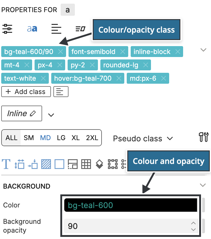
Tailwind CSS 4 writes opacity as part of the colour class: bg-teal-600/90 is the teal-600 background at 90% opacity. Separate opacity classes such as bg-opacity-90 are not used.
To set it, choose the colour first, then choose a value in the opacity control below it. Pinegrow adds the opacity to the colour class. If the element has no colour of that kind yet, the opacity control does nothing.
Arbitrary values and !important
The controls list the values of your theme. To use a value that is not in the theme, such as mt-[13px] or bg-[#0f766e], type the class in the Class Tree inspector, or click Add class in the class list and type it.
To add !important to a class, click the ! next to its control and choose !important. Pinegrow then writes the class with the ! marker. Right-clicking the control opens the same menu.
Related
- Class Tree inspector: edit all classes of an element in a tree grouped by variant.
- Floating Tools: apply common classes from a palette over the page.
- Helpers: swap colours, remove Tailwind classes and jump to controls.
- Match visual controls to a custom theme: show your theme's colours, fonts and spacings in the controls.
- Styles: edit a reusable style with the same controls.
- Tailwind CSS documentation: what each class does.