
Use Tailwind CSS classes and Pinegrow’s Tailwind tools to write regular selector-based CSS. Component styles compile into CSS rules such as h1 or .card, so the HTML keeps only its selectors.
DocsTailwind CSSDocsTailwind CSS2026-10-24
CSS styling with Component Styles
Component styles let you style a project with Tailwind CSS classes without putting the classes on the HTML elements. You style an element with Pinegrow's Tailwind tools, then move its classes into a style with a CSS selector, such as h1 or .card. Pinegrow compiles the style into regular CSS rules, and the HTML keeps only its tags and class names.
This page describes Tailwind CSS 4 projects. Component styles work the same way in Tailwind CSS 3 projects. They are available in Pinegrow Desktop and Pinegrow Online.
This page is about component styles. For Tailwind classes directly on the elements, and for the class styles that manage them, see Styles.
Before you start
Component styles need the Tailwind CSS Design panel to be active in the project. Pinegrow adds the styles to the Tailwind CSS stylesheet that the Design panel compiles:
- With the built-in compiler, Pinegrow compiles the whole stylesheet, including the component styles, on every change.
- With an external build process (Pinegrow Desktop only), Pinegrow writes the component styles into your Tailwind CSS source file and your build tool compiles them. See Use an external Tailwind CSS build.
If the Design panel is not active, Pinegrow offers to open it when you try to create a component style. See Design panel and the built-in compiler.
Component styles are also the default type of new styles in a project with the Design panel active. To check or change the type, click the arrow at the end of the style pills in the Visual controls panel and choose Component (CSS rules).
Create a component style
- Select an element and style it with Tailwind classes, as you would without styles. Use the Visual controls, the Class inspector or the code editor, or paste a component from a Tailwind library.
- Click the pen icon on the Inline pill at the top of the Visual controls panel.
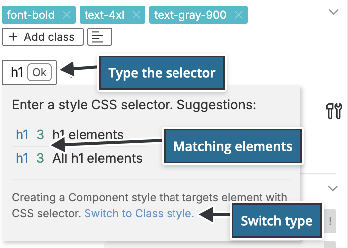
- Type the CSS selector of the style, for example
h1,.buttonor.card h2, and press Enter.
While you type, Pinegrow suggests selectors for the selected element: its id, its tag and its classes. For each one it shows how many elements on the page match and which elements it would style, for example All h1 elements. Click a suggestion to use it. Switch to Class style creates a class style instead.
Pinegrow moves the element's classes into the new style and leaves only what the selector needs on the element:
- If the selector is a class, such as
.button, Pinegrow adds that class to the element. - Classes that are not valid Tailwind CSS classes stay on the element, and Pinegrow lists them.
group,peerandnot-prosealways stay on the element, because they can't be compiled into a CSS rule. - If the selector doesn't match the selected element, Pinegrow asks before creating the style.
From now on the style applies to every element in the project that matches the selector. You don't assign component styles to elements one by one. To style another element with .button, add the button class to it, or click the style name in the Style manager and choose Add to selected element.
Edit a component style
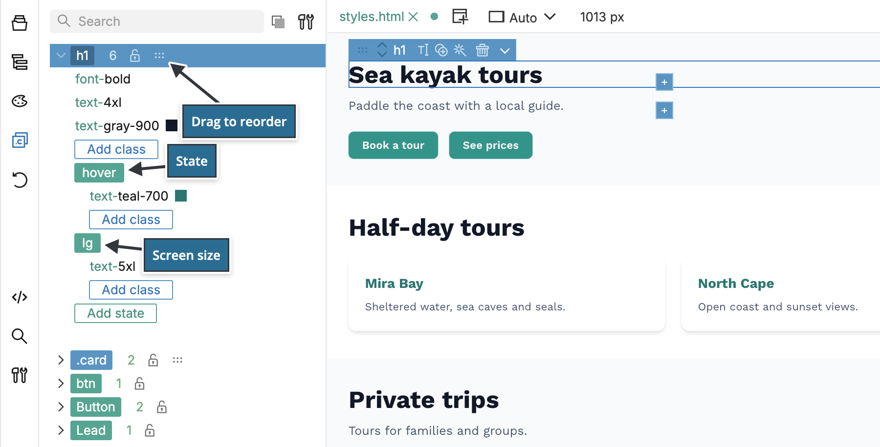
Select an element that matches the style and click the style's pill in the Visual controls panel. The Visual controls and the Class inspector now edit the style, including:
- responsive classes such as
lg:text-3xl, - state variants such as
hover:andfocus:, - classes for sub-elements, written as a selector variant such as
[&_small]:text-gray-500.
One component style can therefore compile into several CSS rules inside @media queries and state selectors, all managed as one style.
In the Style manager panel, click any class to change its value, search styles and properties, and drag component styles to change their order in the stylesheet.
What Pinegrow generates
Pinegrow adds an @layer components block to the Tailwind CSS source, with one @apply rule per component style:
@layer components {
    h1 {
        @apply text-gray-600 text-xl lg:text-3xl;
    }
    .card h2 {
        @apply font-bold hover:underline;
    }
}
Tailwind CSS compiles the block into plain CSS rules for h1 and .card h2, with a @media rule for the lg: class and a :hover rule for the hover: class. Pinegrow generates the same block for Tailwind CSS 4 and Tailwind CSS 3.
- With the built-in compiler, the result is part of
tailwind_theme/tailwind.css, the stylesheet the Design panel links to your pages. - With an external build process, Pinegrow writes the block into your source CSS file between the comments
/* Pinegrow generated Design Panel Extra Rules Begin */and/* Pinegrow generated Design Panel Extra Rules End */, and replaces it on every change. Don't edit the code between these comments.
The style definitions themselves are saved in projectdb.pgml in the project folder, together with the Design panel settings. Keep this file under version control.
Turn off Tailwind's preflight
Preflight is the set of CSS rules with which Tailwind CSS resets the browser's default styling. To style a project without it, open the Design panel, click Compiler & custom config… and check Disable preflight. The option is there when the project uses the built-in compiler. With an external build process, you decide about preflight in your own source CSS file.
Add a CSS property that Tailwind has no class for
Use a Tailwind arbitrary property class in the form [property:value], for example [grid-area:header]. You can combine it with variants, for example md:[grid-area:header], and add it to component styles like any other class.
When to use component styles
Component styles suit projects where you:
- don't control the HTML, for example pages or blocks rendered by a CMS,
- prefer selector-based CSS to utility classes in the HTML,
- want Tailwind's theme, responsive classes and variants, but a stylesheet that works with plain HTML.
Consider the limits:
- All component styles compile into one stylesheet. You can't split them into a stylesheet per block or component.
- In a project that already uses another framework, such as Bootstrap, you would have to copy that framework's colors, spacing and other settings into the Tailwind theme first.
- For apps built from React, Vue or similar components, regular Tailwind classes on the elements are usually simpler, because each component is defined once anyway.
Pinegrow's other CSS tools, such as the Style panel, SASS and stylesheet editing, remain available. Component styles are an alternative, not a replacement.
Is this against Tailwind's best practices?
Tailwind CSS recommends keeping utility classes on the elements because it is designed for component-based apps, where each component is written once and reused. Static HTML pages and WordPress themes often repeat the same markup on many pages, or get their HTML from somewhere you don't control. There, component styles let you keep one definition per element type and still use Tailwind's tools to write it.
Component styles and class styles
- Component styles compile into CSS rules and style every element that matches their selector.
- Class styles put their classes on each element that uses the style, and Pinegrow updates the classes when the style changes. They suit self-contained HTML blocks that should not depend on a separate stylesheet, as long as you control the HTML.
A project can use both. See Styles.
Videos
These videos were recorded with Pinegrow 8, when component styles were introduced.
Why use Tailwind CSS for pure CSS styling:
Regular CSS styling with Tailwind, without utility classes: