
How Tailwind CSS 4 styles a page with utility classes, theme values, responsive and state variants, container queries and arbitrary values, how to keep long class lists manageable, and which Pinegrow tools edit them.
DocsTailwind CSSDocsTailwind CSS2026-10-24
Introduction to Tailwind CSS
Tailwind CSS is a CSS framework made of utility classes. Instead of writing CSS rules, you style each element by adding classes to it, and each class sets one property, or a small group of related properties, to a value from your theme.
This page explains the Tailwind CSS concepts the rest of this documentation relies on and shows which Pinegrow tools work with each of them. It covers Tailwind CSS 4. Pinegrow also supports Tailwind CSS 3; see Working with Tailwind CSS 3 for what differs. Everything described here works the same in Pinegrow Desktop and Pinegrow Online.
Utility classes
The text-center class, for example, sets one CSS property:
.text-center {
    text-align: center;
}
You style an element by combining such classes:
<p class="mt-3 text-lg text-slate-600">...</p>This looks a lot like inline styles:
<p style="margin-top: 12px; font-size: 18px; color: #475569;">...</p>The difference is that Tailwind classes take their values from a shared theme, can target screen sizes and states, and are compiled into one stylesheet that contains only the classes your pages use.
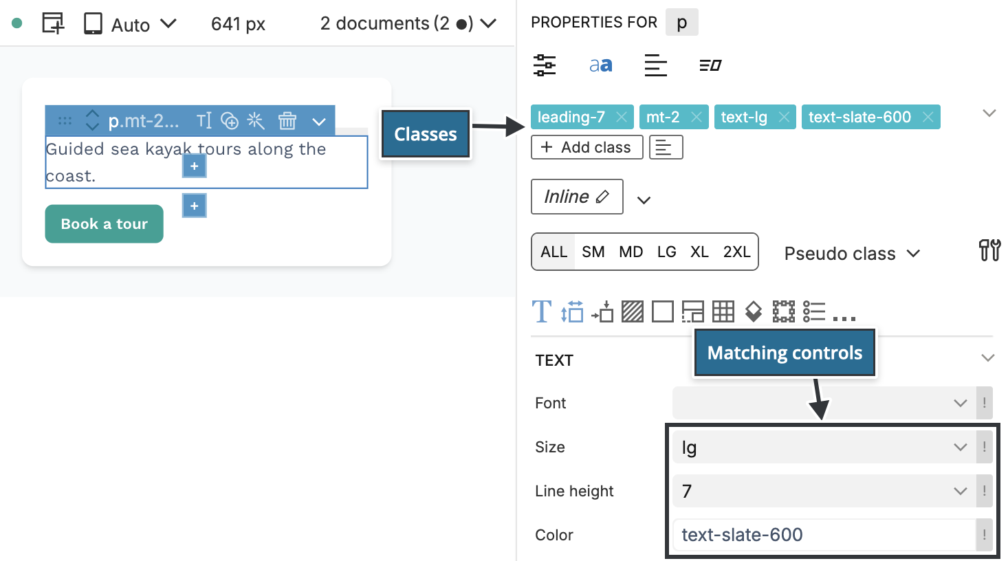
In Pinegrow you rarely type these classes by hand. Select an element and set its text size, colour or spacing in the visual controls, and Pinegrow adds or replaces the matching class.
Theme values
Spacing, colours, fonts, breakpoints and other values are defined once in the theme. If you change a colour in the theme, every element that uses that colour's classes changes with it, and you don't have to edit hard-coded values across the project.
Tailwind CSS 4 defines the theme in CSS, with variables inside an @theme block. There is no tailwind.config.js file:
@import "tailwindcss";

@theme {
    --color-brand: #0f766e;
}
This variable makes classes such as bg-brand, text-brand and border-brand available.
Where you put these values depends on how the project compiles Tailwind CSS:
- With Pinegrow's built-in compiler, set colours, fonts and other design values in the Design panel. Its Tailwind CSS compiler options also have a Custom configuration field for additional
@themevalues. - With your own build process, edit the theme in your project's source CSS file. See Use an external Tailwind CSS build.
To make the visual controls list your custom values, see Match visual controls to a custom theme.
Responsive variants
Add a breakpoint prefix to a class to apply it only from that screen width up:
text-leftapplies at every width.sm:text-leftapplies from 40rem (640px) up.md:text-leftapplies from 48rem (768px) up.lg:text-leftapplies from 64rem (1024px) up.xl:text-leftapplies from 80rem (1280px) up.2xl:text-leftapplies from 96rem (1536px) up.
Tailwind CSS is mobile-first: a class without a prefix styles the smallest screens, and prefixed classes override it from their breakpoint up. You get responsive layouts without writing media queries. The breakpoints come from the theme, so a project can change them or add its own.
In Pinegrow, choose the screen size in the device size tabs at the top of the visual controls, then edit the element. The controls add classes with the matching prefix. See Visual controls.
State variants
State variants style an element in a particular state. hover:bg-teal-700 changes the background colour while the pointer is over the element. Other common variants are focus:, active:, disabled:, first:, group-hover:, dark: for dark mode, aria-expanded: and data-[state=open]:.
Variants combine with breakpoints and with each other. md:hover:bg-teal-700 applies the hover colour from the medium breakpoint up.
Since Tailwind CSS 3, every variant works with every utility class. You don't need to enable variants in a build configuration.
In Pinegrow, pick the variant in the Pseudo class selector next to the device size tabs and edit the element. For hover, focus, active and visited, the page view also shows the element in that state while you work. The Class Tree inspector groups an element's classes by variant.
Container queries
Breakpoint variants respond to the width of the browser window. Container query variants respond to the width of a parent element, which is useful for a card that sits in a wide column on one page and in a narrow sidebar on another.
Mark the parent with the @container class and add container variants such as @sm: or @lg: to its children:
<div class="@container">
    <div class="flex flex-col @md:flex-row">...</div>
</div>
Container queries are built into Tailwind CSS 4. In Pinegrow, the @container option is in the Display section of the visual controls, and the container variants are listed under @… in the Pseudo class selector.
Arbitrary values
When a value is not in the theme, write it in square brackets: mt-[13px], bg-[#0f766e], grid-cols-[200px_1fr]. Tailwind CSS 4 also accepts any number on spacing and size utilities, so mt-13 works without brackets.
Colour classes take an opacity after a slash. bg-teal-600/90 is the teal-600 background at 90% opacity, and in Tailwind CSS 4 this replaces separate opacity classes such as bg-opacity-90.
In Pinegrow, type arbitrary values in the Class Tree inspector, and use the opacity fields in the visual controls to write the slash notation for you.
Keep long class lists manageable
Elements styled with Tailwind collect long class lists. A button often carries ten or twenty classes:
<a href="#" class="mt-4 inline-block rounded-lg bg-teal-600 px-4 py-2 font-semibold text-white shadow-sm hover:bg-teal-700 focus:outline-2 focus:outline-offset-2 md:px-6">Book a tour</a>To change the padding of every button, you would have to find each one and edit its classes. In JavaScript frameworks, the button is usually a component defined in one place. Pinegrow offers two ways to do the same in HTML projects:
- Components. Define the button as a component in the Components (Actions) panel and reuse it across the project. Editing the component updates every instance. See Components.
- Styles. Group a set of Tailwind classes into a named style and apply it to elements. Class styles put the classes on each element. Component styles compile into CSS rules that target elements with a selector, for example every
h1. See Styles and CSS styling with Component Styles.
How Pinegrow works with Tailwind CSS
- Visual controls set classes for the selected element, for any screen size and variant.
- The Class Tree inspector lists the classes of the selected element and its parents, grouped by variant, and lets you change, add and remove them.
- Floating Tools apply text, background and alignment classes from a palette that floats over the page.
- Helpers swap colours across an element and its children, remove Tailwind classes and jump from a class to its control.
- The Design panel defines the project's colours, fonts and other theme values and runs the built-in compiler.
- Tailwind Blocks are ready-made sections you drag onto the page.
To choose between the Tailwind CDN script, Pinegrow's built-in compiler and your own build process, and to publish a site that makes no requests to external servers, see Tailwind CSS versions, compiling and offline use.
Learn more about Tailwind CSS
This documentation covers the Pinegrow tools for Tailwind CSS. For the classes themselves, see the Tailwind CSS documentation.