
Make the Tailwind visual controls and the Class Tree offer your own colors, fonts, font sizes, radii, shadows and breakpoints. With the Design panel this happens automatically; with an external Tailwind CSS 4 build, Pinegrow reads the @theme variables of your source stylesheet.
DocsTailwind CSSDocsTailwind CSS2026-10-24
Match visual controls to a custom theme
A Tailwind CSS theme can add colors, fonts, font sizes and breakpoints, or change the default ones. Pinegrow's visual controls and the Class Tree should offer the same values as your theme, so that the color picker shows brand-500 and the device sizes include your 3xl breakpoint.
How Pinegrow learns about your theme depends on how the project compiles Tailwind CSS:
- Design panel with the built-in compiler: nothing to set up. The controls use the colors and fonts of the Design panel and the theme variables of its custom configuration.
- External Tailwind CSS 4 build: Pinegrow reads the
@themevariables of your source stylesheet. Set it up once as described below. - Tailwind CDN script without the Design panel: the controls show the default Tailwind theme.
This page describes Tailwind CSS 4. For a Tailwind CSS 3 build with tailwind.config.js, see Working with Tailwind CSS 3.
With the Design panel
When the Design panel compiles the stylesheet with the built-in compiler, Pinegrow reads the theme from the same compiler. Add colors and fonts in the Design panel, and other theme variables, such as --breakpoint-3xl or --radius-4xl, in the Custom configuration of the Tailwind CSS Options. See Design panel and the built-in compiler.
With an external Tailwind CSS 4 build
This works in Pinegrow Desktop with an npm-based build. The project folder must contain:
package.json;- Tailwind CSS 4 installed with npm, so that
node_modules/tailwindcssexists; - the source stylesheet of your build, with your theme in
@themeblocks or in stylesheets it imports.
The standalone Tailwind executable is not supported. If the project has no package.json, Pinegrow says that Tailwind customization requires an npm based workflow.
Pinegrow doesn't need a tailwind.config.js file or a Pinegrow plugin for Tailwind CSS 4.
Set it up
- Set up the build and connect it to Pinegrow, as described in Use an external Tailwind CSS build. The step that matters here is the Source CSS file.
- Pinegrow reads the theme when you save the settings. A message says Fetching custom Tailwind configuration…, then Tailwind visual controls updated!
To read the theme again, choose Customize visual controls in the Tailwind CSS menu (the Project settings menu, or the Settings & Tools icon in the Visual controls panel). The command appears while the external build is on. Pinegrow also reads the theme again when you save the source stylesheet, in Pinegrow or in another editor.
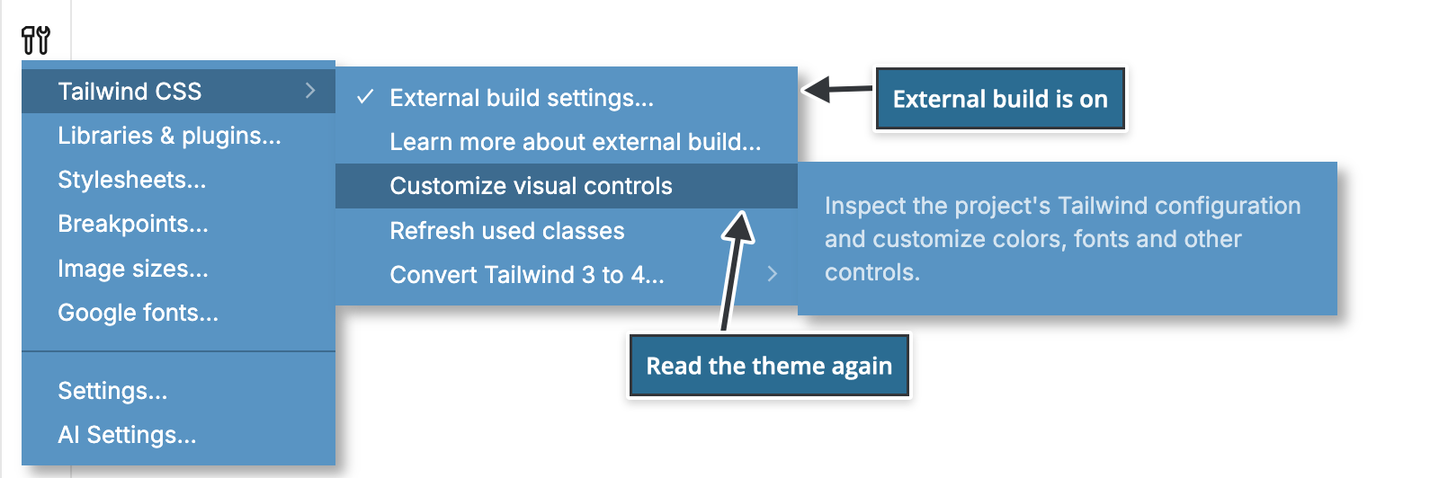
If the controls show the default theme after you open the project, choose Customize visual controls.
What Pinegrow reads
Pinegrow compiles your source stylesheet with the Tailwind CSS package installed in the project and reads the theme variables from the result. These variables change the controls:
--color-*: the colors and shades in the color pickers;--font-*: the font families;--text-*: the font sizes;--font-weight-*,--leading-*and--tracking-*: font weights, line heights and letter spacing;--radius-*: the border radius values;--shadow-*,--inset-shadow-*,--drop-shadow-*and--blur-*: shadows and blurs;--ease-*,--animate-*and--aspect-*: easing, animations and aspect ratios;--breakpoint-*: the breakpoints, which also appear as device sizes and responsive variants.
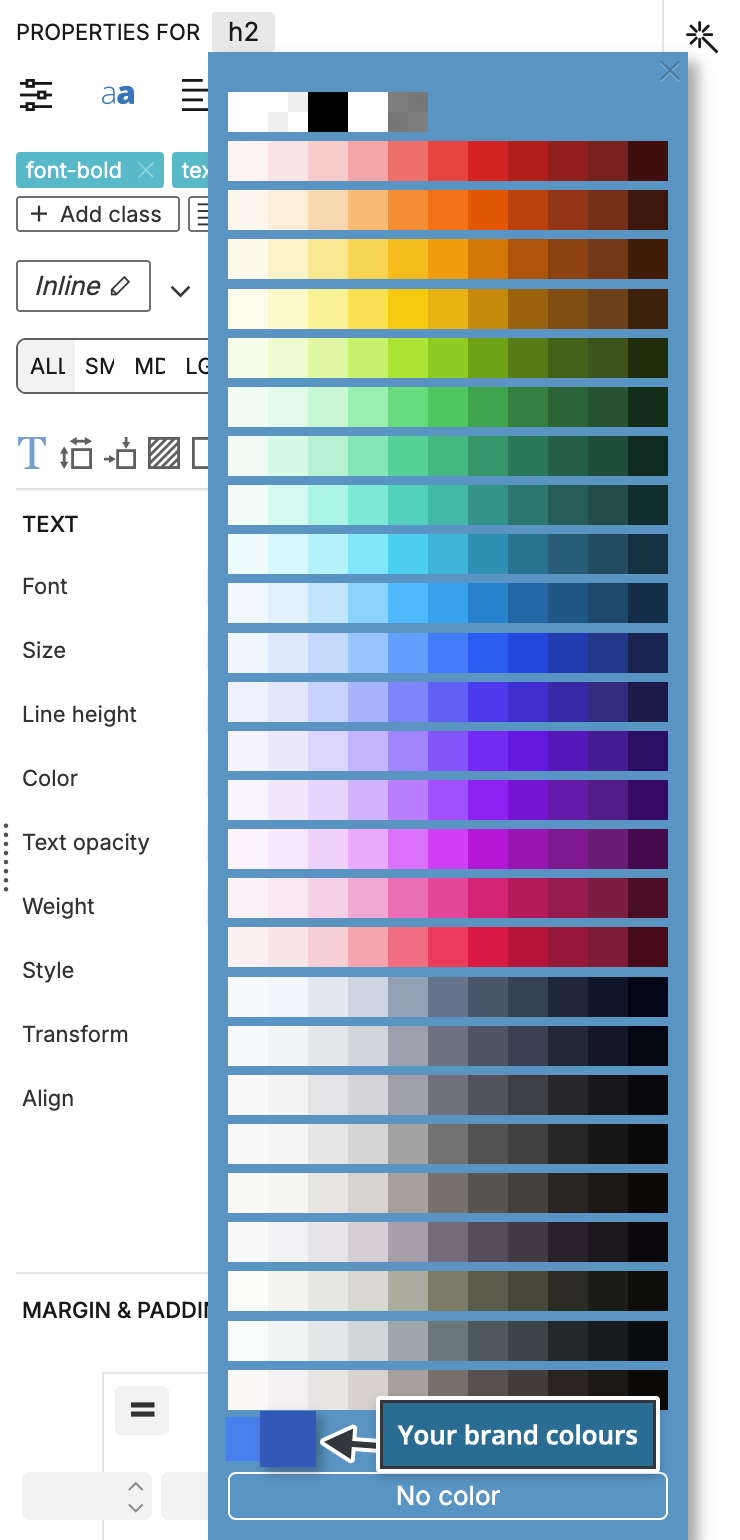
For example, with this theme the color controls offer brand-500 and brand-700, and 3xl appears among the breakpoints:
@import "tailwindcss" theme(static);
@source "../_pginfo/used-classes.html";

@theme {
    --color-brand-500: oklch(0.62 0.19 260);
    --color-brand-700: oklch(0.49 0.17 262);
    --breakpoint-3xl: 1800px;
}
Things to keep in mind
- Classes that plugins add, through
@plugin, are not added to the controls. You can still type them in the class list. - If you remove a color or another value from the theme, elements may still have classes that use it. The controls don't recognize such a class, so they don't replace it when you pick a new value. Remove the old class from the element yourself.
- The Design panel can also write its colors and fonts into the source stylesheet of an external build. Pinegrow then reads them like the rest of your theme.