
A step by step tutorial on the easiest way to create custom Gutenberg blocks. No prior knowledge of React, PHP or WordPress blocks is required.
DocsWordPressDocsWordPress2021-12-05
The complete guide to creating custom WordPress blocks
Follow this guide to learn how to:
- Create fully editable React JavaScript blocks
- Allow sub-blocks to be inserted into custom blocks
- Display up-to-date information from the WordPress database with dynamic PHP blocks
- Add custom CSS styling to your blocks
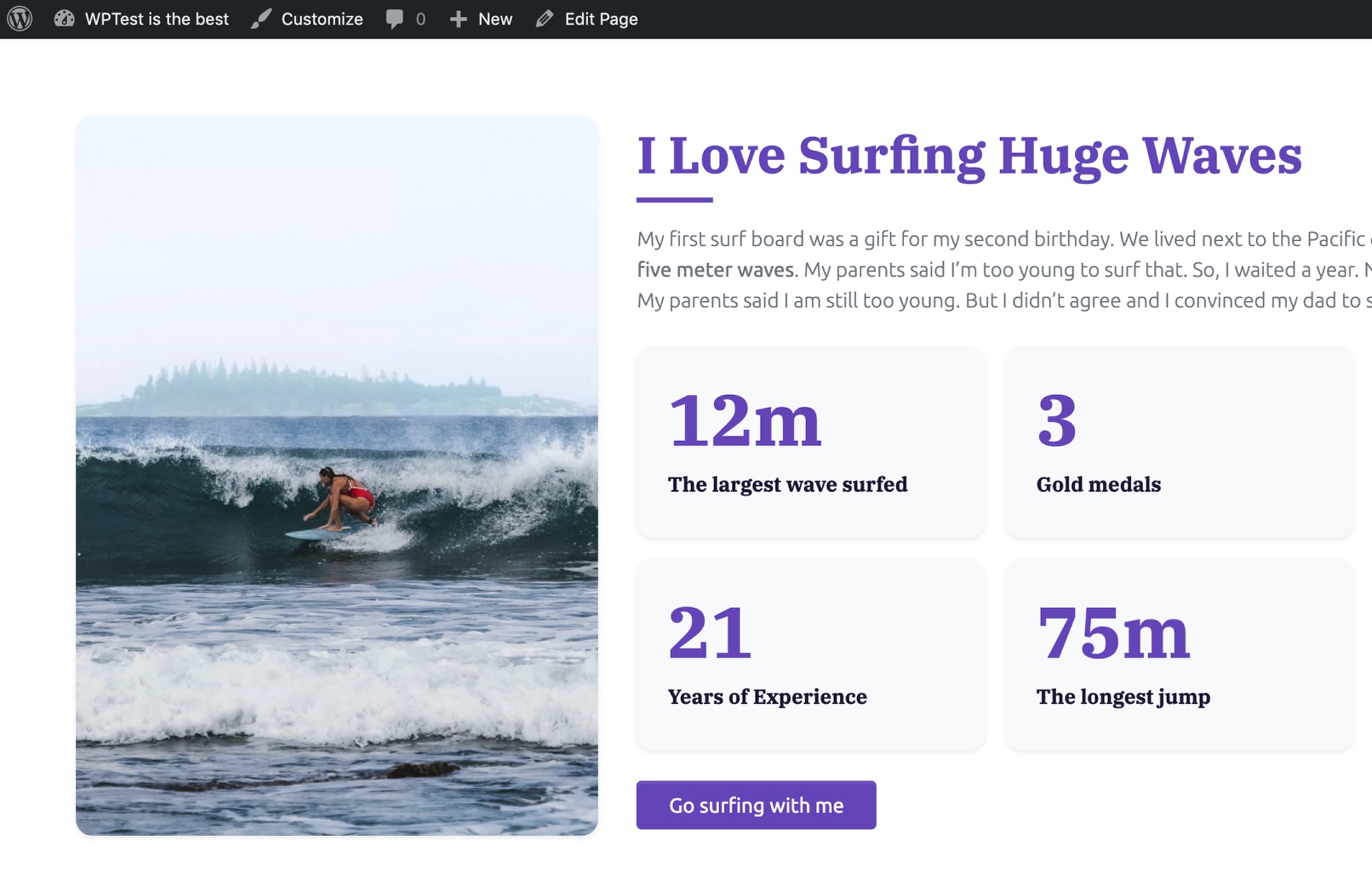
This is an example of a custom block you will be able to create after following this guide:
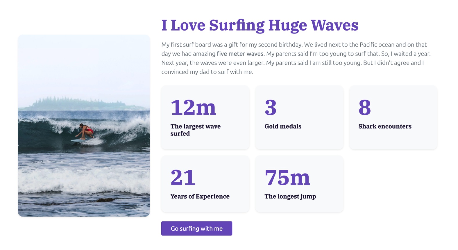
All texts and images are editable and it even contains a set of editable sub-blocks.
Normally, creating such custom blocks requires significant effort and skills, including:
- Being familiar with the WordPress blocks framework
- Coding the PHP code that registers the block on the server-side
- Setting up the development environment and the build process
- Coding browser-side blocks code in React based JavaScript code
- Digging through WordPress documentation and source code to figure out how to fetch data, define block controls and so on.
This is not the case with our approach.
No prior knowledge of React, PHP or WordPress blocks architecture is required to follow this guide and to become a successful block maker.
That said, you do need to be familiar with HTML, CSS and WordPress.
What is our secret sauce?
We will be using Pinegrow Web Editor to help us with the tedious parts of block creation. Pinegrow is a powerful desktop application for visually working with web projects. It supports regular HTML/CSS editing, Bootstrap, Tailwind CSS and it also lets us create WordPress themes, plugins and blocks.
If you don’t have Pinegrow yet, just download the free trial version. It has all the features you will need to complete this guide.
Let’s get started.
BTW, this page is quite long. Do you prefer to read multiple shorter pages? Switch over to the multiple page version.
What are WordPress blocks?
Once upon a time, the content of WordPress posts and pages was just one large blob of HTML code. It worked ok, but it was difficult to add structured content elements and layouts, in a way that end-users could easily edit them.
To solve this, WordPress authors created the Gutenberg editor that became the default content editor in WordPress 5.0, and is now known as the block editor.
The post content is now constructed with blocks, a nested structure of various content elements. Each paragraph and each image is a block, for example.
Although WordPress comes with a rich set of ready-to-use blocks , projects come with their unique designs, content structure and requirements. It is often hard to get one of the standard blocks to do exactly what we need.
The good news is that WordPress block editor is designed to be extendible. We can create our custom blocks that fit our needs perfectly.
We will now learn how to do that next.
Setting up the development environment
To follow along with the tutorial you will need a local WordPress installation. See how to set it up.
You will also need Pinegrow Web Editor. It works on Windows, Mac and Linux. Download and install it from here, the full trial version is included.
Our custom blocks will be exported as a part of a WordPress theme. Download the starter project and set up the theme export.
The project we will be using is based on Bootstrap 5. We could use any framework (or none). This approach works for every HTML based project.
We are now ready to create the first custom WordPress block.
We will start with a HTML landing page implemented with Bootstrap 5. The steps described in this guide assume that the theme export is already set up.
Creating our first custom block
The page has an About Me section that would work great as a block:
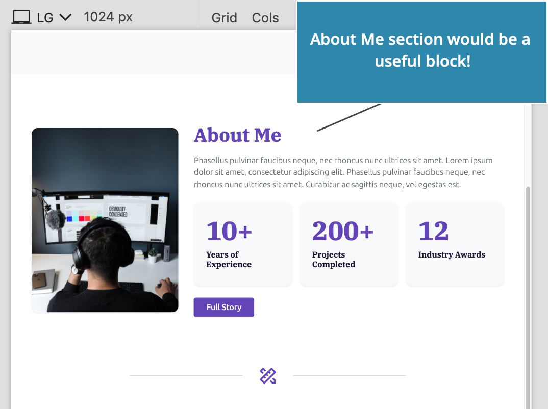
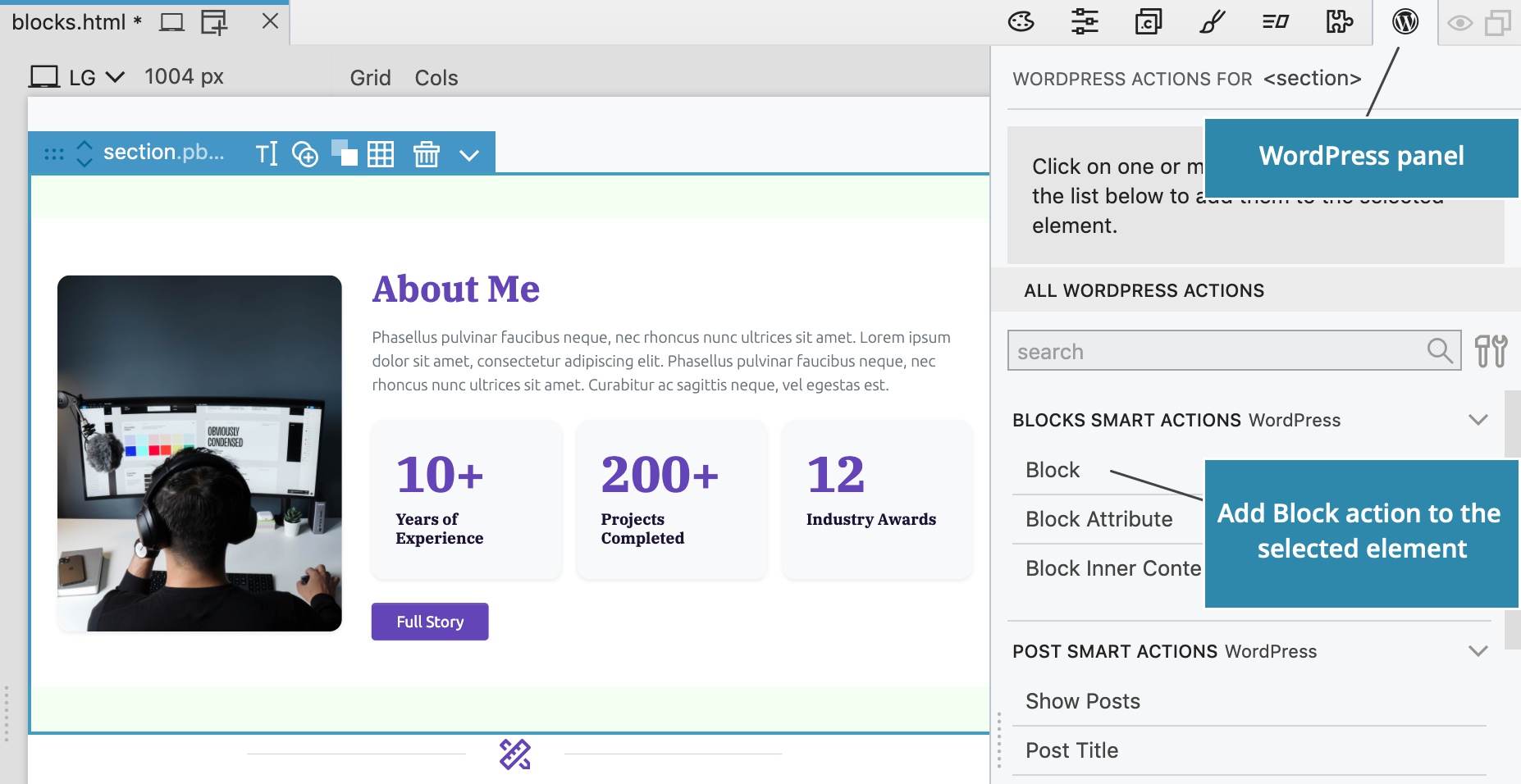
Add the Block action
To create a new block type, select the About Me <section> HTML element and add the Block action from the WordPress panel.
Block action settings are now shown in the WordPress panel:
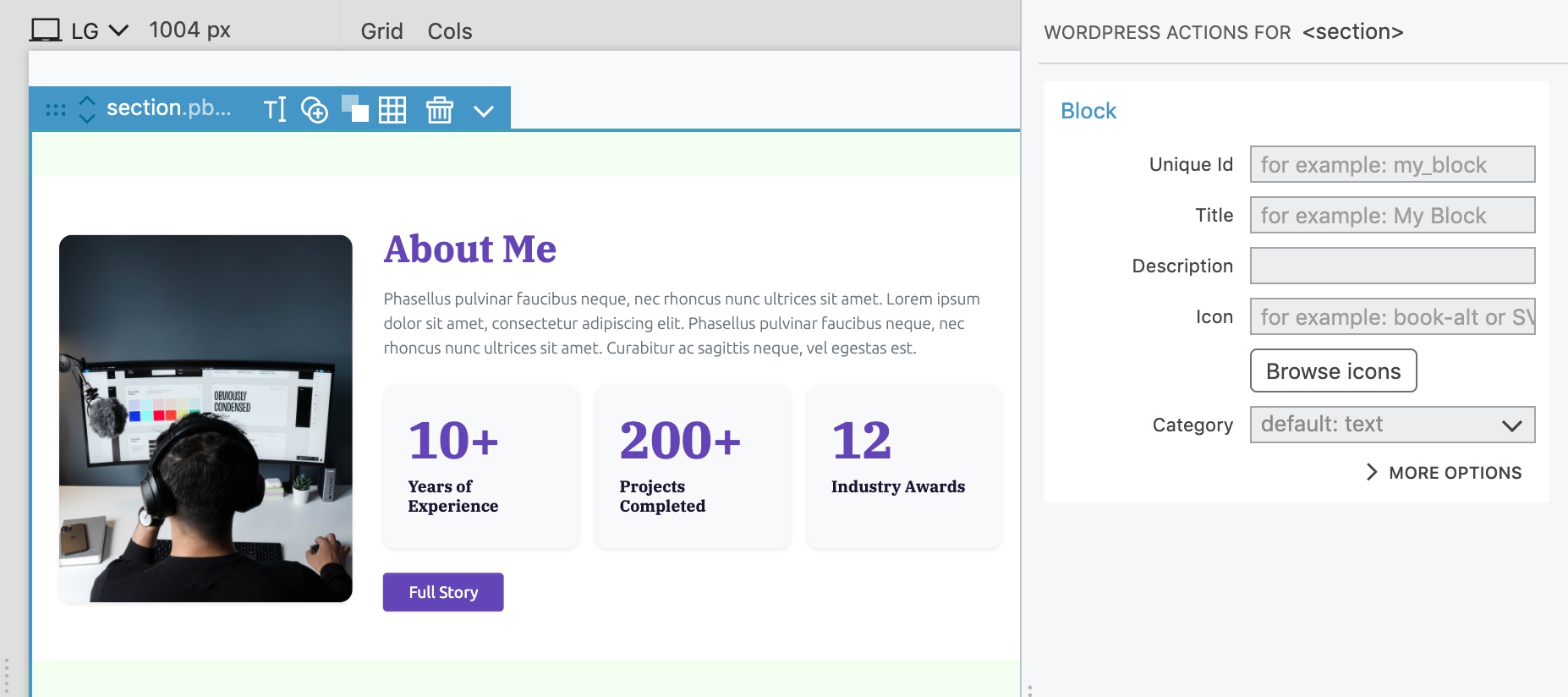
Give the block a unique id
Each block needs an id. In WordPress the whole id consists of the namespace (theme or plugin slug, for example), followed by the block id, for example mytheme/aboutme.
On Block action, we just enter the main id, in our case aboutme. Pinegrow will automatically prepend the theme / plugin slug as the namespace during export.
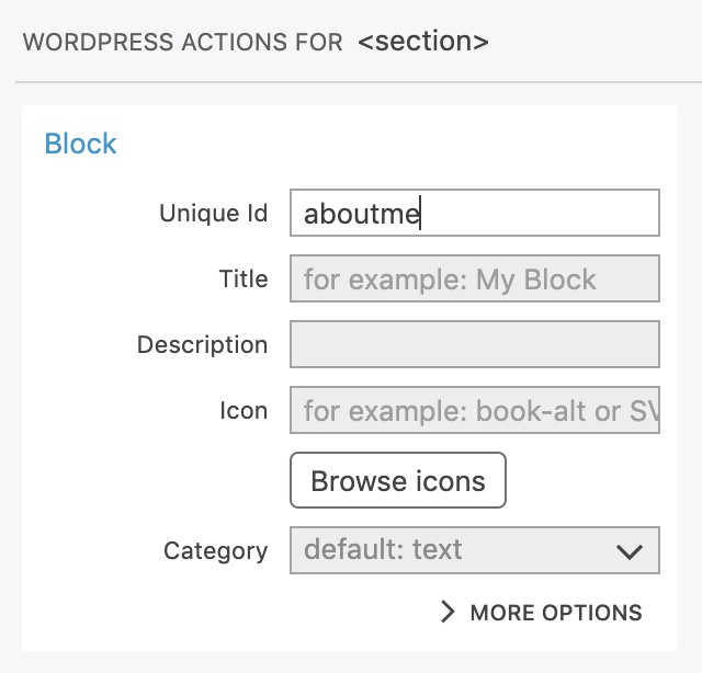
Describe the block
Name, description and icon help users find and understand the function of the block.
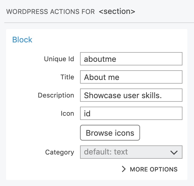
Icon can be one of built-in WordPress dashicons, or SVG image code. We will use the icon named id.
Category places the block into one of predefined WordPress block categories or into a custom category.
Regular and dynamic blocks
Let’s take a quick peek into the More options section, without having to change any settings there.
The main setting there is Block type that selects the way how the block is implemented.
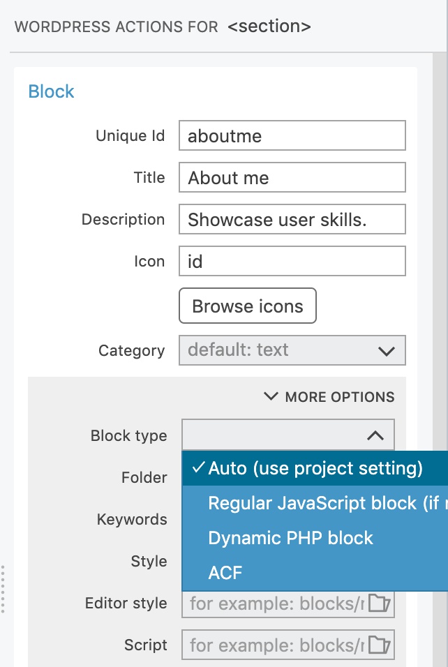
There are two types of native WordPress blocks that don’t require any plugins: regular and dynamic.
- Regular blocks are implemented in JavaScript and offer the best editing experience and performance. But, such blocks can not use WordPress actions such as Show posts.
- Dynamic blocks are implemented in PHP and render their content on the server, every time they are displayed. They can use any WordPress action and always display up-to-date information. The editing process has delays due to server-side rendering.
ACF blocks are implemented as Advanced Custom Fields PRO Blocks. They offer a mix of browser-side and server-side rendering.
Learn more about the difference between regular, dynamic and ACF blocks.
We will leave the Block type setting on auto in order to generate a regular JavaScript block.
Testing the block
Export the theme…
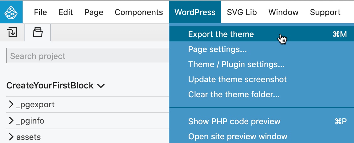
…and reload the Block editor.
Use the block in the block editor
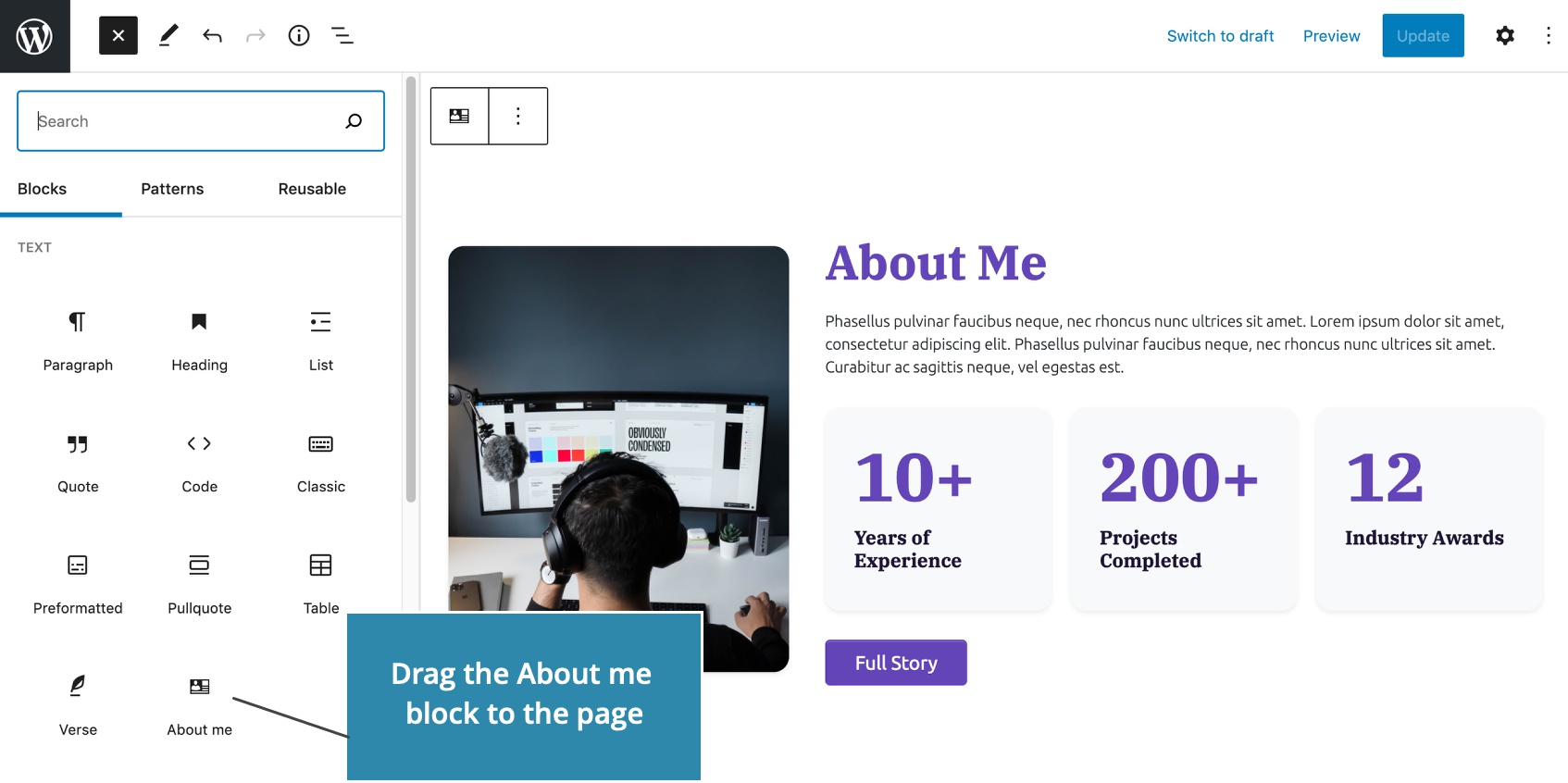
Our About me block is listed in the block library from where we can drag it to the content:
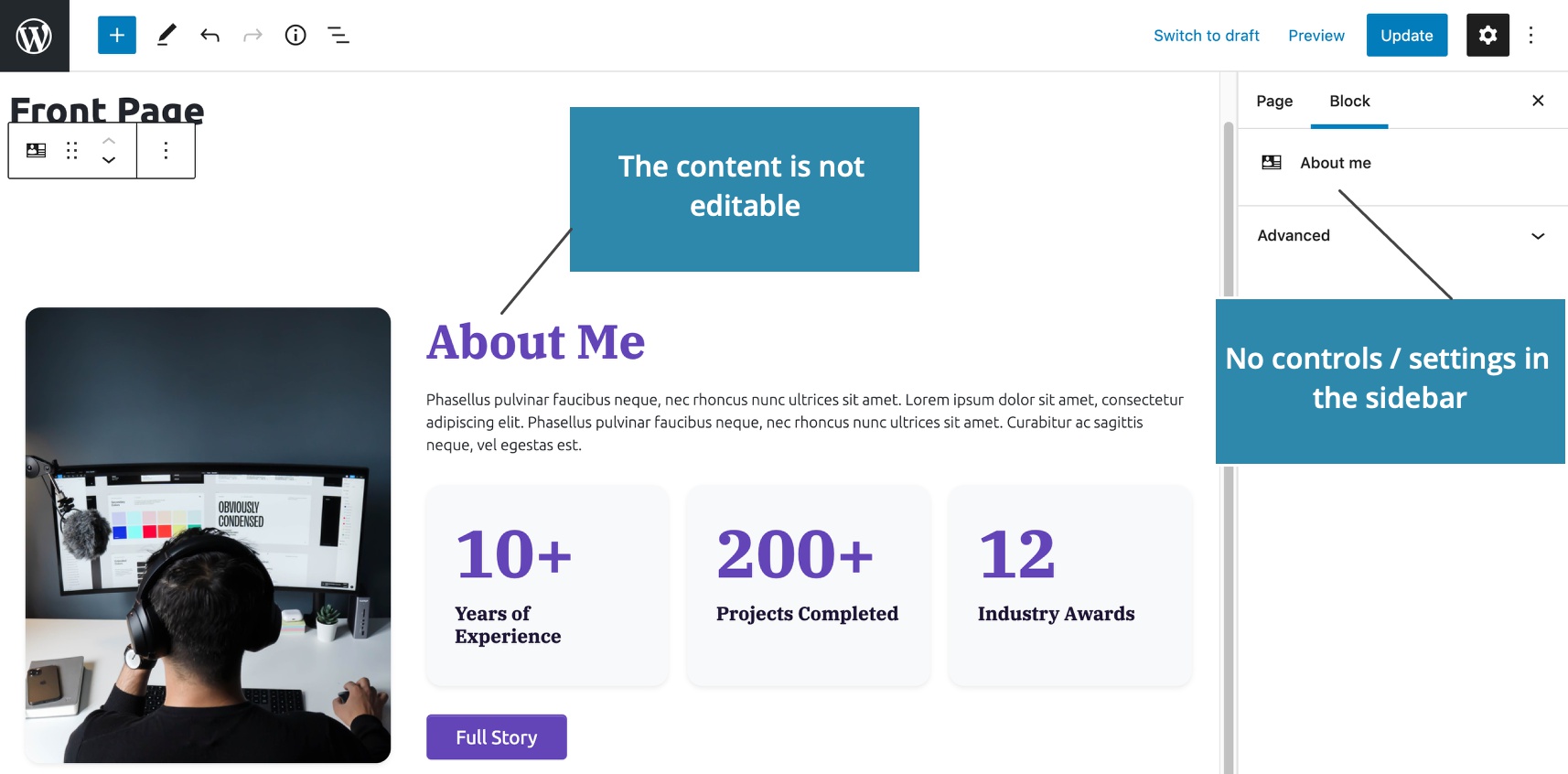
But, the block is not yet editable. We can’t change its content and it has no control fields in the sidebar:
Making the block editable by adding Attributes and Controls
Attributes are editable properties of a block. Editable attributes make blocks much more useful, because we can use the same block type with different content.
Our About me block will have editable title, description, image and the button (we will take care of the counters in the next part).
Title
To make the heading editable, select the <h3> element and add Block Attributes action:
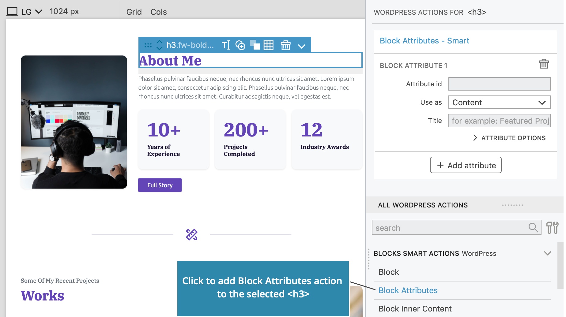
Each attribute needs an id, such as title. Attribute id needs to be unique within its block.
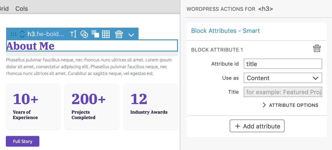
Next, we set how the attribute is used on the selected element. Will it set the element inner content, add a class, set a style, element attribute…?
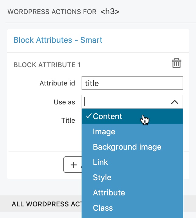
For the title attribute we will select Content. The attribute value will replace the inner content of the <h3> element.
Title is a human readable name of the attribute.
What to do if the attribute value is not set?
Attribute options let us further customize the attribute.
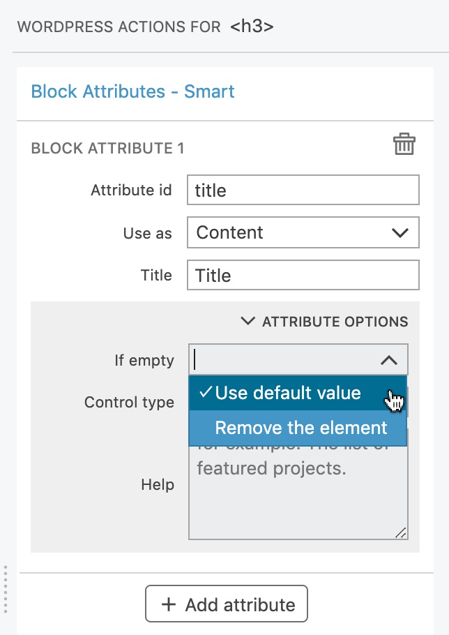
We have two options: use the default value or remove the element from the output.
Default values are taken from the source HTML element. For example, if the attribute is used as the element content, its default value will be the element content found in the source HTML. In this case we will leave the setting as it is and use the default value.
Description
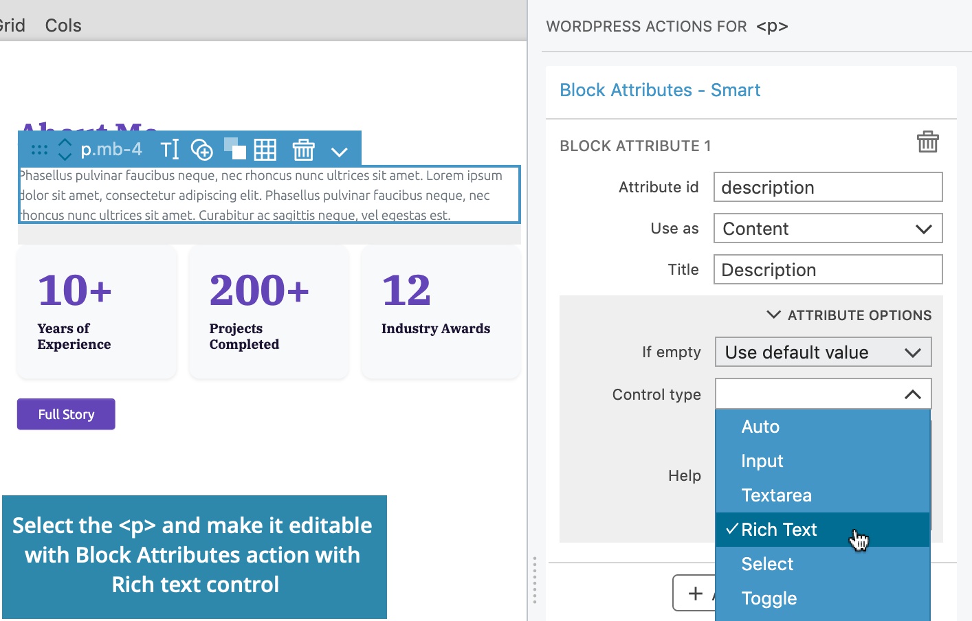
To make the description editable, select the <p> element and add Block Attributes action with the id description. Here we will set the control type to Rich text, so that we can format the text if needed.
Image
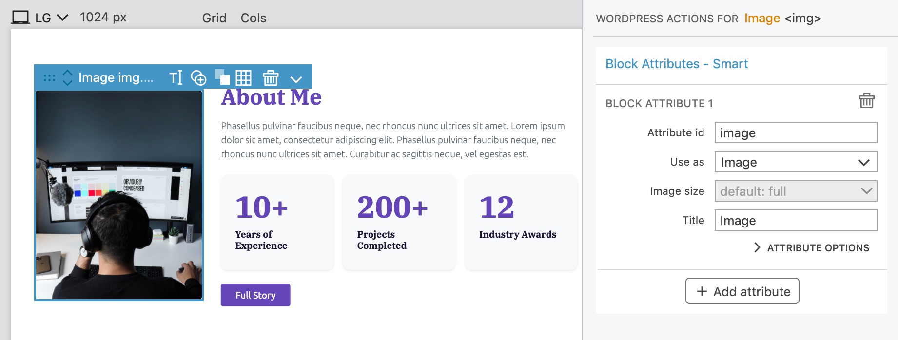
To make the image editable, we select the <img> element and add the Block Attributes action. The attribute will be used as the value of src attribute and image selector control will be displayed in the sidebar.
Button
Then select the button <a> and add Block Attributes action. Select Use as “Link” to make the href editable:
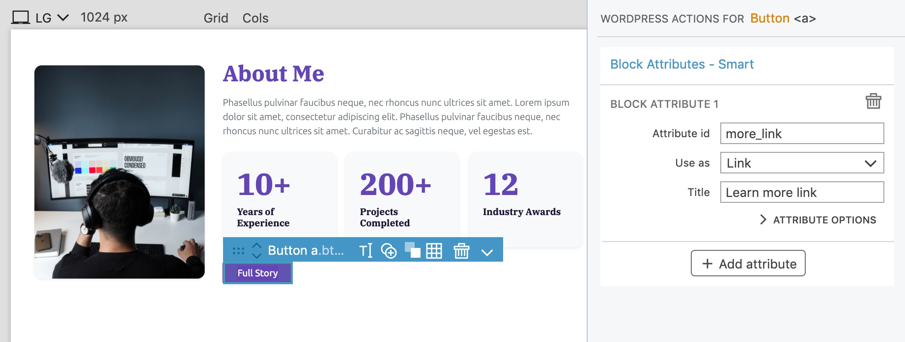
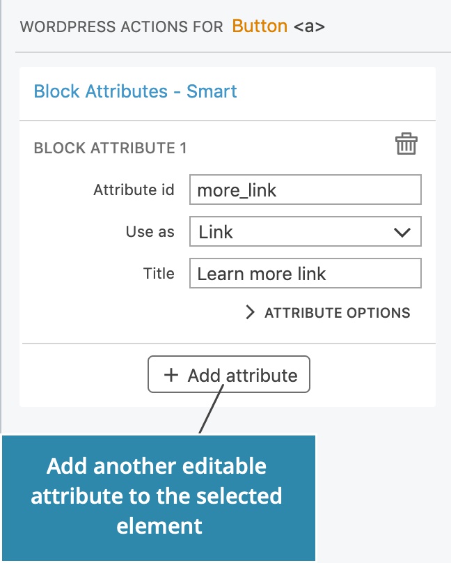
Let’s also make the label editable. Click on the Add attribute button on the Block Attributes action to add another editable attribute to the selected element:
Here, we will make the Content editable:
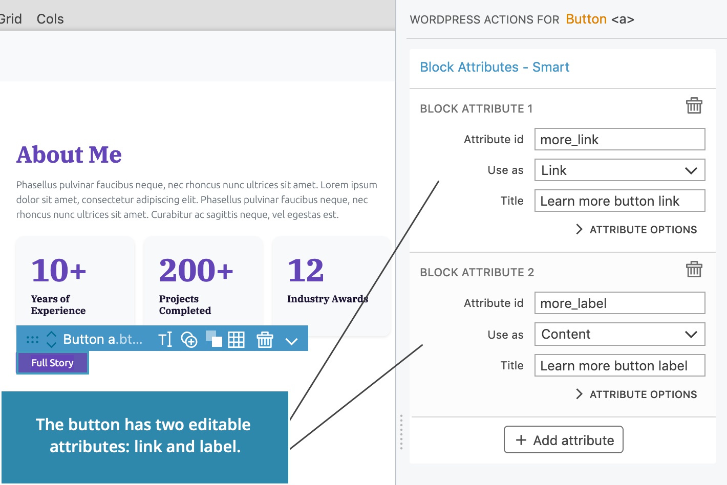
The block is now editable!
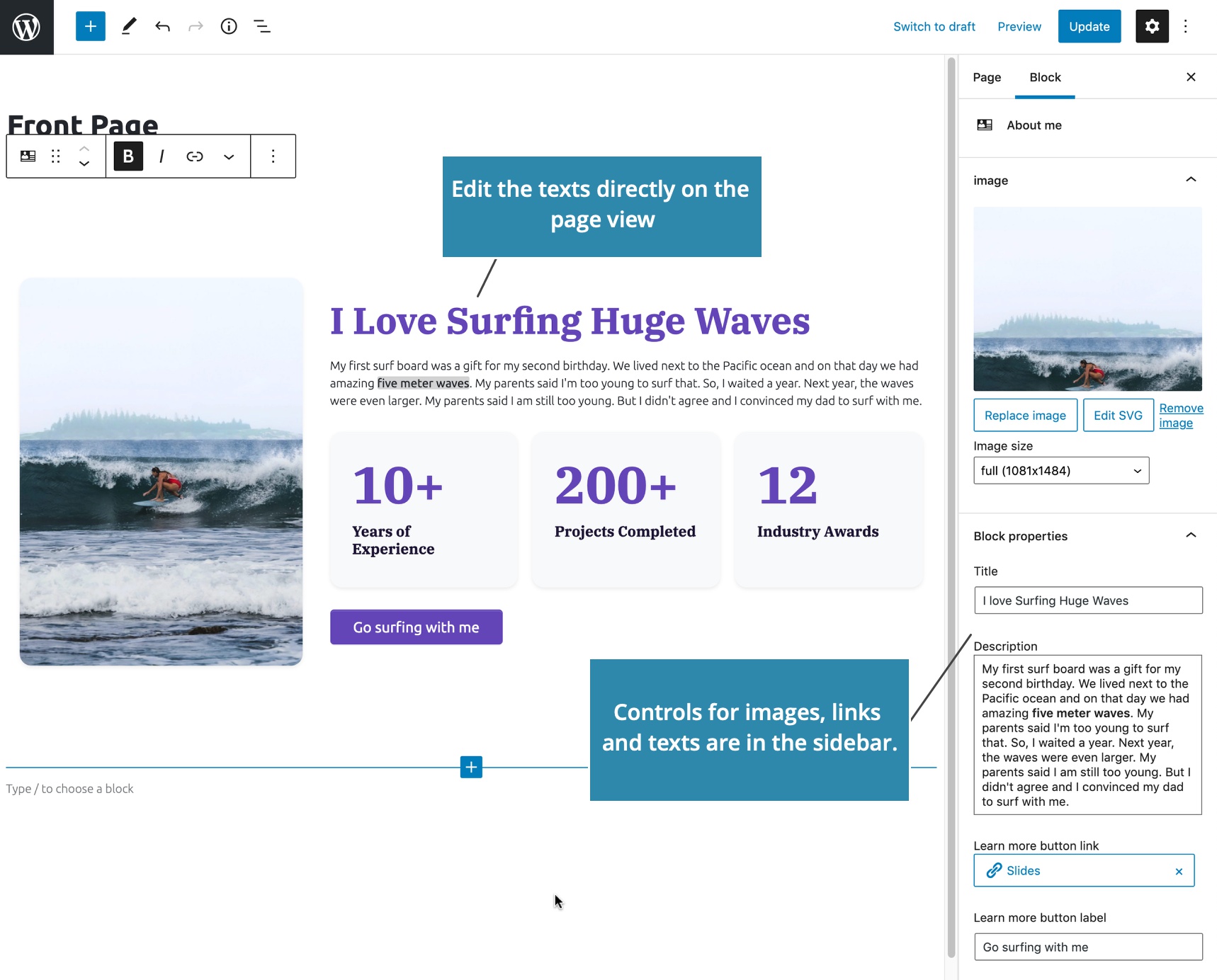
Export the project and reload the Block editor.
Now we can edit the title and description directly on the block, and customize all its properties in the sidebar.
Learn more about Block Attributes action.
We need to make the counters editable as well. We could use a fixed number of counters and make their numbers and descriptions editable with attributes such as Counter number 1, Counter label 1, Counter number 2…
But, we have a much better solution: nested blocks.
Inner Blocks - Blocks within the blocks
We will create an area where sub-blocks can be inserted into the block.
Blocks can contain other blocks. In WordPress, sub-blocks are called inner blocks.
Each block can have only one inner blocks area. Multiple inner blocks areas are not supported in WordPress.
We just need to add Block Inner Content action to the element that should contain inner blocks.
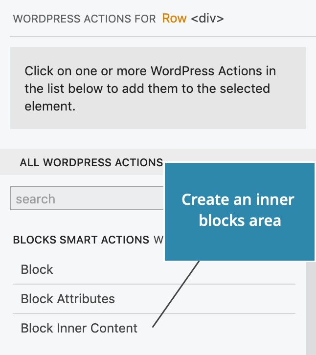
For example, our About me block could have a content area where user can freely insert one or more blocks.
But let’s do something more interesting.
Create sub-blocks
Block Inner Content action lets us limit what kind of blocks can be inserted into the area. In addition, we can also define a new block type, tailor made for the inner content area.
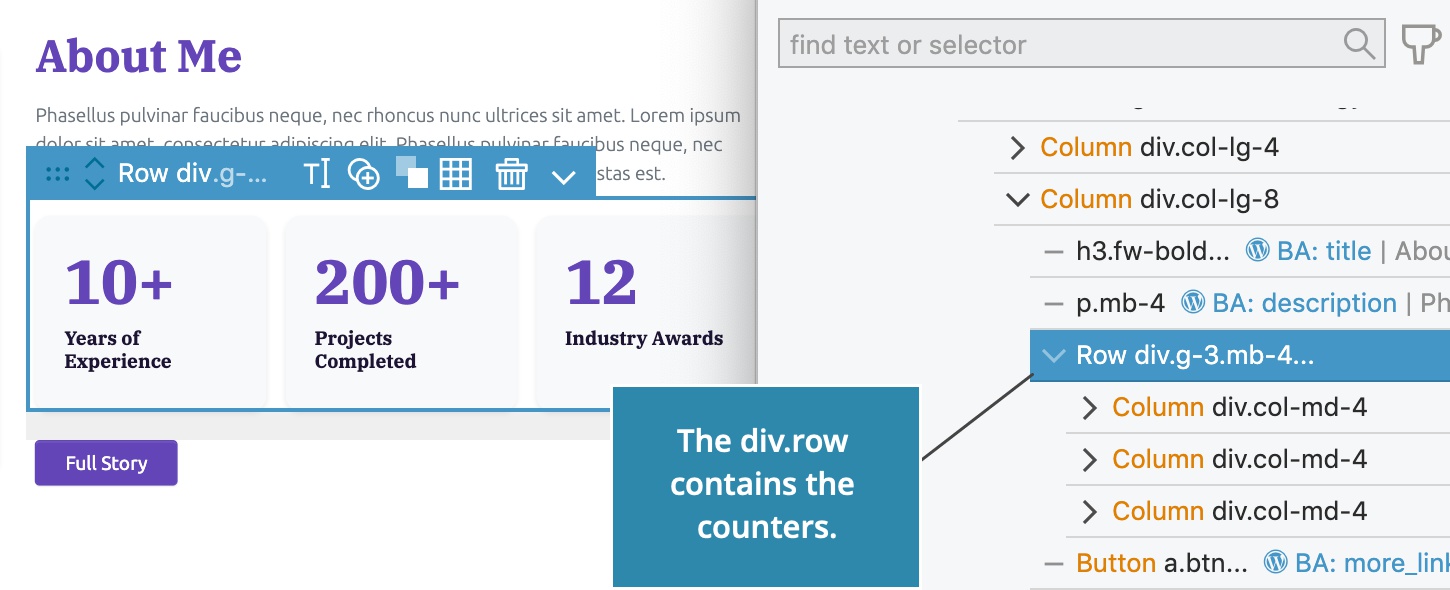
Our HTML project has a div.row that contains counters, implemented as Bootstrap columns.
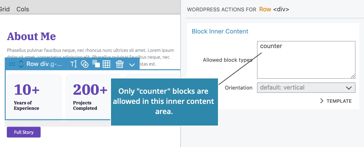
Select the div.row and add Block Inner Content action.
Here, we don’t want just any kind of block to be added here. We will only allow Counter blocks by entering counter into the Allowed Block Types field. counter is the block id of the custom block we will create below.
Counter block
We also need to define the block type Counter.
Select the first counter element and add Block action with the id counter and title Counter.
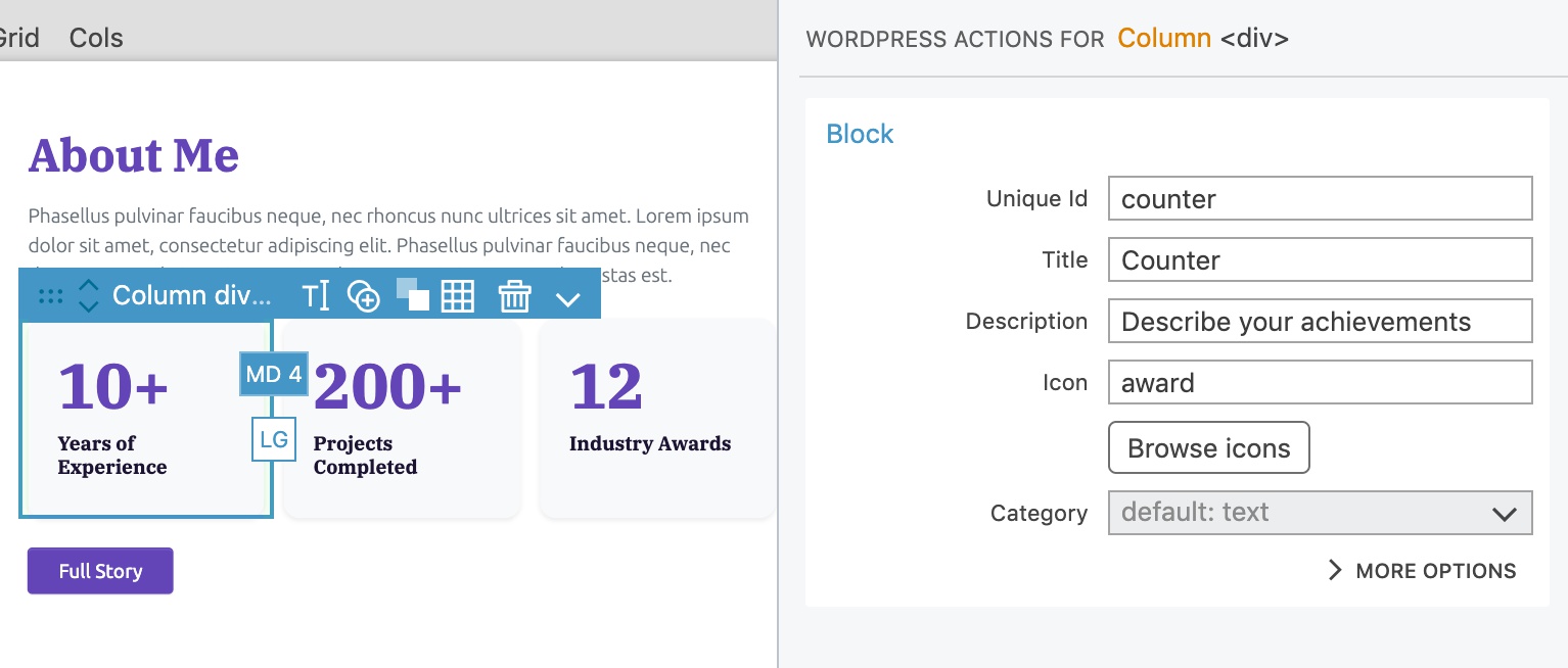
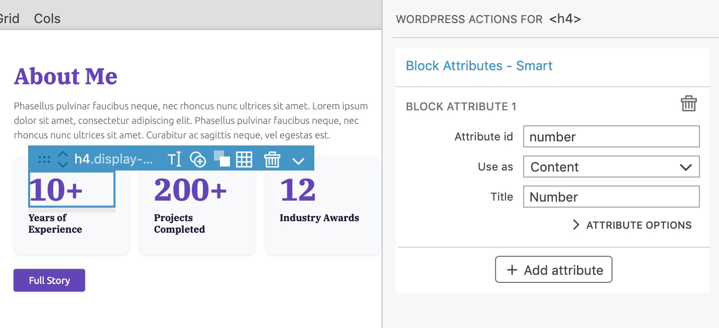
Make the number editable by selecting the <h4> element and adding Block Attributes action with the id number.
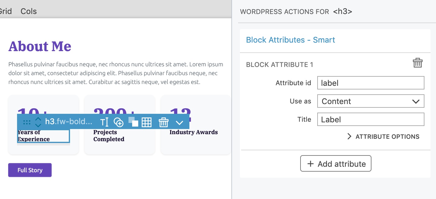
Add another Block Attributes action to the <p> and set the id to label.
Export the project and reload the Block editor.
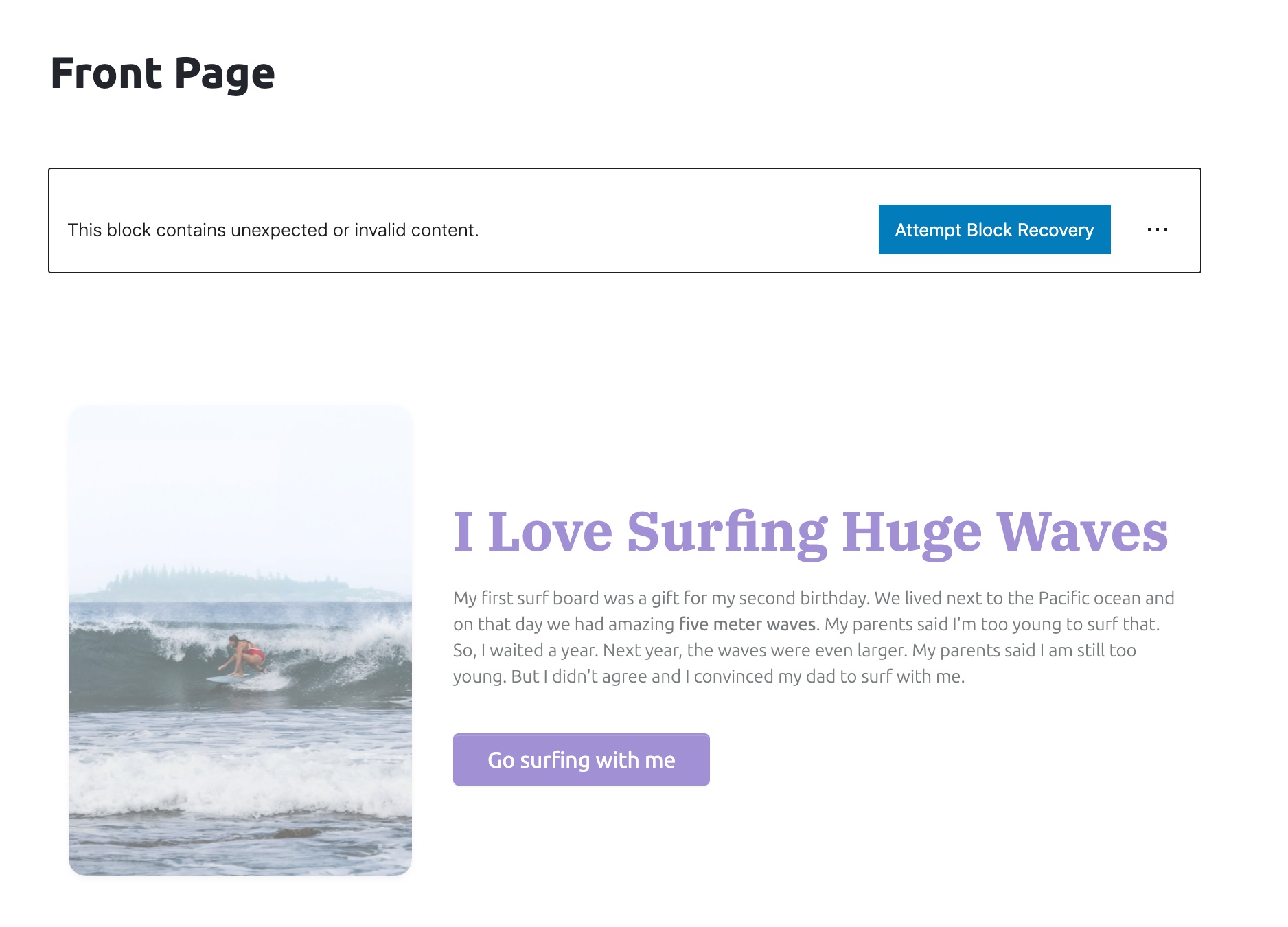
We have to recover the block because the block structure changed. Just click on the Attempt Block Recovery button and WordPress will figure it out.
Edit, add and move counters
We can edit the numbers and labels of the counters. Each counter is a block.
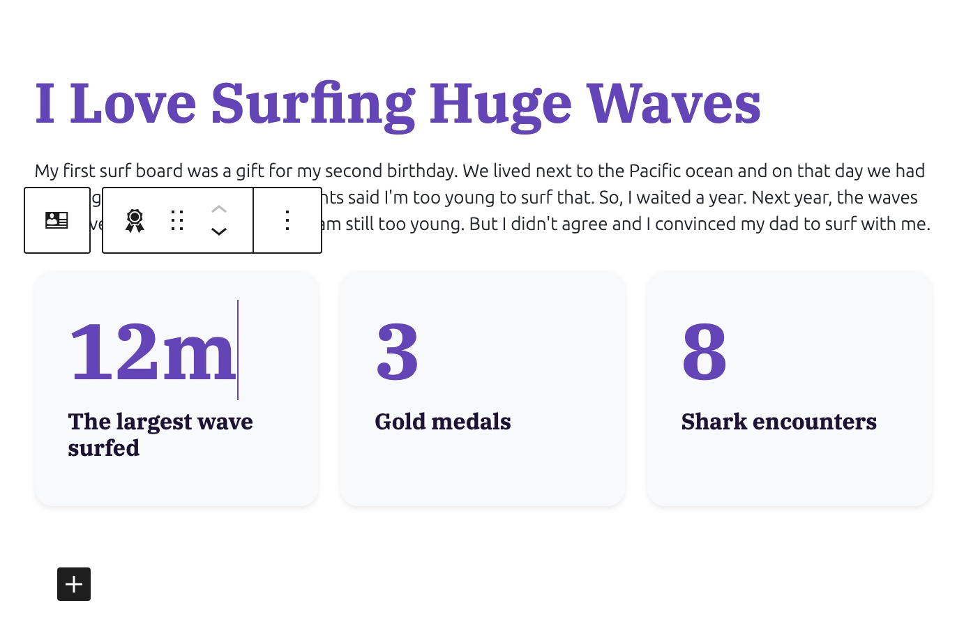
We now see an insertion point when the block is selected.
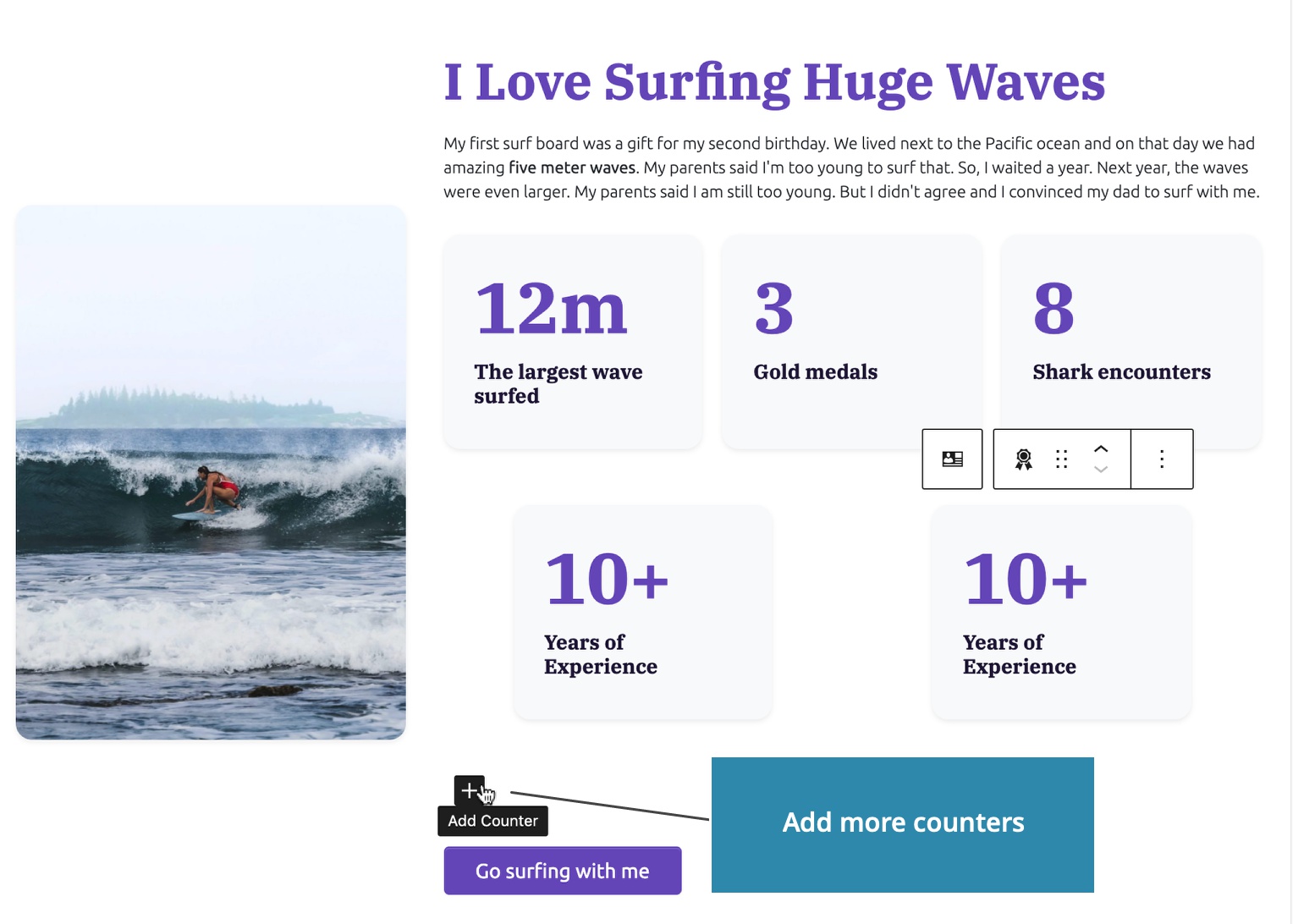
Clicking on it will insert a new Counter block. Because only one block type is allowed, WordPress doesn’t ask us about what type of block we want to insert.
We can insert as many counters as we need.
Of course we can delete counters and reorder them with up and down controls.
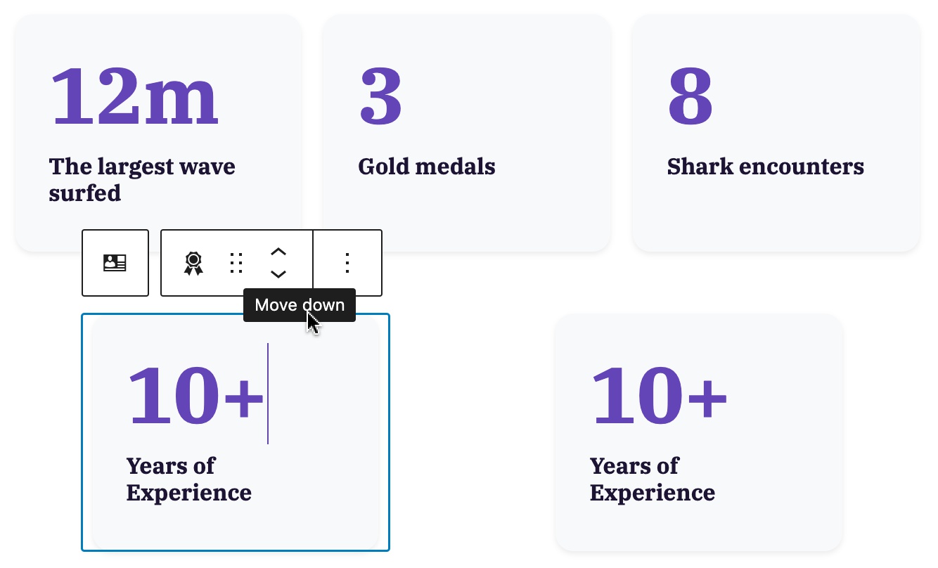
Note, as on the image above, the styling of our block in the Block editor can differ slightly from how they are styled on the front-end. In rare cases where this creates problems, we can use editor styling to fine-tune the styling in the editor.
For reference, this is how our block appears on the front-end:
Recap of what we did so far
Learn more about the Block Inner Content action.
In just a few minutes we created a fully customizable block that we can reuse on this and other projects.
Our About me and Counter blocks are implemented as Regular JavaScript blocks because all their content is stored in attributes whose value is set at the time of editing the post.
Next, let’s create a dynamic PHP block that will display up-to-date information from the WordPress database.
Displaying up-to-date information with Dynamic Blocks
The content of a Regular JavaScript block gets set when we save the post in the Block editor.
Dynamic PHP Blocks, on the other hand, are rendered every time they are displayed. And because they are run on the server-side and coded in PHP they can use any WordPress function to query posts, site information, current user and more.
Create a dynamic block
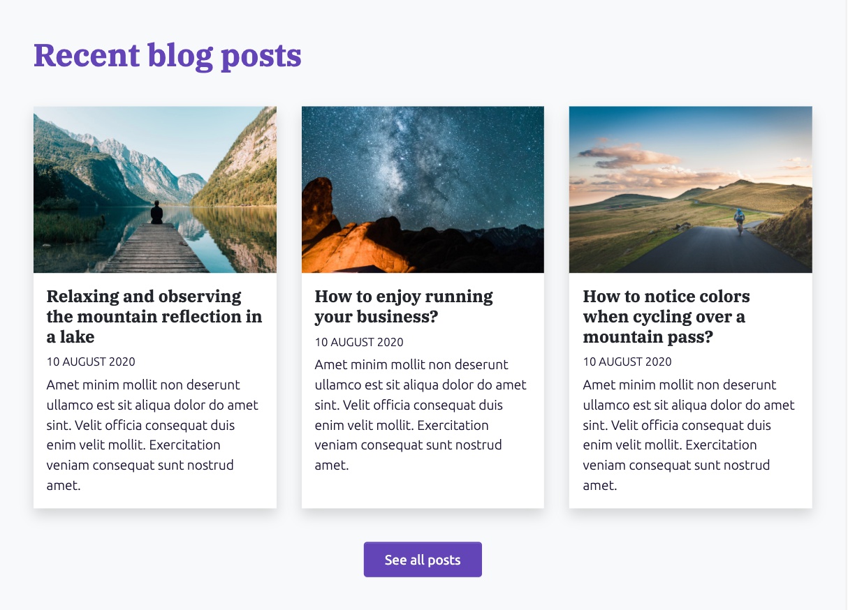
Let’s create a dynamic block that will display the three most recent blog posts.
We will start with the HTML layout for the section:
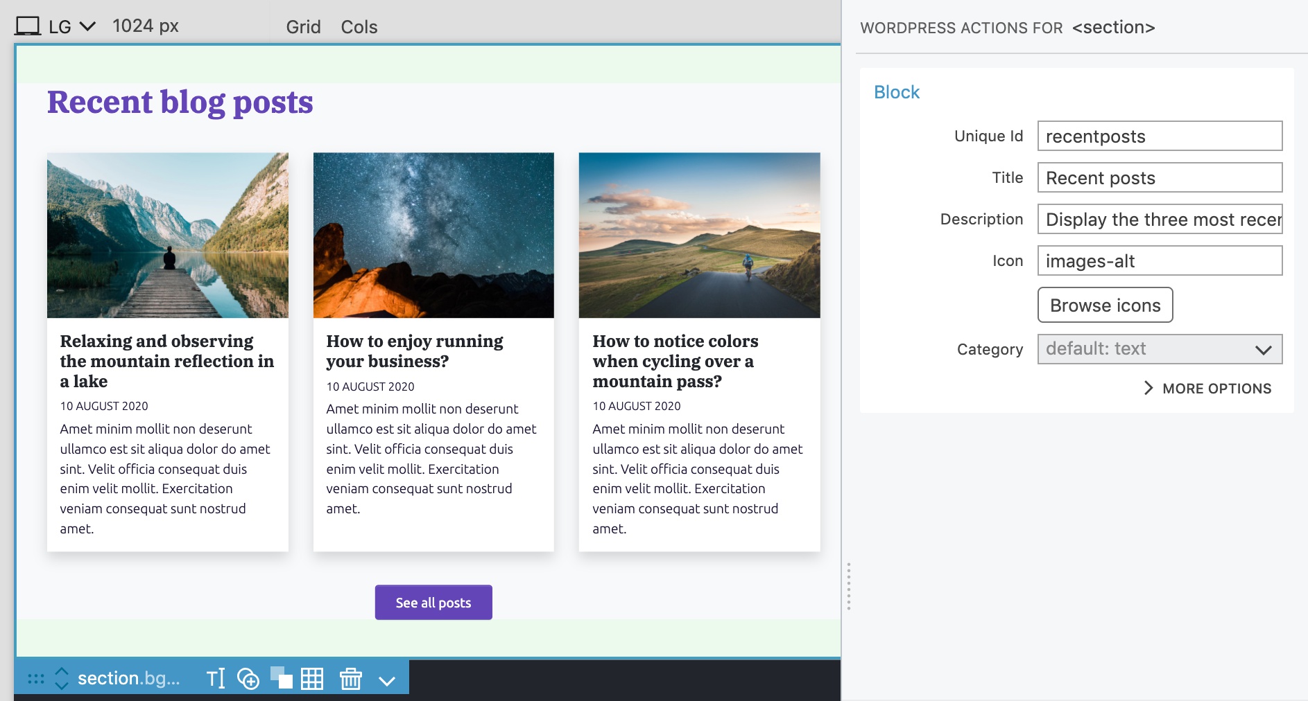
We define the block by adding Block action to the <section> element and set the id to recentposts, title to Recent posts and icon to images-alt.
Show posts with custom query
Select the first post column div and in the WordPress panel add Show Posts action with Loop type “Custom query”, Order by “Created date - Down”, Posts per page “3” and Paginate results “No”.
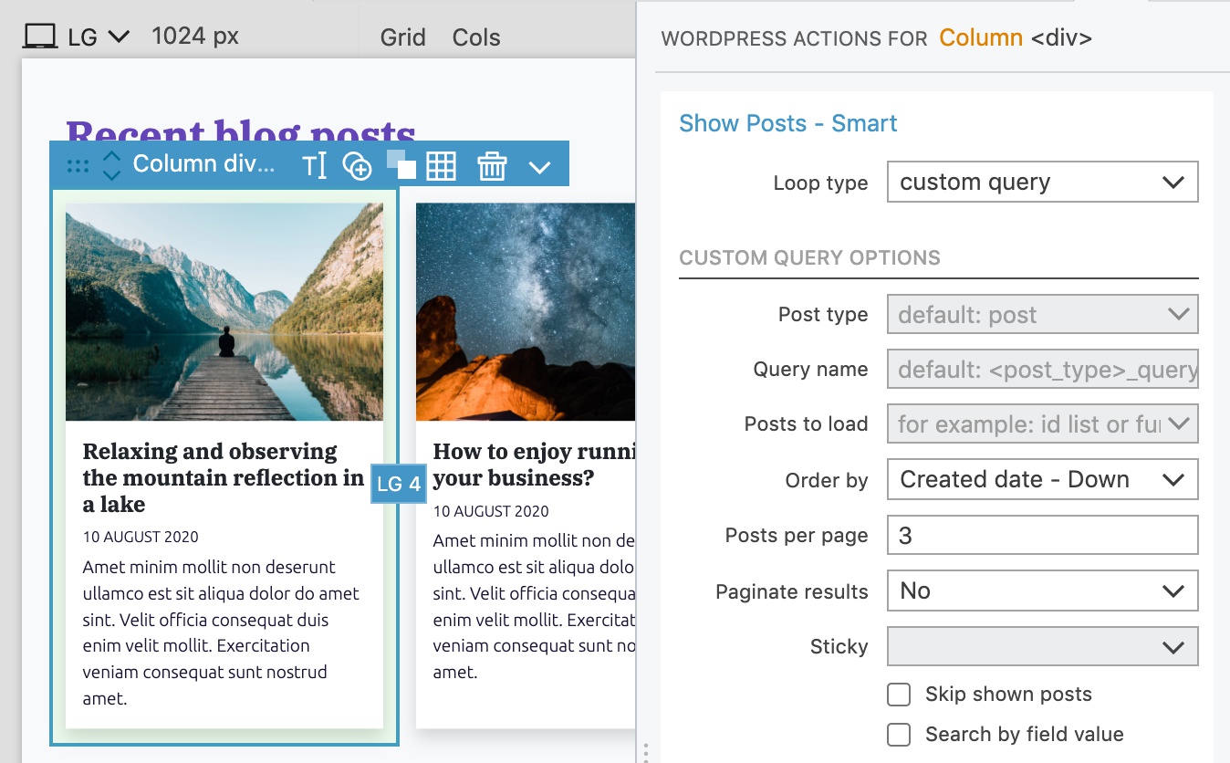
Show Posts action will read the posts from the WordPress database and repeat the element for each post.
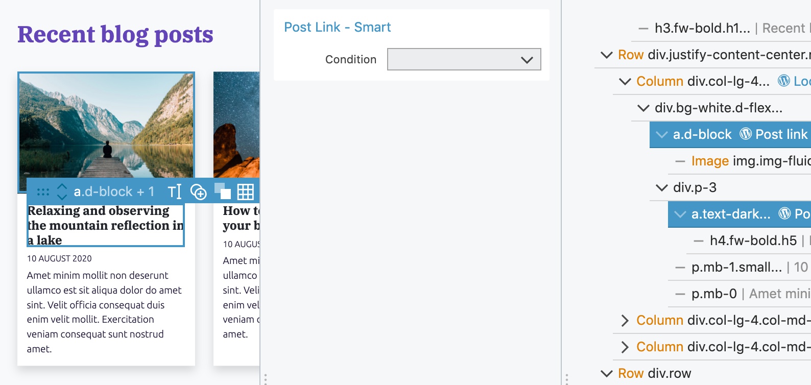
Select both <a> elements and add the Post link action:
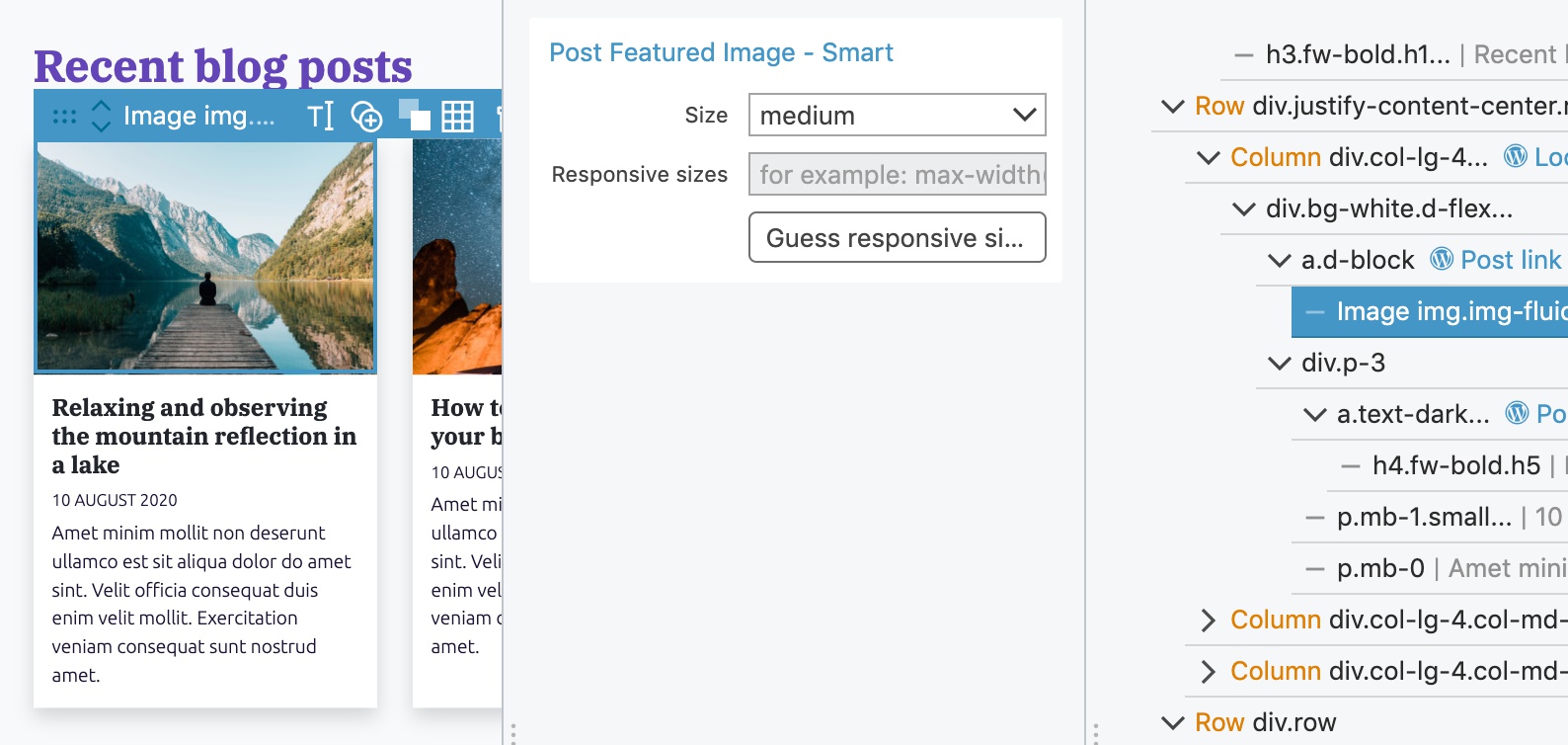
On the <img> element we add the Post Featured Image action and set the image size to “medium”:
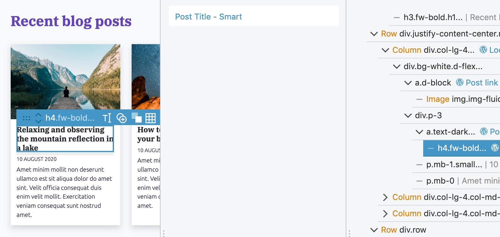
Post Title action goes to the <h4> element:
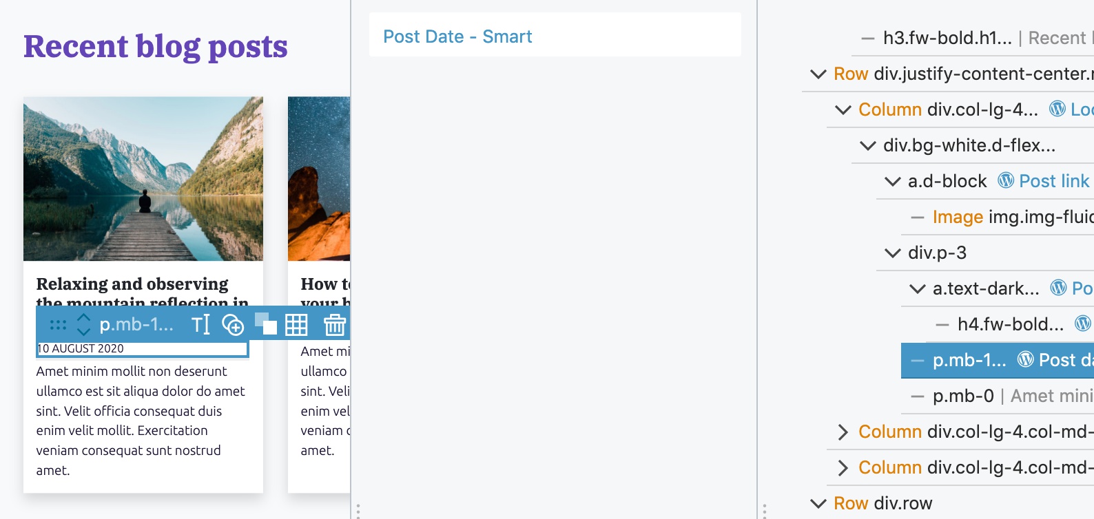
Next, we add Post Date action to the <p> element with the date:
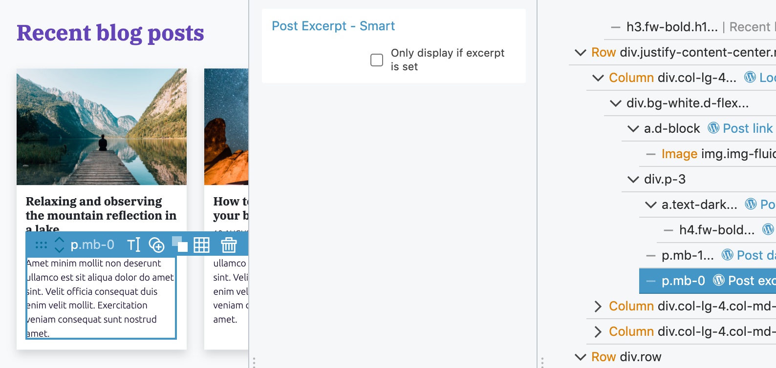
And the Post Excerpt action to the <p> with the post excerpt:
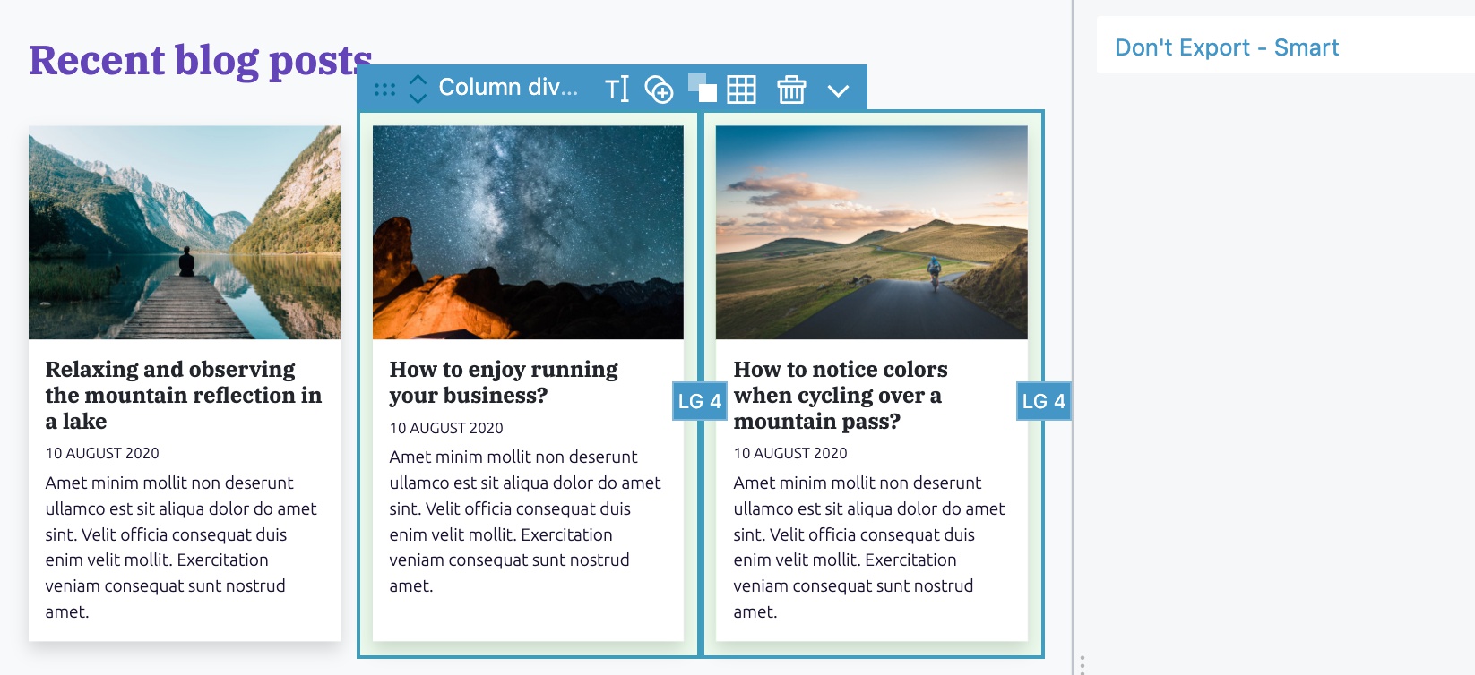
What to do with the other placeholder posts in our HTML project?
The Show posts is already set up on the first post and we don’t want to export the other two placeholder posts to the theme. To do that we add Don’t Export action from the Global Smart Actions section of the WordPress panel to both posts:
Editable title and button
Let’s make the section title and button editable as well.
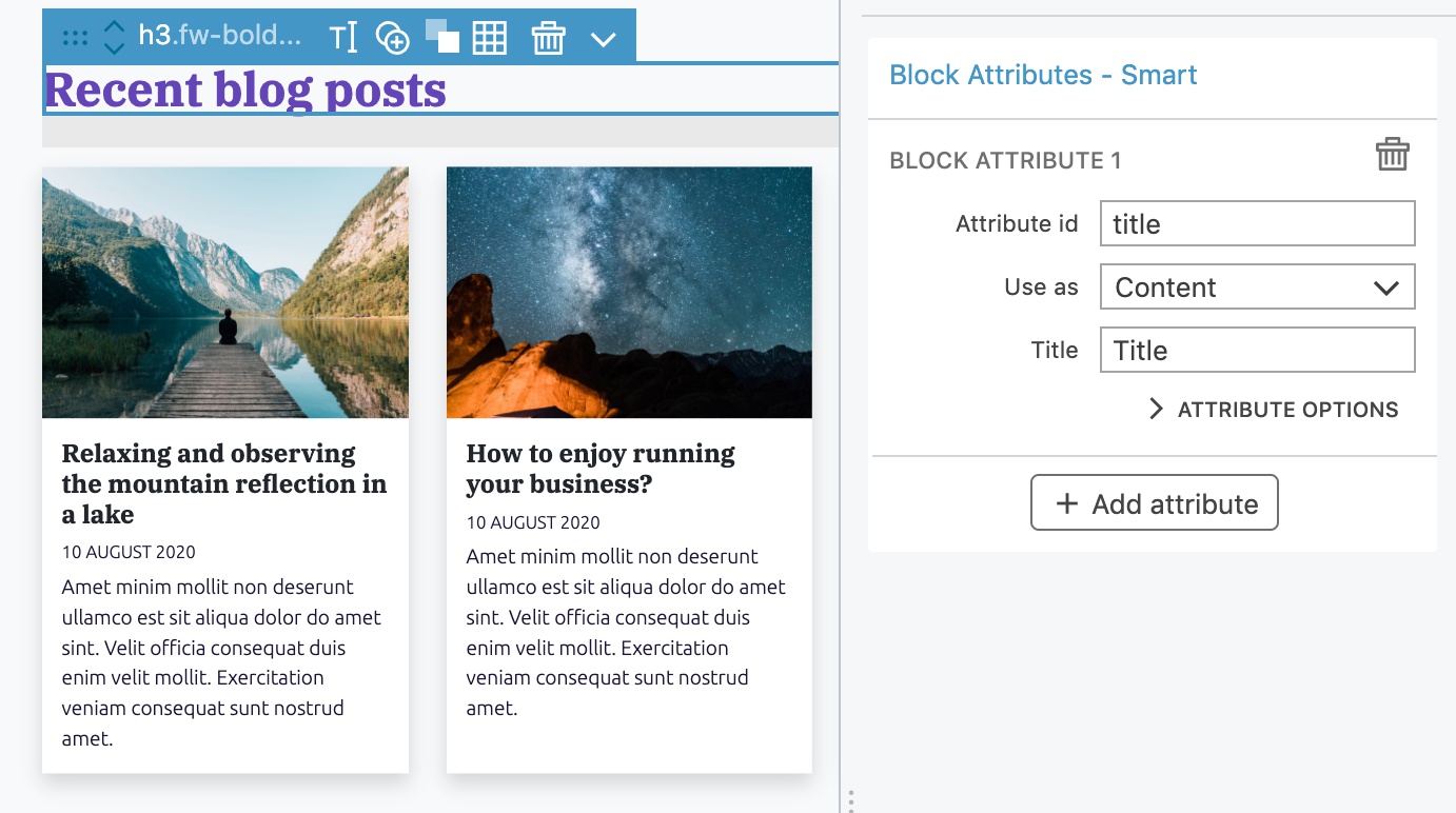
Select the Recent blog posts <h3> and add Block Attributes action:
On the button, add Block Attributes action and make both the link and the label editable:
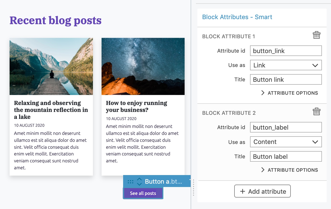
One advantage of dynamic blocks is that we can freely mix block attributes and WordPress actions.
See it in action
Export the project. Because the block contains actions such as Show Posts that runs on the server-side, Pinegrow automatically exported the block as Dynamic PHP block.
Reload the Block editor and add the Recent posts block to the page.
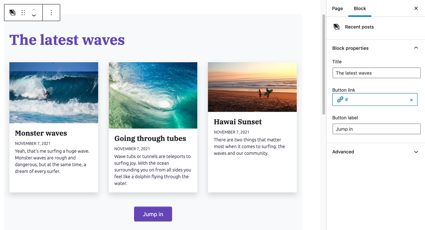
We can notice a slight delay when displaying the block, due to its content being rendered on the server.
Dynamic blocks are rendered each time they are displayed, so our block will always show the most recent posts.
The post selector control
How about if we want to hand pick the list of posts that is displayed in the block?
That’s easy! We just need to change the Loop type to “block” on the Show Posts action, and fill in the Attribute id, title and description:
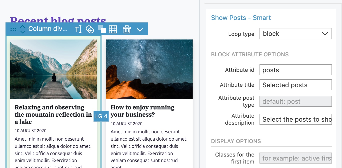
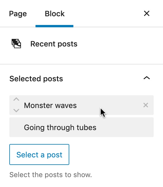
Using the block query type adds the Post selector control to the sidebar. It lets us hand pick the posts we want to display.
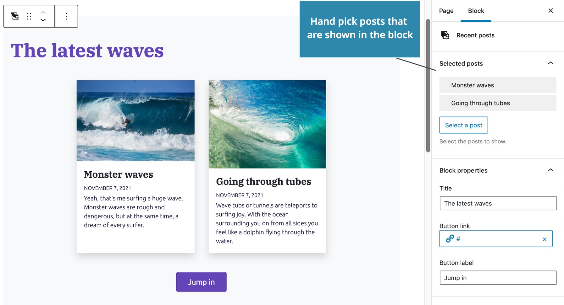
Use the up, down and remove controls to manipulate the list of selected posts:
When to use dynamic blocks?
Dynamic blocks are very powerful because we can use any of the 200+ WordPress actions and include custom PHP code. So, why not just use dynamic blocks all the time?
Dynamic blocks have three drawbacks though:
- The delay during editing due to server side rendering.
- They can slow down the page display, if we use too many of them on the page.
- Text attributes can not be edited on the block, only in the sidebar.
So, we should use Dynamic blocks only when needed and stick to regular JavaScript blocks in other cases.
Note, most non-native block solutions such as ACF PRO Block support only dynamic blocks because they are easier to implement. Pinegrow is unique in supporting easy creation of both JavaScript and PHP blocks.
Styling our Custom Blocks
Sometimes our custom blocks need special CSS styling that is not covered by the framework styling or by the global theme stylesheet.
The best approach is to create a special CSS stylesheet that contains the block styling and to instruct WordPress to load it only if the block is displayed on the current page.
Create a new CSS file
To do that, create a new CSS file with all the required CSS styling. First, we create the folder blocks that will contain our block assets. The name doesn’t have to be blocks, of course.
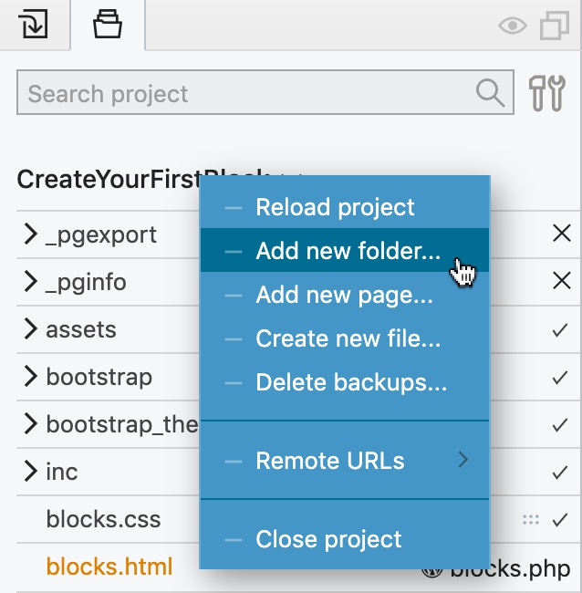
Next, we create a new file in the Project panel by right-clicking on the blocks folder:
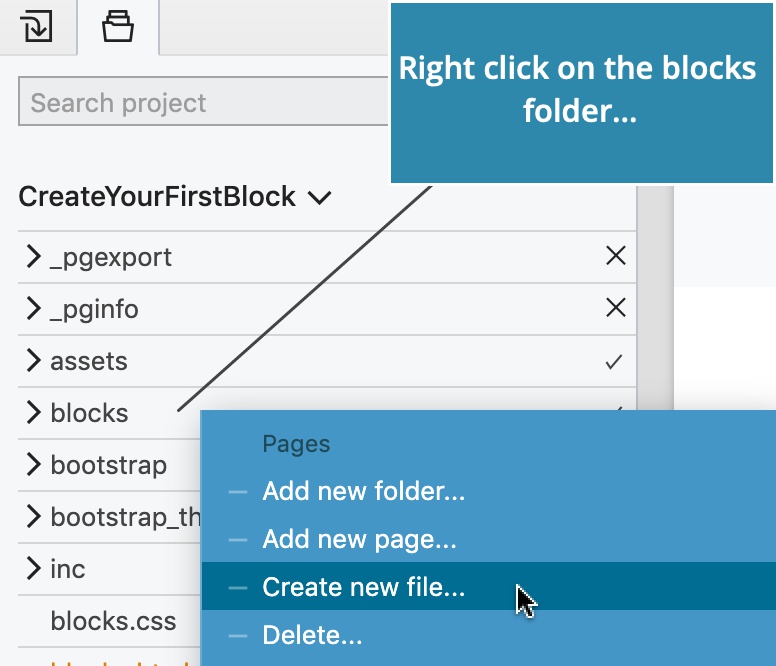
We will name the file fancy.css:
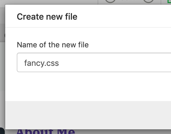
Then, drag fancy.css to the page.
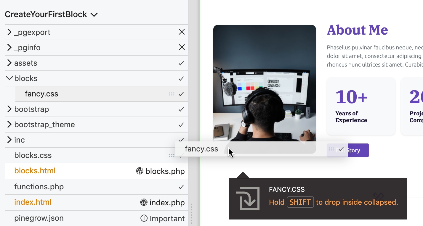
CSS rules should be scoped to the target block. The best way to do that is to add a class to the main block element and then use that class in CSS selectors.
Let’s go back to our About me block and add the class fancy-block to its main <section> element.
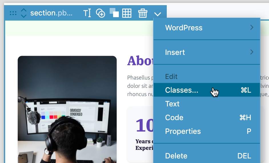
The right-click context menu or the CMD + L open up the Assign class dialog:
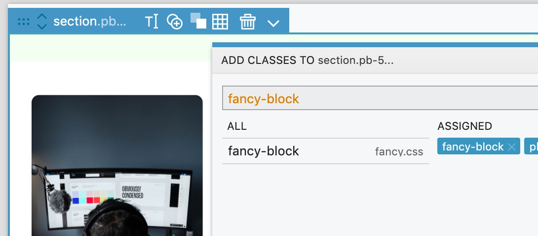
CSS rules use the class to scope the styling to the block. Here we will add a short decorative line below <h3>:
Click on fancy.css in the Project panel to open the file in the code editor:
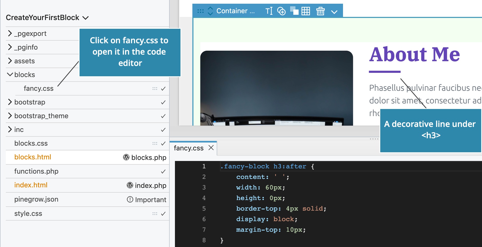
We then include the CSS file with the Style setting on the Block action. The value is the relative url of the stylesheet, in relation to the project folder. In our case, blocks/fancy.css.
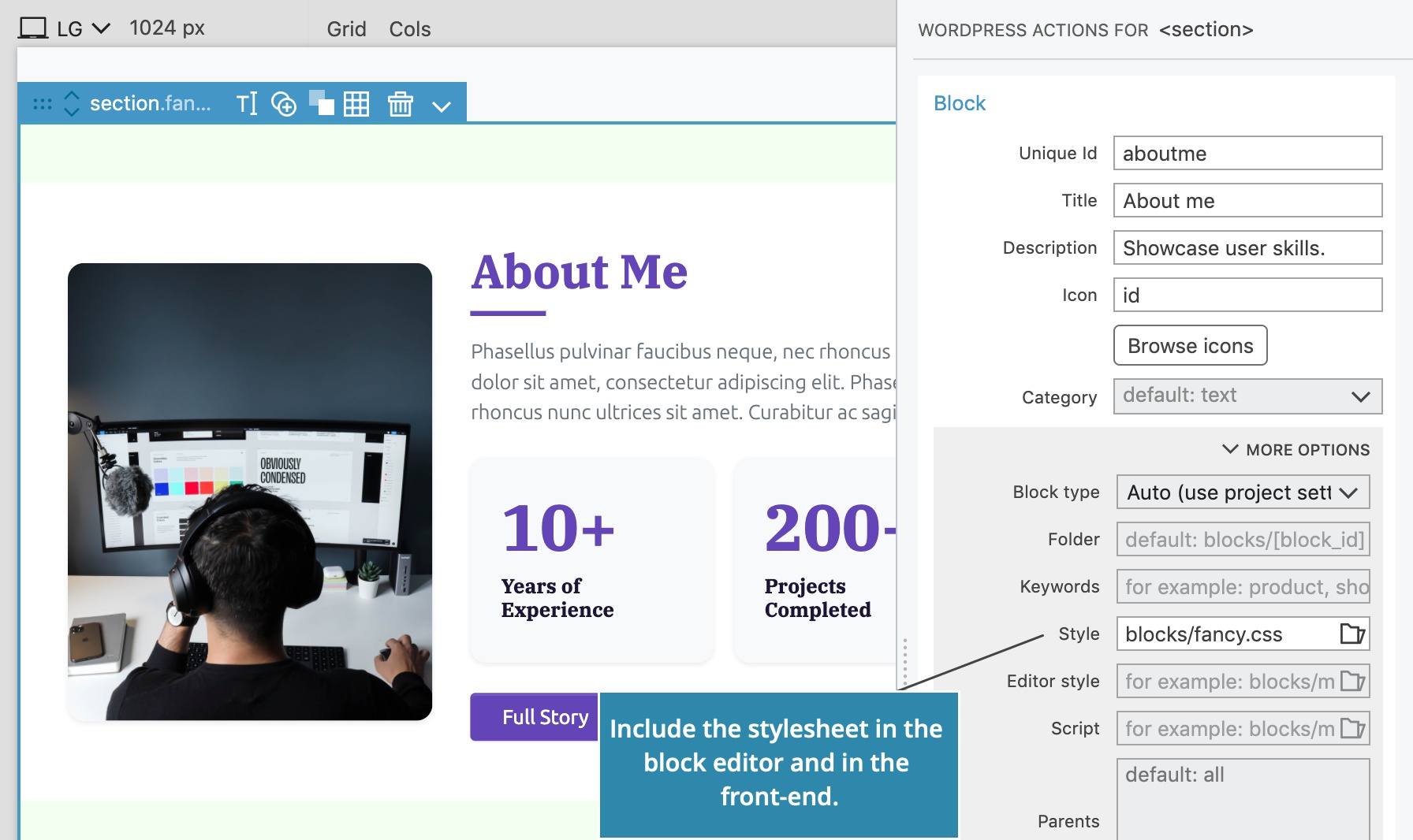
The stylesheet will be included both in the editor and on the front-end.
Including a stylesheet only in the editor
Use Editor style setting to add a stylesheet that should be included only in the editor.
Both Style setting and Editor style setting can be defined.
Sharing the same CSS stylesheets between more blocks
A group of blocks can share the same stylesheet. Just add it to each block with the Style setting on their Block actions.
Pinegrow generates resource handles based on the stylesheet name, so that the stylesheet will be included only once, even if more blocks are using it.
Including the framework stylesheet in the Block editor
Our blocks usually rely on styling provided by the global theme stylesheet or framework stylesheet such as Bootstrap and Tailwind CSS. Without these styles block don’t show up correctly in the block editor. Use Theme settings to include theme stylesheets in the block editor.
Congratulations
This completes the Create Your First Block guide.
Explore the rest of Blocks documentation and tutorials to learn more.